2.1 Data Collection and Descriptive Statistics (Part 2)#
Summarizing and Visualizing One Qualitative Variable#
In the upcoming discussion, we will be exploring into a dataset that encompasses both qualitative and quantitative variables. Our initial focus will be on the qualitative aspect of the data, where we aim to systematically summarize and subsequently visualize these categorical variables.
We explore the freMTPL2freq dataset from the R package CASdatasets, which comprises a French motor third-party liability (MTPL) insurance portfolio with observed claim counts in a single accounting year.
IDpol: Unique identifier representing the policy number.
ClaimNb: Number of claims associated with the policy.
Exposure: Total exposure in yearly units, indicating the duration of the policy.
Area: Categorical variable denoting the area code.
VehPower: Ordered categorical variable representing the power of the car.
VehAge: Age of the car in years.
DrivAge: Age of the driver in years.
BonusMalus: Bonus-malus level ranging from 50 to 230, with a reference level of 100.
VehBrand: Categorical variable indicating the car brand.
VehGas: Binary variable indicating whether the car uses diesel or regular fuel.
Density: Density of inhabitants per square kilometer in the city of the driver’s residence.
Region: Categorical variable representing regions in France prior to 2016.
Tip
Students interested in understanding how different models, from traditional statistics to advanced machine learning, explain and predict the number of insurance claims, should check out the article ‘Case Study_ French Motor Third-Party Liability Claims (Noll, Salzmann, and Wuthrich [NSW20])’. It provides valuable insights into the topic and offers a great learning experience in insurance analytics.
Summarizing one qualitative variable involves describing the essential characteristics of a categorical data set. Here are several ways to summarize a qualitative variable:
1. Frequency Distribution#
Create a table that shows the count or frequency of each category in the qualitative variable.
Include both the absolute frequencies (counts) and relative frequencies (percentages).
suppressMessages({
  suppressWarnings(library(CASdatasets))
})


data(freMTPL2freq)
Error in library(CASdatasets): there is no package called ‘CASdatasets’
Traceback:

1. suppressMessages({
 .     suppressWarnings(library(CASdatasets))
 . })
2. withCallingHandlers(expr, message = function(c) if (inherits(c,
 .     classes)) tryInvokeRestart("muffleMessage"))
3. suppressWarnings(library(CASdatasets))   # at line 2 of file <text>
4. withCallingHandlers(expr, warning = function(w) if (inherits(w,
 .     classes)) tryInvokeRestart("muffleWarning"))
5. library(CASdatasets)
str(freMTPL2freq)
'data.frame':	677991 obs. of  12 variables:
 $ IDpol     : Factor w/ 677991 levels "1","3","5","10",..: 1 2 3 4 5 6 7 8 9 10 ...
 $ ClaimNb   : num  0 0 0 0 0 0 0 0 0 0 ...
 $ Exposure  : num  0.1 0.77 0.75 0.09 0.84 0.52 0.45 0.27 0.71 0.15 ...
 $ VehPower  : int  5 5 6 7 7 6 6 7 7 7 ...
 $ VehAge    : int  0 0 2 0 0 2 2 0 0 0 ...
 $ DrivAge   : int  55 55 52 46 46 38 38 33 33 41 ...
 $ BonusMalus: int  50 50 50 50 50 50 50 68 68 50 ...
 $ VehBrand  : Factor w/ 11 levels "B1","B10","B11",..: 4 4 4 4 4 4 4 4 4 4 ...
 $ VehGas    : chr  "Regular" "Regular" "Diesel" "Diesel" ...
 $ Area      : Factor w/ 6 levels "A","B","C","D",..: 4 4 2 2 2 5 5 3 3 2 ...
 $ Density   : int  1217 1217 54 76 76 3003 3003 137 137 60 ...
 $ Region    : Factor w/ 22 levels "Alsace","Aquitaine",..: 22 22 19 2 2 17 17 13 13 18 ...
Example 2.13 Summarizing one qualitative variable: freMTPL2freq dataset
What are the different categories present in the “Area” variable, and how frequently do each of these categories occur in the dataset? Provide both the absolute frequencies (counts) and the relative frequencies (percentages).
To answer Example 2.13 and create a frequency distribution for the “Area” variable in the “freMTPL2freq” dataset, you can use R. Here’s a step-by-step guide:
# Install and load the CASdatasets package
if (!requireNamespace("CASdatasets", quietly = TRUE)) {
  install.packages("CASdatasets")
}
suppressMessages({
  suppressWarnings(library(CASdatasets))
})

# Load the freMTPL2freq dataset
data("freMTPL2freq")

# View the unique categories in the "Area" variable
unique_areas <- unique(freMTPL2freq$Area)
print(unique_areas)

# Create a frequency table
frequency_table <- table(freMTPL2freq$Area)

# Convert absolute frequencies to percentages
relative_frequencies <- prop.table(frequency_table) * 100

# Combine absolute and relative frequencies
result <- data.frame(Area = names(frequency_table),
                     Absolute_Frequency = as.numeric(frequency_table),
                     Relative_Frequency = as.numeric(relative_frequencies))

# Print the result
print(result)
[1] D B E C F A
Levels: A B C D E F
  Area Absolute_Frequency Relative_Frequency
1    A             103952           15.33236
2    B              75457           11.12950
3    C             191874           28.30038
4    D             151592           22.35900
5    E             137163           20.23080
6    F              17953            2.64797
This code snippet does the following:
Installs and loads the CASdatasets package (if not already installed).
Loads the “freMTPL2freq” dataset.
Prints the unique categories in the “Area” variable.
Creates a frequency table for the “Area” variable using the
table()function.Converts absolute frequencies to relative frequencies using the
prop.table()function.Combines absolute and relative frequencies into a data frame for a comprehensive result.
Prints the final result, showing both absolute and relative frequencies.
Example 2.14 Summarizing one qualitative variable: freMTPL2freq dataset
Can you provide a breakdown of the distribution of car brands (“VehBrand”) in the dataset, highlighting the frequency of each brand? Show both the absolute frequencies (counts) and the relative frequencies (percentages).
Example 2.15 Summarizing one qualitative variable: freMTPL2freq dataset
For the “Region” variable, which represents regions in France, could you outline the frequency distribution of each region within the dataset? Present both the absolute frequencies (counts) and the relative frequencies (percentages).
2. Bar Charts#
Represent the frequencies visually using a bar chart.
Each category is represented by a bar, and the height of the bar corresponds to the frequency or percentage.
Tip
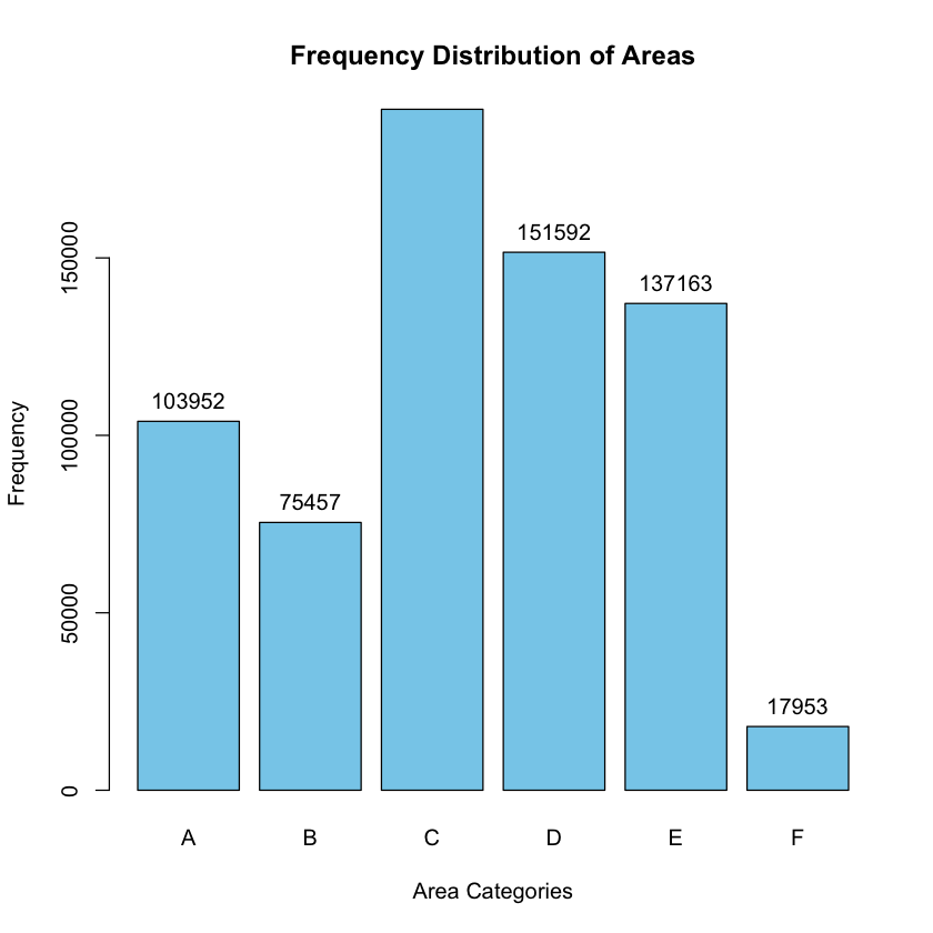
To create a bar chart for the “Area” variable in R, you can use the barplot() function. Here’s a step-by-step guide:
# Load necessary libraries
suppressMessages(library(CASdatasets))

# Load the freMTPL2freq dataset
data("freMTPL2freq")

# Create a frequency table for the "Area" variable
frequency_table <- table(freMTPL2freq$Area)

# Convert absolute frequencies to percentages
relative_frequencies <- prop.table(frequency_table) * 100

# Combine absolute and relative frequencies into a data frame
result <- data.frame(Area = names(frequency_table),
                     Absolute_Frequency = as.numeric(frequency_table),
                     Relative_Frequency = as.numeric(relative_frequencies))

# Create a bar chart
barplot(frequency_table, main = "Frequency Distribution of Areas",
        xlab = "Area Categories", ylab = "Frequency", col = "skyblue")

# Add data labels
text(x = barplot(frequency_table, plot = FALSE), y = frequency_table + 1, labels = frequency_table, pos = 3, col = "black")

# Display the result
print(result)
  Area Absolute_Frequency Relative_Frequency
1    A             103952           15.33236
2    B              75457           11.12950
3    C             191874           28.30038
4    D             151592           22.35900
5    E             137163           20.23080
6    F              17953            2.64797
3. Pie Charts#
Display the relative frequencies of each category in a circular pie chart.
Each category is represented by a slice, and the size of the slice corresponds to the percentage of occurrences.
Tip
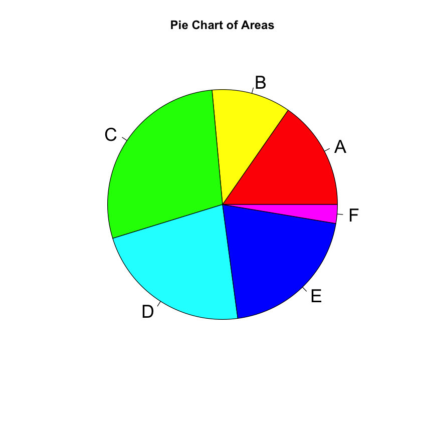
To create a pie chart for the “Area” variable in R, you can use the pie() function. Here’s a step-by-step guide:
# Load necessary libraries
suppressMessages(library(CASdatasets))

# Load the freMTPL2freq dataset
data("freMTPL2freq")

# Create a frequency table for the "Area" variable
frequency_table <- table(freMTPL2freq$Area)

# Convert absolute frequencies to percentages
relative_frequencies <- prop.table(frequency_table) * 100

# Combine absolute and relative frequencies into a data frame
result <- data.frame(Area = names(frequency_table),
                     Absolute_Frequency = as.numeric(frequency_table),
                     Relative_Frequency = as.numeric(relative_frequencies))

# Create a pie chart
pie(frequency_table, labels = result$Area, main = "Pie Chart of Areas",
    col = rainbow(length(result$Area)), cex = 1.8)

# Display the result
print(result)
  Area Absolute_Frequency Relative_Frequency
1    A             103952           15.33236
2    B              75457           11.12950
3    C             191874           28.30038
4    D             151592           22.35900
5    E             137163           20.23080
6    F              17953            2.64797
Tip
The cxex parameter in the
pie()function controls the size of the labels in the pie chart. Specifically, it stands for “character expansion,” and it is used to adjust the size of the labels relative to the default size.The
pie()function in R does not automatically arrange the slices in descending or ascending order based on frequencies or percentages. It plots the slices in the order they appear in the data.
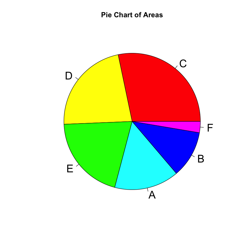
If you want to arrange the slices in descending order of frequencies or percentages, you should sort the data frame before creating the pie chart. Here’s an example:
# Sort the result data frame by Absolute_Frequency in descending order
result_sorted <- result[order(result$Absolute_Frequency, decreasing = TRUE), ]

# Create a pie chart with the sorted data
pie(result_sorted$Absolute_Frequency, labels = result_sorted$Area,
    main = "Pie Chart of Areas", col = rainbow(length(result_sorted$Area)), cex = 1.8)
Tip
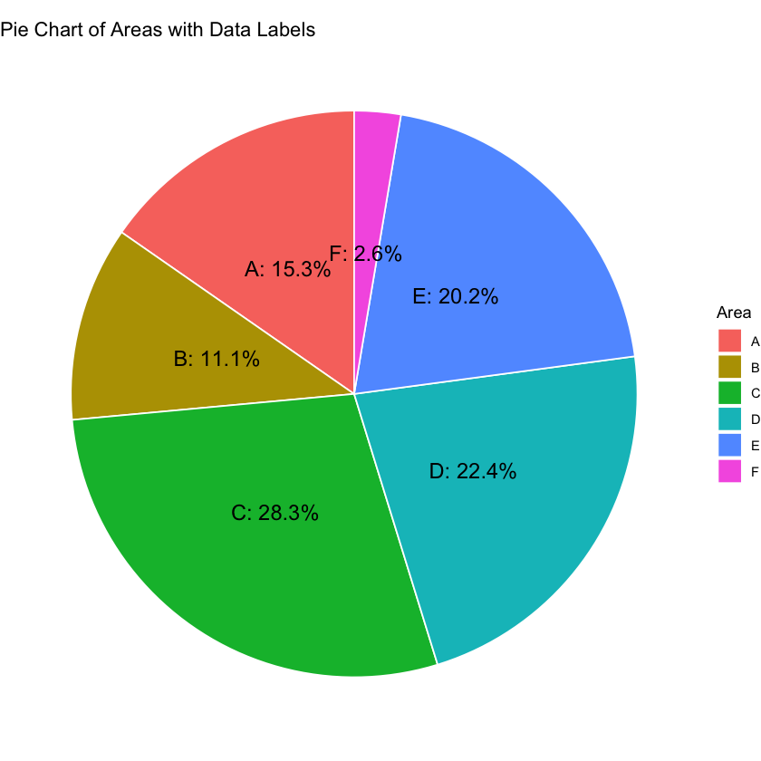
This code below uses ggplot2 to create a pie chart with labels that include both the “Area” and “Absolute_Frequency” values. You may need to adjust the size, colors, or other parameters based on your preferences.
Further information about pie charts with ggplot2 can be found at https://r-graph-gallery.com/piechart-ggplot2.html
# Install and load the ggplot2 package
if (!requireNamespace("ggplot2", quietly = TRUE)) {
  install.packages("ggplot2")
}
library(ggplot2)

# Create a data frame for ggplot2
df_ggplot <- data.frame(
  Area = names(frequency_table),
  Absolute_Frequency = as.numeric(frequency_table),
  Relative_Frequency = as.numeric(relative_frequencies)
)

# Create a pie chart with ggplot2
ggplot(df_ggplot, aes(x = "", y = Absolute_Frequency, fill = Area)) +
  geom_bar(stat = "identity", width = 1, color = "white") +
  coord_polar("y", start = 0) +
  theme_void() +
  geom_text(aes(label = paste0(Area, ": ", round(Relative_Frequency, 1), "%")),
            position = position_stack(vjust = 0.5), size = 5) +
  ggtitle("Pie Chart of Areas with Data Labels")
Example 2.16 Visualizing one qualitative variable: freMTPL2freq dataset
How can we effectively visualize the distribution of car brands (‘VehBrand’) and regions (‘Region’) in the ‘freMTPL2freq’ dataset?
Using R, create both a bar chart and a pie chart for the ‘VehBrand’ variable, illustrating the counts of each car brand (if possible). Additionally, generate similar visualizations for the ‘Region’ variable, providing insights into the geographical distribution of insurance claims.
Example 2.17 Excel: Visualizing one qualitative variable
In Excel, how can we effectively summarize and visualize the ‘Area’ variable based on the first 100 observations of the dataset?
Which specific ‘Area’ categories appear most frequently within the subset of the first 100 observations, and how do their frequencies differ from the entire dataset?
How do the frequency distribution and visual representation of the ‘Area’ variable among the first 100 observations compare to the overall dataset?
In Excel,
one can analyze the ‘Area’ variable by initially selecting the first 100 observations to streamline the dataset.
Subsequently, one should employ Excel functions or PivotTables to compute the frequency distribution of ‘Area’ within this subset, facilitating a concise overview of categorical occurrences.
To enhance comprehension, one can then create visual representations, such as bar charts or pie charts, effectively illustrating the distribution patterns.
head(freMTPL2freq,100)
| IDpol | ClaimNb | Exposure | VehPower | VehAge | DrivAge | BonusMalus | VehBrand | VehGas | Area | Density | Region | |
|---|---|---|---|---|---|---|---|---|---|---|---|---|
| <fct> | <dbl> | <dbl> | <int> | <int> | <int> | <int> | <fct> | <chr> | <fct> | <int> | <fct> | |
| 1 | 1 | 0 | 0.10 | 5 | 0 | 55 | 50 | B12 | Regular | D | 1217 | Rhone-Alpes |
| 2 | 3 | 0 | 0.77 | 5 | 0 | 55 | 50 | B12 | Regular | D | 1217 | Rhone-Alpes |
| 3 | 5 | 0 | 0.75 | 6 | 2 | 52 | 50 | B12 | Diesel | B | 54 | Picardie |
| 4 | 10 | 0 | 0.09 | 7 | 0 | 46 | 50 | B12 | Diesel | B | 76 | Aquitaine |
| 5 | 11 | 0 | 0.84 | 7 | 0 | 46 | 50 | B12 | Diesel | B | 76 | Aquitaine |
| 6 | 13 | 0 | 0.52 | 6 | 2 | 38 | 50 | B12 | Regular | E | 3003 | Nord-Pas-de-Calais |
| 7 | 15 | 0 | 0.45 | 6 | 2 | 38 | 50 | B12 | Regular | E | 3003 | Nord-Pas-de-Calais |
| 8 | 17 | 0 | 0.27 | 7 | 0 | 33 | 68 | B12 | Diesel | C | 137 | Languedoc-Roussillon |
| 9 | 18 | 0 | 0.71 | 7 | 0 | 33 | 68 | B12 | Diesel | C | 137 | Languedoc-Roussillon |
| 10 | 21 | 0 | 0.15 | 7 | 0 | 41 | 50 | B12 | Diesel | B | 60 | Pays-de-la-Loire |
| 11 | 25 | 0 | 0.75 | 7 | 0 | 41 | 50 | B12 | Diesel | B | 60 | Pays-de-la-Loire |
| 12 | 27 | 0 | 0.87 | 7 | 0 | 56 | 50 | B12 | Diesel | C | 173 | Provence-Alpes-Cotes-D'Azur |
| 13 | 30 | 0 | 0.81 | 4 | 1 | 27 | 90 | B12 | Regular | D | 695 | Aquitaine |
| 14 | 32 | 0 | 0.05 | 4 | 0 | 27 | 90 | B12 | Regular | D | 695 | Aquitaine |
| 15 | 35 | 0 | 0.76 | 4 | 9 | 23 | 100 | B6 | Regular | E | 7887 | Nord-Pas-de-Calais |
| 16 | 36 | 0 | 0.34 | 9 | 0 | 44 | 76 | B12 | Regular | F | 27000 | Ile-de-France |
| 17 | 38 | 0 | 0.10 | 6 | 2 | 32 | 56 | B12 | Diesel | A | 23 | Centre |
| 18 | 42 | 0 | 0.77 | 6 | 2 | 32 | 56 | B12 | Diesel | A | 23 | Centre |
| 19 | 44 | 0 | 0.74 | 6 | 2 | 55 | 50 | B12 | Regular | A | 37 | Corse |
| 20 | 45 | 0 | 0.10 | 6 | 2 | 55 | 50 | B12 | Regular | A | 37 | Corse |
| 21 | 47 | 0 | 0.03 | 6 | 2 | 55 | 50 | B12 | Regular | A | 37 | Corse |
| 22 | 49 | 0 | 0.81 | 7 | 0 | 73 | 50 | B12 | Regular | E | 3317 | Provence-Alpes-Cotes-D'Azur |
| 23 | 50 | 0 | 0.06 | 7 | 0 | 73 | 50 | B12 | Regular | E | 3317 | Provence-Alpes-Cotes-D'Azur |
| 24 | 52 | 0 | 0.10 | 6 | 8 | 27 | 76 | B3 | Diesel | B | 85 | Provence-Alpes-Cotes-D'Azur |
| 25 | 53 | 0 | 0.55 | 5 | 0 | 33 | 100 | B12 | Regular | D | 1746 | Ile-de-France |
| 26 | 54 | 0 | 0.19 | 5 | 0 | 33 | 100 | B12 | Regular | D | 1746 | Ile-de-France |
| 27 | 55 | 0 | 0.01 | 5 | 0 | 33 | 100 | B12 | Regular | D | 1746 | Ile-de-France |
| 28 | 58 | 0 | 0.03 | 5 | 0 | 59 | 50 | B12 | Regular | C | 455 | Languedoc-Roussillon |
| 29 | 59 | 0 | 0.79 | 5 | 0 | 59 | 50 | B12 | Regular | C | 455 | Languedoc-Roussillon |
| 30 | 60 | 0 | 0.04 | 5 | 0 | 59 | 50 | B12 | Regular | C | 455 | Languedoc-Roussillon |
| ⋮ | ⋮ | ⋮ | ⋮ | ⋮ | ⋮ | ⋮ | ⋮ | ⋮ | ⋮ | ⋮ | ⋮ | ⋮ |
| 71 | 148 | 0 | 0.12 | 5 | 0 | 55 | 50 | B12 | Regular | C | 480 | Picardie |
| 72 | 149 | 0 | 0.06 | 5 | 0 | 55 | 50 | B12 | Regular | C | 480 | Picardie |
| 73 | 150 | 0 | 0.11 | 15 | 0 | 51 | 50 | B12 | Diesel | C | 480 | Picardie |
| 74 | 151 | 0 | 0.04 | 15 | 0 | 55 | 50 | B12 | Diesel | C | 480 | Picardie |
| 75 | 153 | 0 | 0.74 | 7 | 0 | 59 | 50 | B12 | Regular | C | 364 | Midi-Pyrenees |
| 76 | 155 | 0 | 0.12 | 7 | 0 | 59 | 50 | B12 | Regular | C | 364 | Midi-Pyrenees |
| 77 | 158 | 0 | 0.07 | 7 | 0 | 51 | 50 | B12 | Regular | D | 721 | Provence-Alpes-Cotes-D'Azur |
| 78 | 159 | 0 | 0.79 | 7 | 0 | 51 | 50 | B12 | Regular | D | 721 | Provence-Alpes-Cotes-D'Azur |
| 79 | 161 | 0 | 0.81 | 5 | 0 | 53 | 50 | B12 | Regular | E | 3430 | Provence-Alpes-Cotes-D'Azur |
| 80 | 163 | 0 | 0.05 | 5 | 0 | 53 | 50 | B12 | Regular | E | 3430 | Provence-Alpes-Cotes-D'Azur |
| 81 | 166 | 0 | 0.09 | 4 | 0 | 55 | 50 | B12 | Regular | E | 2715 | Provence-Alpes-Cotes-D'Azur |
| 82 | 167 | 0 | 0.77 | 4 | 0 | 55 | 50 | B12 | Regular | E | 2715 | Provence-Alpes-Cotes-D'Azur |
| 83 | 170 | 0 | 0.87 | 10 | 0 | 31 | 72 | B12 | Diesel | F | 27000 | Ile-de-France |
| 84 | 173 | 0 | 0.87 | 5 | 0 | 65 | 50 | B12 | Regular | D | 645 | Languedoc-Roussillon |
| 85 | 175 | 0 | 0.78 | 6 | 1 | 47 | 53 | B2 | Regular | B | 93 | Languedoc-Roussillon |
| 86 | 178 | 0 | 0.04 | 6 | 1 | 47 | 53 | B2 | Regular | B | 93 | Languedoc-Roussillon |
| 87 | 179 | 0 | 0.03 | 6 | 1 | 47 | 53 | B2 | Regular | B | 93 | Languedoc-Roussillon |
| 88 | 181 | 0 | 0.69 | 5 | 8 | 46 | 52 | B5 | Regular | E | 3023 | Ile-de-France |
| 89 | 183 | 0 | 0.12 | 5 | 8 | 46 | 52 | B5 | Regular | E | 3023 | Ile-de-France |
| 90 | 184 | 0 | 0.04 | 5 | 8 | 46 | 52 | B5 | Regular | E | 3023 | Ile-de-France |
| 91 | 186 | 0 | 0.83 | 5 | 0 | 75 | 50 | B12 | Regular | C | 215 | Alsace |
| 92 | 188 | 0 | 0.03 | 5 | 0 | 75 | 50 | B12 | Regular | C | 215 | Alsace |
| 93 | 189 | 0 | 0.55 | 12 | 5 | 50 | 60 | B12 | Diesel | B | 56 | Basse-Normandie |
| 94 | 190 | 1 | 0.14 | 12 | 5 | 50 | 60 | B12 | Diesel | B | 56 | Basse-Normandie |
| 95 | 193 | 0 | 0.77 | 7 | 4 | 39 | 50 | B10 | Diesel | A | 30 | Aquitaine |
| 96 | 194 | 0 | 0.09 | 7 | 4 | 39 | 50 | B10 | Diesel | A | 30 | Aquitaine |
| 97 | 195 | 0 | 0.14 | 10 | 0 | 67 | 95 | B12 | Diesel | E | 5460 | Ile-de-France |
| 98 | 196 | 0 | 0.67 | 5 | 0 | 22 | 90 | B12 | Regular | D | 1324 | Ile-de-France |
| 99 | 197 | 0 | 0.13 | 4 | 0 | 39 | 100 | B12 | Regular | E | 6736 | Ile-de-France |
| 100 | 198 | 0 | 0.59 | 4 | 0 | 39 | 100 | B12 | Regular | E | 6736 | Ile-de-France |
Using PivotTables in Excel#
Using PivotTables in Excel to analyze the ‘Area’ variable based on the first 100 observations involves the following steps:
Data Selection:
Open your Excel workbook and navigate to the worksheet containing the dataset.
Select the first 100 observations of the ‘Area’ variable, ensuring you include the column headers.
Insert PivotTable:
Go to the “Insert” tab on the Excel ribbon.
Click on “PivotTable” and choose the range of the selected data. Ensure the “New Worksheet” option is selected.
Configure PivotTable Fields:
In the newly created PivotTable, drag the ‘Area’ field to the “Rows” area. This will list unique ‘Area’ categories.
Drag the ‘Area’ field again to the “Values” area. This will default to counting the occurrences, providing the frequency distribution.
Adjust PivotTable Options:
Customize the PivotTable by right-clicking on the count in the “Values” area, selecting “Value Field Settings,” and renaming it to “Frequency.”
Create a PivotChart (Optional):
For a visual representation, select any cell within the PivotTable, go to the “Insert” tab, and choose “PivotChart.”
Choose the chart type (e.g., bar chart or pie chart) to visualize the frequency distribution.
By following these steps, students can efficiently use PivotTables to summarize and visualize the ‘Area’ variable based on the first 100 observations in Excel. The resulting table and optional chart provide a clear representation of the categorical distribution within the subset.
Summarizing and Visualizing One Quantitative Variable#
In the world of data analysis, diving into the characteristics of a dataset is essential for extracting meaningful insights. When we focus on summarizing and visualizing one quantitative variable, a crucial aspect is central tendency. This represents the typical value around which other data points cluster.
Descriptive measures like the mean and median offer insights into this central tendency. Another important aspect is understanding the variability in the data – how much the data points differ from the central value. Measures such as the range, interquartile range, and standard deviation quantify this spread. Visualization complements these measures, providing a graphical representation of the data’s distribution. This visual representation helps us identify patterns, outliers, and the overall shape of the dataset.
Essentially, these analytical tools collectively enable us to explain the complexities of quantitative variables, facilitating a deeper understanding of datasets.
In this analysis, we will use the same dataset that was employed when examining the qualitative variable. Summarizing and visualizing the variable “Exposure” in the freMTPL2freq dataset involves a series of steps:
Summarizing#
1. Descriptive Statistics#
Calculate basic descriptive statistics for “Exposure,” such as the mean, median, minimum, maximum, and standard deviation. This provides a summary of the central tendency and variability of the variable.
Measures of Central Tendency#
Measures of central tendency are essential statistical metrics that provide insights into the central or typical value within a dataset. These indicators help us understand the central position around which data points cluster. Commonly used measures of central tendency include the mean, median, and mode. Each of these measures offers a unique perspective on the central tendencies of a dataset, aiding in the interpretation and analysis of numerical information.
Mean#
The average, often referred to as the mean, is a fundamental measure of central tendency. It is calculated by summing up all the values in a dataset and dividing the sum by the total number of values. The mean provides a numeric representation of the central position of the data, making it a widely used and easily interpretable indicator.
Let \(x_1, x_2, x_3, \ldots, x_n\) be our sample. The sample mean \(\bar{x}\) is
Tip
The population mean, \(\mu\) (lowercase mu, Greek alphabet), is the mean of all \(x\) values for the entire population.
The mean is sensitive to extreme values, making it important to consider the distribution and characteristics of the data when interpreting this central tendency measure.
Median#
The median is another important measure of central tendency. It represents the middle value in a dataset when arranged in ascending or descending order. To calculate the median, the dataset is first sorted, and then the middle value is determined. If the dataset has an even number of observations, the median is the average of the two middle values.
Let \(x_1, x_2, x_3, \ldots, x_n\) be our sample. The median is denoted as \(\tilde{x}\), and it is determined based on the position of the middle values in the ordered dataset.
Odd Number of Observations:
Even Number of Observations:
Tip
The population median, \(M\) (uppercase mu in the Greek alphabet), is the data value in the middle position of the entire ranked population.
The median is less sensitive to extreme values, making it a robust measure of central tendency that is not heavily influenced by outliers. This characteristic is particularly advantageous when dealing with datasets with skewed distributions or significant outliers.
Mode#
The mode is the value that occurs most frequently in a dataset. Unlike the mean and median, a dataset can have multiple modes, making it a multimodal distribution. If no value repeats, the dataset is considered to have no mode.
Let \(x_1, x_2, x_3, \ldots, x_n\) be our sample. The mode is denoted as \(Mo\) and it is the value(s) with the highest frequency.
If there is one mode: \(Mo = x_i\) with the highest frequency.
If there are multiple modes: \(Mo = \{x_1, x_2, \ldots, x_k\}\) where \(k\) is the number of modes.
Example 2.18 Descriptive statistics for the “Exposure” variable: freMTPL2freq dataset
What are the basic descriptive statistics for the “Exposure” variable in the freMTPL2freq dataset?
To explore and understand the characteristics of the “Exposure” variable in the freMTPL2freq dataset, we will use the summary() function in R. This function provides key descriptive statistics, such as the mean, median, minimum, maximum, and quartiles, offering a comprehensive overview of the distribution and central tendencies of the “Exposure” variable.
# Load necessary libraries
suppressMessages(library(CASdatasets))

# Load the freMTPL2freq dataset
data("freMTPL2freq")

summary(freMTPL2freq$Exposure)
    Min.  1st Qu.   Median     Mean  3rd Qu.     Max.
0.002732 0.180000 0.490000 0.528743 0.990000 2.010000
Measures of Position
Quartiles are specific values within a dataset that partition the ordered data into four equal parts. In any dataset, there are three quartiles.
The first quartile, denoted as Q1, is a value such that at most 25% of the data are smaller than Q1, and at most 75% are larger.
The second quartile is synonymous with the median, representing the middle value of the dataset.
The third quartile, denoted as Q3, is a value such that at most 75% of the data are smaller than Q3, and at most 25% are larger.
In essence, quartiles provide valuable insights into the distribution of data by identifying key points that divide it into quarters.
Measures of Variability#
Measures of variability complement measures of central tendency by providing insights into the spread or dispersion of data points within a dataset. Two commonly used measures of variability are Variance (\(\sigma^2\) or \(s^2\)) and Standard Deviation (\(\sigma\) or \(s\)). These metrics quantify the extent to which individual data points deviate from the central tendency, offering a comprehensive understanding of the data’s distribution.
Population Variance (\(\sigma^2\)):
Sample Variance (\(s^2\)):
Population Standard Deviation (\(\sigma\)):
Sample Standard Deviation (\(s\)):
Where:
\(X_i\) or \(x_i\) represents each individual data point in the population or sample.
\(\mu\) is the population mean.
\(\bar{x}\) is the sample mean.
\(N\) is the total number of data points in the population.
\(n\) is the total number of data points in the sample.
These measures offer valuable insights into the variability of data points, helping to identify the degree of dispersion and assess the overall stability of the dataset.
Example 2.19 Measures of dispersion: freMTPL2freq dataset
What are the key measures of dispersion for the “Exposure” variable in the freMTPL2freq dataset?
To explore the variability and spread of the “Exposure” variable in the freMTPL2freq dataset, we can employ the sd() function in R for the standard deviation and the var() function for the variance. These measures provide valuable insights into how individual values deviate from the central tendency, contributing to a more comprehensive understanding of the dataset’s distribution.
# Load necessary libraries
suppressMessages(library(CASdatasets))

# Load the freMTPL2freq dataset
data("freMTPL2freq")

# Calculate the standard deviation and variance for the "Exposure" variable
standard_deviation <- sd(freMTPL2freq$Exposure)
variance <- var(freMTPL2freq$Exposure)

# Output the measures of dispersion
cat("Standard Deviation:", standard_deviation, "\n")
cat("Variance:", variance, "\n")
Standard Deviation: 0.3644406
Variance: 0.132817
Tip
In R, one popular package that provides comprehensive summary statistics is the psych package. It offers the describe() function, which generates a detailed summary including
measures of central tendency,
dispersion, and
distribution shape for each variable in a dataset.
The output includes mean, standard deviation, skewness, kurtosis, minimum, 25th percentile, median, 75th percentile, and maximum.
Here is an example with the describe() function.
# Load the psych package
library(psych)

# Load the freMTPL2freq dataset
data("freMTPL2freq")

# Use describe() to get comprehensive summary statistics for the dataset
summary_stats <- describe(freMTPL2freq)

# View the summary statistics
print(summary_stats)
           vars      n      mean        sd    median   trimmed       mad min
IDpol*        1 677991 338996.00 195719.29 338996.00 338996.00 251297.73   1
ClaimNb       2 677991      0.04      0.21      0.00      0.00      0.00   0
Exposure      3 677991      0.53      0.36      0.49      0.53      0.55   0
VehPower      4 677991      6.45      2.05      6.00      6.19      1.48   4
VehAge        5 677991      7.04      5.67      6.00      6.56      5.93   0
DrivAge       6 677991     45.50     14.14     44.00     44.73     14.83  18
BonusMalus    7 677991     59.76     15.64     50.00     56.34      0.00  50
VehBrand*     8 677991      5.05      3.07      4.00      4.89      4.45   1
VehGas*       9 677991      1.51      0.50      2.00      1.51      0.00   1
Area*        10 677991      3.29      1.38      3.00      3.33      1.48   1
Density      11 677991   1792.41   3958.57    393.00    921.94    526.32   1
Region*      12 677991     12.96      6.55     12.00     13.04      7.41   1
                 max     range  skew kurtosis     se
IDpol*     677991.00 677990.00  0.00    -1.20 237.70
ClaimNb        16.00     16.00  6.80   118.71   0.00
Exposure        2.01      2.01  0.09    -1.52   0.00
VehPower       15.00     11.00  1.17     1.67   0.00
VehAge        100.00    100.00  1.15     6.52   0.01
DrivAge       100.00     82.00  0.44    -0.34   0.02
BonusMalus    230.00    180.00  1.73     2.67   0.02
VehBrand*      11.00     10.00  0.14    -1.10   0.00
VehGas*         2.00      1.00 -0.04    -2.00   0.00
Area*           6.00      5.00 -0.18    -0.88   0.00
Density     27000.00  26999.00  4.65    24.87   4.81
Region*        22.00     21.00  0.04    -1.43   0.01
2. Frequency Distribution#
Create a frequency distribution to understand the distribution of different exposure values. This can help identify common exposure levels and potential outliers.
Frequency Distribution
Definition: A frequency distribution is a tabular representation of a set of data that shows the number of times each distinct value or range of values occurs in a dataset. It provides a systematic way to organize and summarize quantitative data, allowing for a clearer understanding of the data’s distribution and patterns.
Creating a Frequency Distribution for a Quantitative Variable: The process of creating a frequency distribution for a quantitative variable involves several steps:
Identify the Range of Values: Determine the range of values present in the quantitative variable. This involves finding the minimum and maximum values.
Divide the Range into Intervals (Bins): Divide the range of values into intervals or bins. Each bin represents a range of values, and the number of values falling within each bin will be counted.
Count the Frequencies: Count the number of data points that fall into each bin. This is done by examining each data point and determining which bin it belongs to.
Create a Table: Construct a table with two columns – one for the bins (intervals) and another for the frequencies. Each row in the table represents a bin, and the corresponding frequency indicates how many values fall within that bin.
Display the Information: Present the frequency distribution in a clear and visually accessible format. This can be done through a table, histogram, or other graphical representation.
The resulting frequency distribution provides a snapshot of the data’s distribution, highlighting the concentration of values within specific intervals and revealing any patterns or outliers. It is a fundamental tool for exploring and summarizing quantitative data.
The rules of thumb for choosing the number of bins
When determining the number of bins for a histogram, the Square Root Rule is a straightforward guideline suggesting that the number of bins should be approximately equal to the square root of the total number of data points,
where \(n\) is the number of data points.
This provides a balanced representation, avoiding excessive detail or oversimplification. Additionally, alternative rules, such as Sturges’ Rule, Freedman-Diaconis Rule, Scott’s Rule, and Doane’s Formula, offer refined approaches.
Visualizing#
3. Histogram#
Construct a histogram to visualize the distribution of “Exposure.” The histogram provides a visual representation of the frequency of different exposure intervals, offering insights into the variable’s overall pattern.
Definition:
Histogram A histogram is a graphical representation of the distribution of a quantitative variable. It uses bars to represent the frequencies of different values or intervals. The bars are typically drawn adjacent to each other, with the width of each bar corresponding to the width of the interval, and the height corresponding to the frequency of observations in that interval.
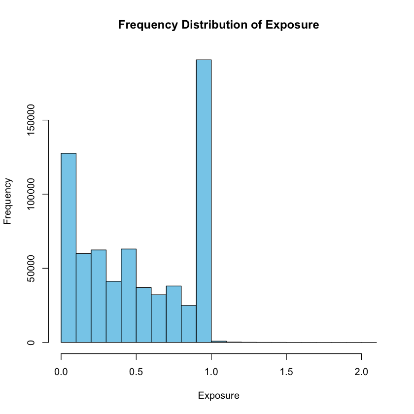
Example 2.20 Frequency Distribution and Histogram: freMTPL2freq dataset
How is the “Exposure” variable distributed in the freMTPL2freq dataset?
To gain insights into the distribution of the “Exposure” variable, we can create a frequency distribution using appropriate bins.
The hist() function in R is a useful tool for generating histograms, allowing us to visualize the frequency of different exposure levels.
Additionally, we can use the table() function to create a frequency table displaying the ranges of data along with their respective counts.
This tabular representation enhances our understanding of the concentration of values and potential outliers within the dataset.
# Load necessary libraries
suppressMessages(library(CASdatasets))

# Load the freMTPL2freq dataset
data("freMTPL2freq")

# Create a histogram for the "Exposure" variable
hist_data <- hist(freMTPL2freq$Exposure, main = "Frequency Distribution of Exposure", xlab = "Exposure", ylab = "Frequency", col = "skyblue")

# Create a frequency table
frequency_table <- table(cut(freMTPL2freq$Exposure, breaks = hist_data$breaks, include.lowest = TRUE, right = TRUE))

# Display the frequency table
frequency_table
  [0,0.1] (0.1,0.2] (0.2,0.3] (0.3,0.4] (0.4,0.5] (0.5,0.6] (0.6,0.7] (0.7,0.8]
   127594     59973     62369     41184     62989     36998     32114     38023
(0.8,0.9]   (0.9,1]   (1,1.1] (1.1,1.2] (1.2,1.3] (1.3,1.4] (1.4,1.5] (1.5,1.6]
    24864    190659       819       202        80        41        40        13
(1.6,1.7] (1.7,1.8] (1.8,1.9]   (1.9,2]   (2,2.1]
       12         4         6         5         2
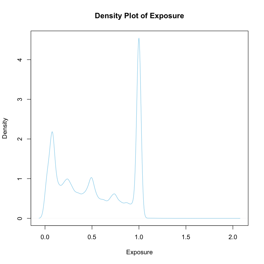
4. Density Plot#
Create a density plot to visualize the distribution of “Exposure.” Unlike a histogram, a density plot provides a smooth, continuous representation of the data distribution. It is especially useful for identifying patterns in the data and understanding the shape of the distribution.
Definition:
Density Plot A density plot is a smoothed representation of the distribution of a quantitative variable. It uses a continuous curve to depict the estimated probability density function. Density plots are advantageous for highlighting subtle features in the data distribution and are particularly useful when dealing with large datasets.
# Create a density plot for the "Exposure" variable
plot(density(freMTPL2freq$Exposure), main = "Density Plot of Exposure", xlab = "Exposure", col = "skyblue")
5. Box Plot#
Generate a box plot to visualize the distribution of “Exposure.” A box plot provides a summary of the data distribution, displaying the median, quartiles, and potential outliers. It offers a concise visual representation of the central tendency and spread of the data.
Definition:
Box Plot A box plot is a visual summary of the distribution of a quantitative variable. It displays the median, quartiles, and potential outliers using a box-and-whisker format. Box plots are effective for identifying the central tendency and spread of the data, making them useful for comparing distributions.
# Create a box plot for the "Exposure" variable
boxplot(freMTPL2freq$Exposure, main = "Box Plot of Exposure", col = "skyblue")
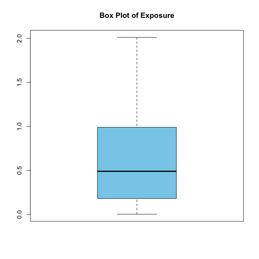
Outliers
In a box plot, outliers are individual data points that significantly differ from the overall pattern of the distribution. These points fall beyond the “whiskers” of the box plot, which are lines extending from the box. Outliers can provide valuable information about unusual or extreme values in the dataset.
Importance of Identifying Outliers:
Identifying outliers is important for several reasons:
Data Quality Assessment: Outliers may indicate errors in data collection or measurement.
Influential Impact: Outliers can disproportionately influence statistical analyses and model outcomes.
Understanding Variability: Outliers offer insights into the variability and potential patterns in the data.
Display on Box Plot:
In a box plot, outliers are typically shown as individual points beyond the “whiskers.” The whiskers represent the range within which most of the data falls, while any points beyond the whiskers are considered potential outliers. The exact definition of outliers and how they are displayed can depend on the method used to calculate them, but commonly, points beyond a certain distance from the quartiles are considered outliers.
Example 2.21 Descriptive statistics for the “Exposure” variable: freMTPL2freq dataset
Upon reviewing the descriptive summary statistics for the “Exposure” variable in the freMTPL2freq dataset using the summary() function, what patterns, central tendencies, and notable characteristics emerge? Analyzing the mean, median, quartiles, and other descriptive measures, what information can be inferred about the distribution of exposure values and their significance within the dataset?
Example 2.22 Excel: Exploring and Visualizing One Quantitative Variable
In Excel, how can we effectively summarize and visualize the ‘Exposure’ variable based on the first 100 observations of the dataset?
Which specific exposure intervals or values are most common within the subset of the first 100 observations, and how do their frequencies differ from the entire dataset?
How does the frequency distribution and visual representation of the ‘Exposure’ variable among the first 100 observations compare to the overall dataset?
Consider using appropriate Excel tools and functions to generate descriptive statistics, frequency distributions, and visualizations to gain insights into the distribution and characteristics of the ‘Exposure’ variable within the selected subset.