8. Unsupervised Machine Learning: K-means Clustering
In this chapter, we will take an in-depth look at k-means clustering and its components. We explain why clustering is important, how to use it, and how to perform it in Python with a real dataset.
8.1. What is clustering and how does it work?
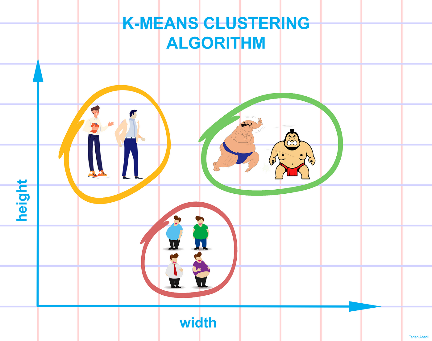
Clustering is a collection of methods for dividing data into groups or clusters. Clusters are roughly described as collections of data objects that are more similar to each other than data objects from other clusters.
There are numerous cases where automatic grouping of data can be very beneficial. Take the case of developing an Internet advertising campaign for a brand new product line that is about to be launched. While we could show a single generic ad to the entire population, a far better approach would be to divide the population into groups of people with common characteristics and interests, and then show individualized ads to each group. K-means is an algorithm that finds these groupings in large data sets where manual searching is impossible.
8.2. How is clustering a problem of unsupervised learning?
Imagine a project where you need to predict whether a loan will be approved or not. We aim to predict the loan status based on the customer’s gender, marital status, income, and other factors. Such challenges are called supervised learning problems when we have a target variable that we need to predict based on a set of predictors or independent variables.
There may be cases where we do not have an outcome variable that we can predict.
Unsupervised learning problems are those where there is no fixed target variable.
In clustering, we do not have a target that we can predict. We examine the data and try to categorize comparable observations into different groups. Consequently, it is a challenge of unsupervised learning. There are only independent variables and no target/dependent variable.
k-means clustering: image from medium
8.3. Applications of Clustering
Customer segmentation is the process of obtaining information about a company’s customer base based on their interactions with the company. In most cases, this interaction is about their purchasing habits and behaviors. Businesses can use to create targeted advertising campaigns.

Recommendation engines The recommendation system is a popular way for offering automatic personalized product, service, and information recommendations.
The recommendation engine, for example, is widely used to recommend products on Amazon, as well as to suggest songs of the same genre on YouTube.
In essence, each cluster will be given to specific preferences based on the preferences of customers in the cluster. Customers would then receive suggestions based on cluster estimates within each cluster.

Medical application In the medical field, clustering has been used in gene expression experiments. The clustering results identify groupings of people who respond to medical treatments differently.
8.4. The K-means Algorithm: An Overview
This section takes you step by step through the traditional form of the k-means algorithm. This section will help you decide if k-means is the best method to solve your clustering problem.
The traditional k-means algorithm consists of only a few steps.
To begin, we randomly select k centroids, where k is the number of clusters you want to use.
Centroids are data points that represent the center of the cluster.
The main component of the algorithm is based on a two-step procedure known as expectation maximization.
The expectation step (E-step): each data point is assigned to the closest centroid.
The maximization step (M-step): Update the centroids (mean) as being the centre of their respective observation.
We repeat these two steps until the centroid positions do not change (or until there is no further change in the clusters)
Note The “E-step” or “expectation step” is so called because it updates our expectation of which cluster each point belongs to.
The “M-step” or “maximization step” is so named because it involves maximizing a fitness function that defines the location of the cluster centers - in this case, this maximization is achieved by simply averaging the data in each cluster.
8.5. K-means clustering in 1 dimension: Explained
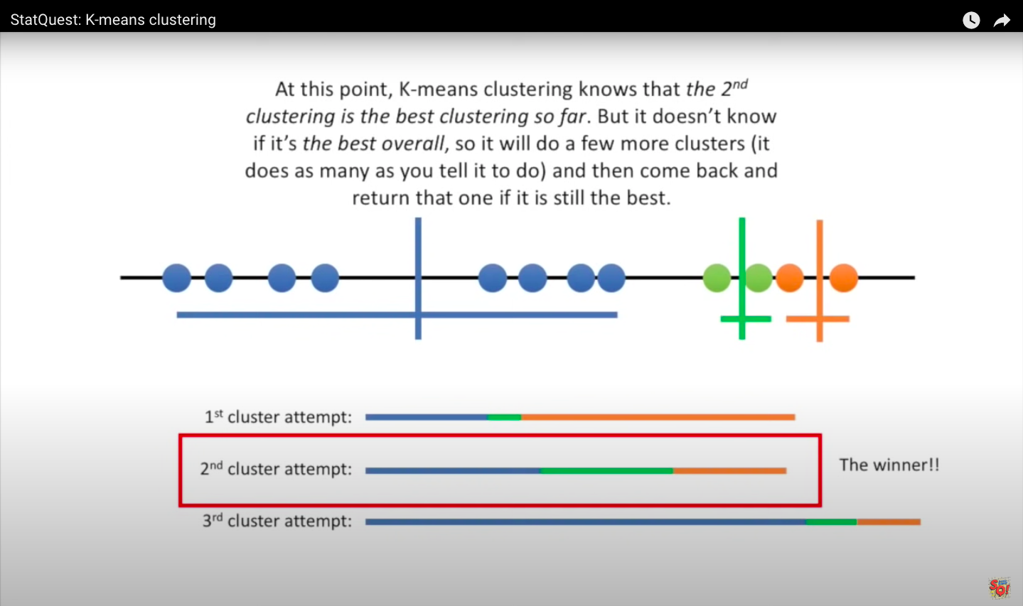
We will learn how to cluster samples that can be put on a line, and the concept can be extended more generally. Imagine that you had some data that you could plot on a line, and you knew that you had to divide it into three clusters. Perhaps they are measurements from three different tumor types or other cell types. In this case, the data yields three relatively obvious clusters, but instead of relying on our eye, we want to see if we can get a computer to identify the same three clusters, using k-means clustering. We start with raw data that we have not yet clustered.
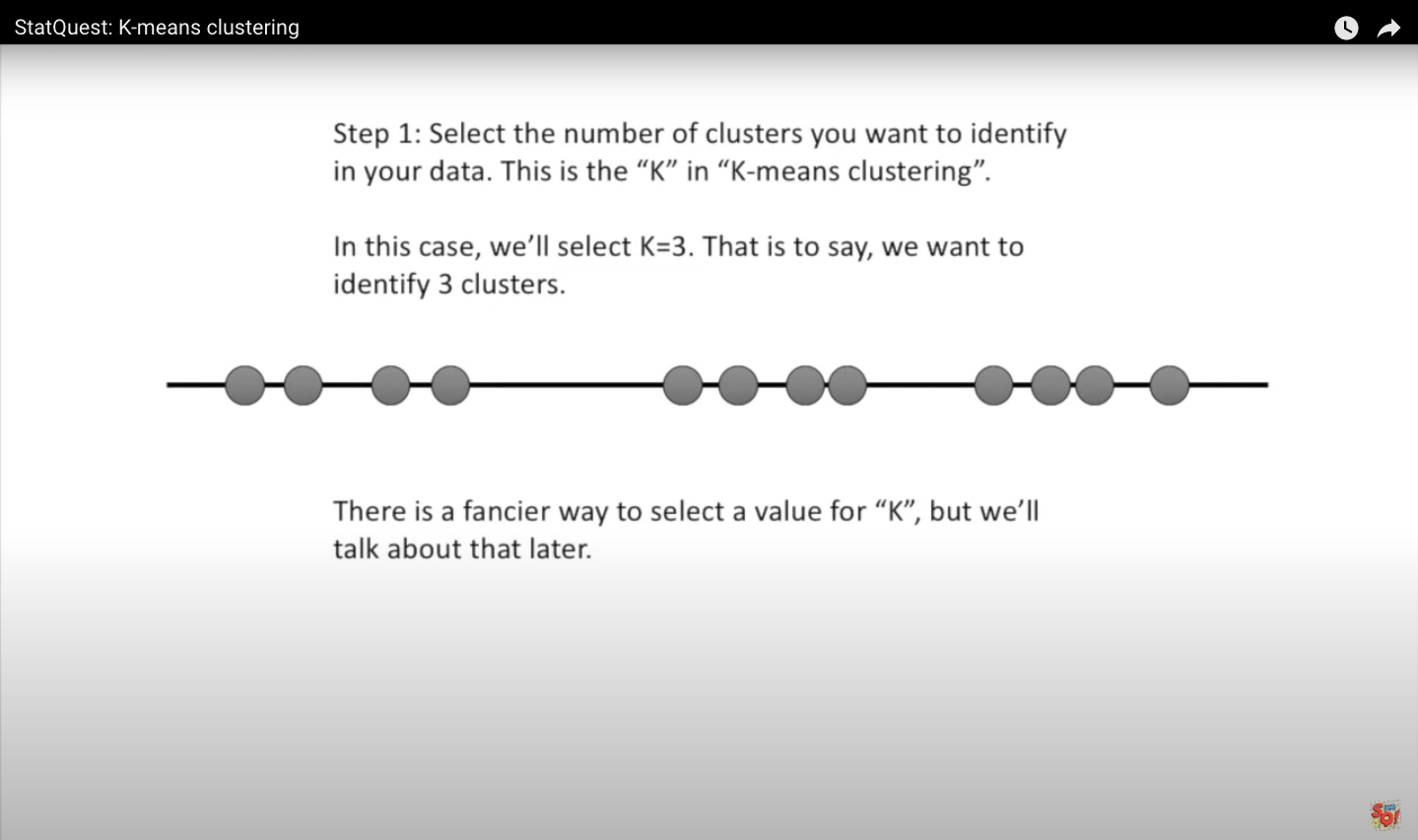
Step one: choose the number of clusters you want to identify in your data - that’s the K in k-means clustering. In this case, we choose K to equal three, meaning we want to identify three clusters. There is a more sophisticated way to select a value for K, but we will get into that later.
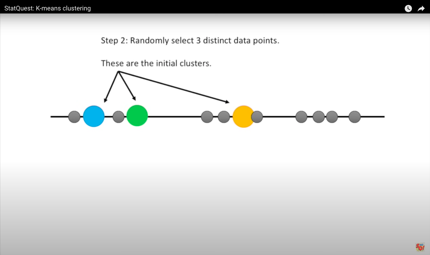
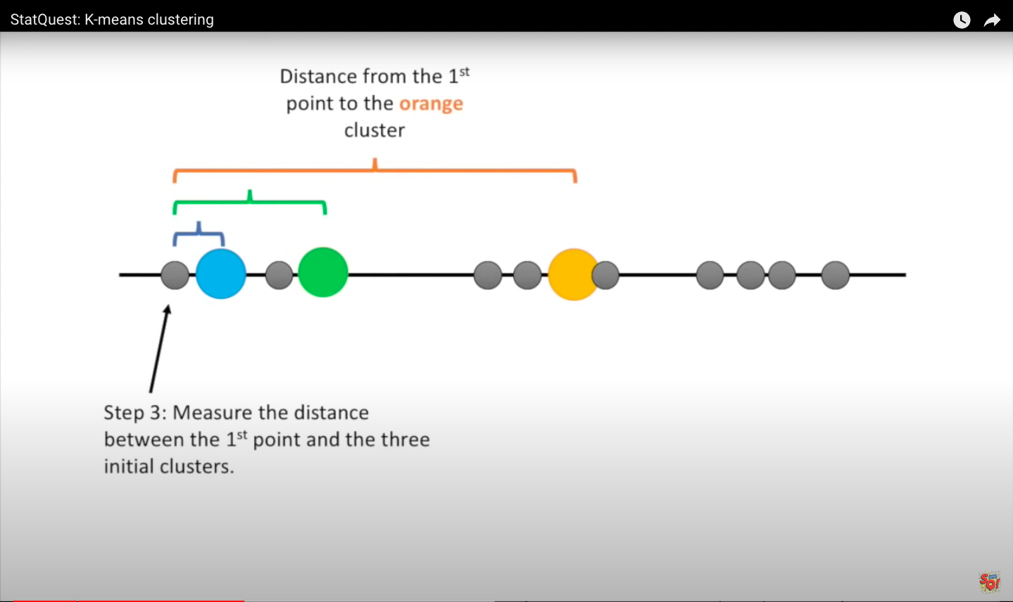
Images below from statquest.
Step 2: Randomly select three unique data points - these are the first clusters.
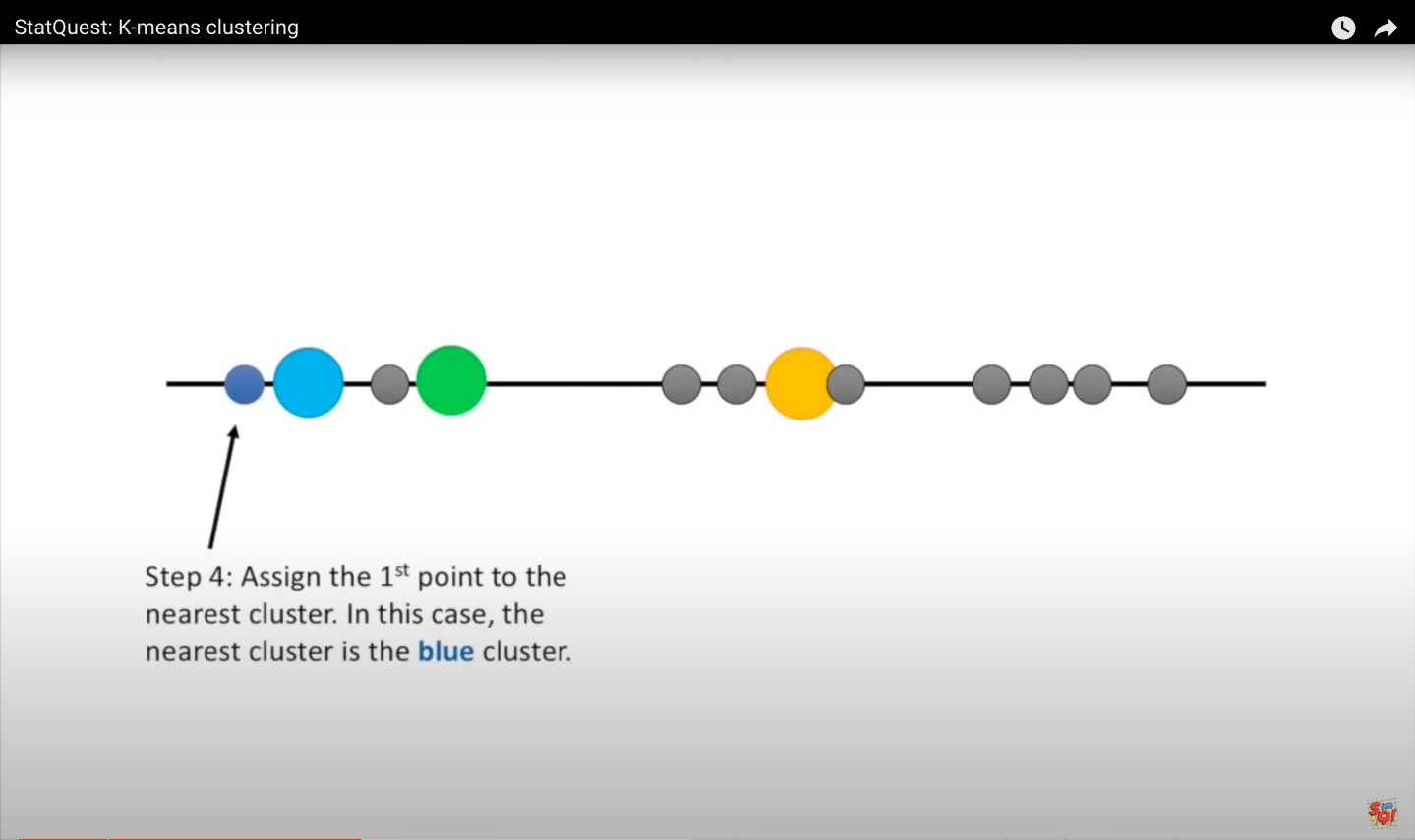
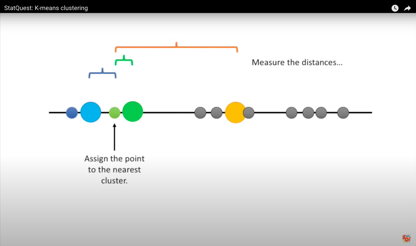
Step 3: Measure the distance between the first point and the three initial clusters this is the distance between the first point and the three clusters.
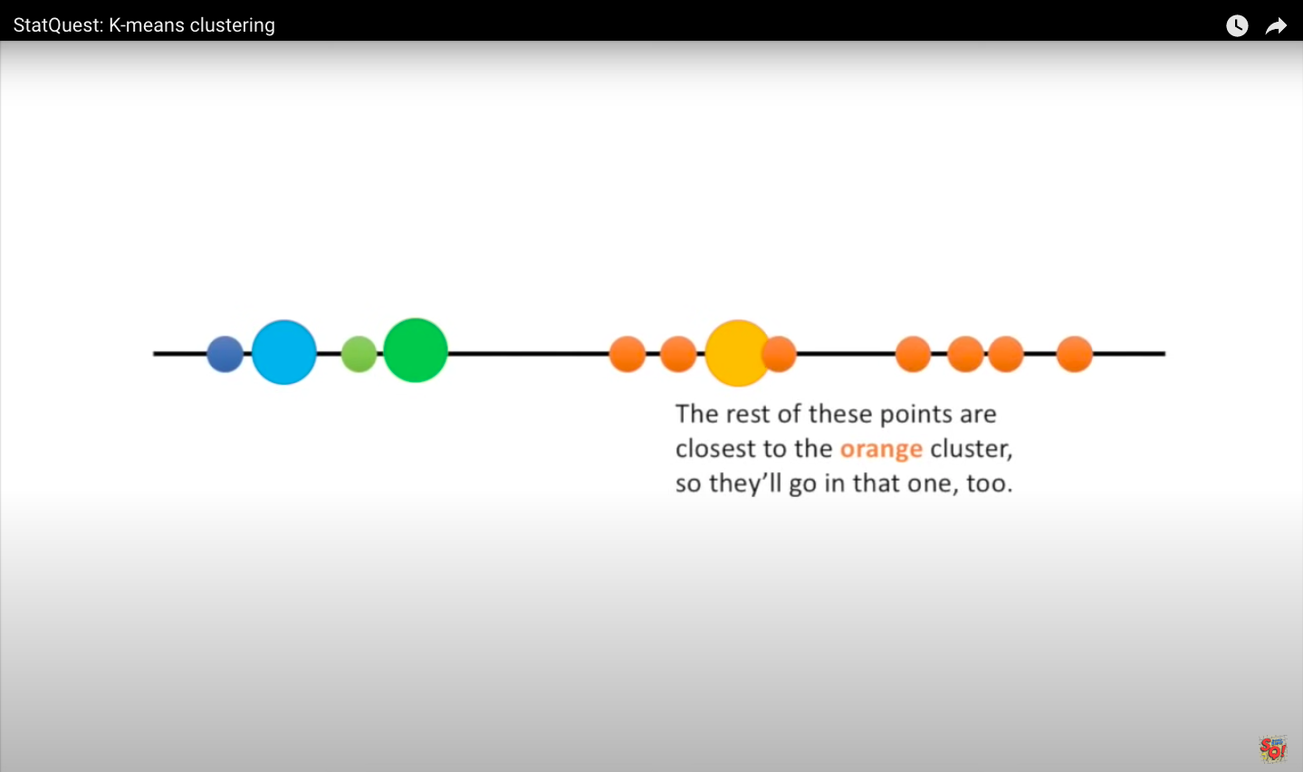
Step 4: Assign the first point to the nearest cluster. In this case, the closest cluster is the blue cluster. Then we do the same for the next point. We measure the distances and then assign the point to the nearest cluster. When all the points are in clusters, we proceed to step 5.
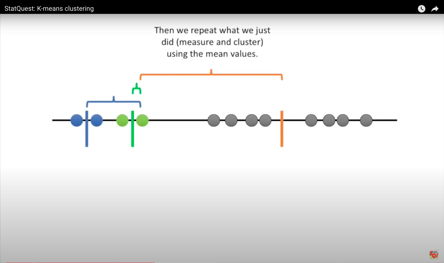
Step 5: We calculate the mean value of each cluster.
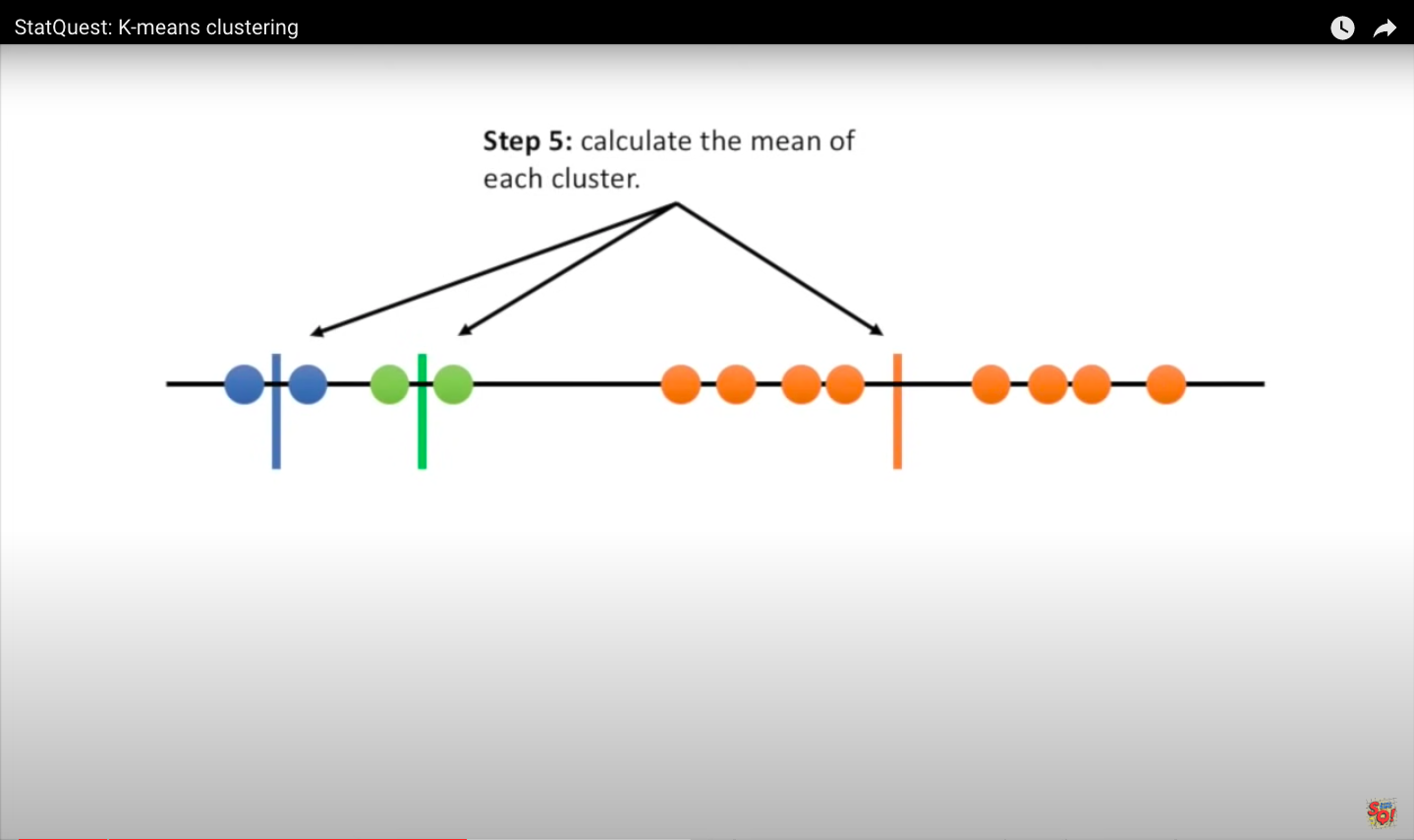
Then we repeat the measurement and clustering based on the mean values. Since the clustering did not change during the last iteration, we are done.
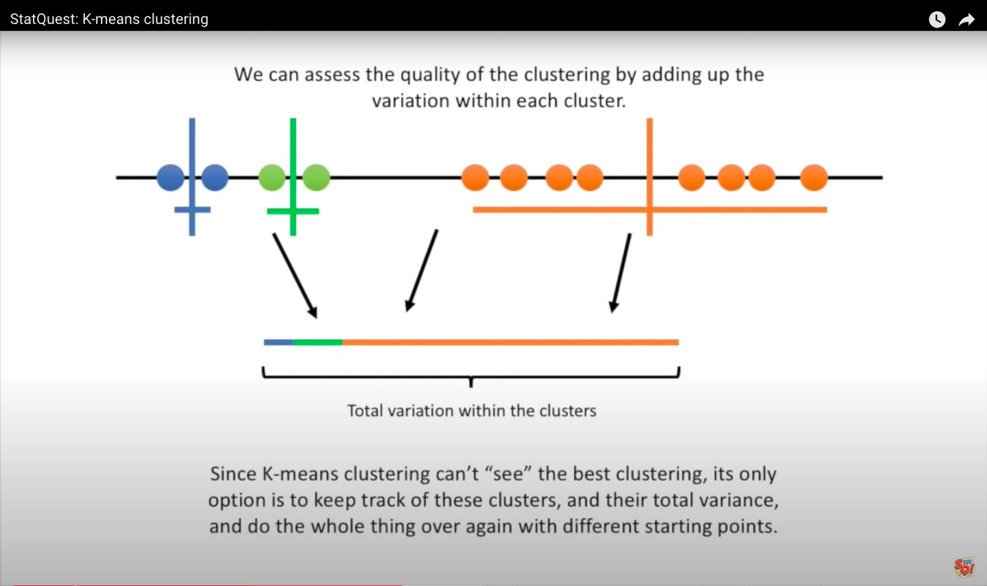
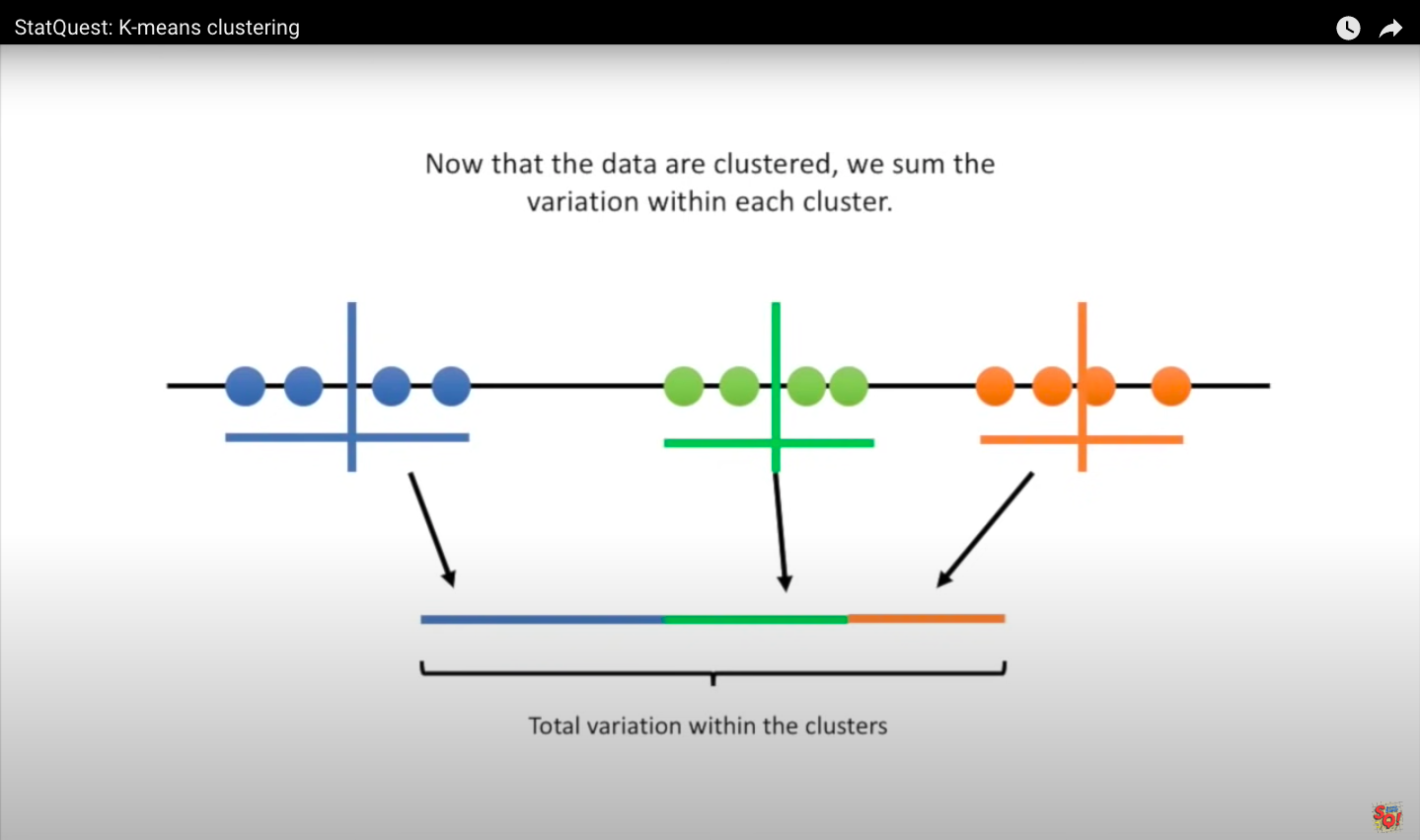
8.5.1. The quality of the cluster assignments
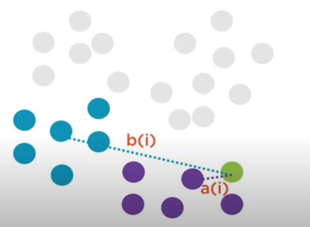
Before going any further, it’s important to define what we mean by a good clustering solution. What do we mean when we say “best potential clustering solution”? Consider the following diagram, which depicts two potential observations assignments to the same centroid.
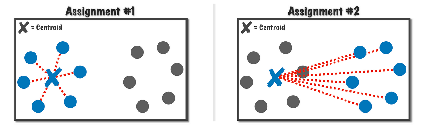
The first assignment is clearly better than the second, but how can we quantify this using the k-means algorithm?
A good clustering solution is the one that minimizes the total sum of these (dotted red) lines, or more formally the sum of squared error (SSE), is the one we are aiming for.
In mathematical language, we want to identify the centroid \(C\) that minimizes: given a cluster of observations \(x_i \in \{x_1, x_2,..., x_m\}\).
Since the centroid is simply the center of its respective observations, we can calculate:
This equation provides us the sum of squared error for a single centroid \(C\), but we really want to minimize the sum of squared errors for all centroids \(c_j \in \{c_1, c_2,..., c_k\}\) for all observations \(x_i \in \{x_1, x_2,..., x_n\}\) (here \(n\) not \(m\)). The objective function of k-means is to minimize the total sum of squared error (SST):
where the points \(x_i^{(j)}\) are assigned to the centriod \(c_j\), the closest centroid .
Note The nondeterministic nature of the k-means algorithm is due to the random initialization stage, which means that cluster assignments will differ if the process is run repeatedly on the same dataset. Researchers frequently execute several initializations of the entire k-means algorithm and pick the cluster assignments from the one with the lowest SSE.
8.6. K-means clustering in Python: a toy example
#!pip install kneed
# Importing Libraries

import matplotlib.pyplot as plt
from kneed import KneeLocator
from sklearn.datasets import make_blobs
from sklearn.cluster import KMeans
from sklearn.metrics import silhouette_score
from sklearn.preprocessing import StandardScaler
from sklearn.preprocessing import MinMaxScaler

import numpy as np

import seaborn as sns
---------------------------------------------------------------------------
ModuleNotFoundError                       Traceback (most recent call last)
/var/folders/kl/h_r05n_j76n32kt0dwy7kynw0000gn/T/ipykernel_5539/1718519535.py in <module>
      2
      3 import matplotlib.pyplot as plt
----> 4 from kneed import KneeLocator
      5 from sklearn.datasets import make_blobs
      6 from sklearn.cluster import KMeans

ModuleNotFoundError: No module named 'kneed'
8.6.1. A simple example
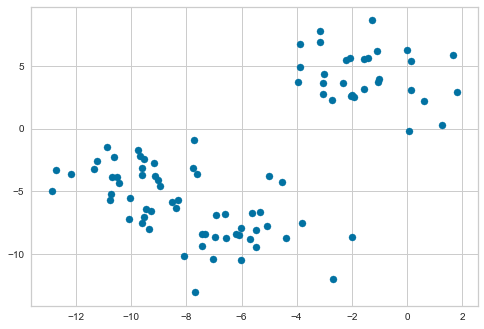
Let us get started by using scikit-learn to generate some random data points. It has a make_blobs() function that generates a number of gaussian clusters. We will create a two-dimensional dataset containing three distinct blobs. We set random_state=1 to ensure that this example will always generate the same points for reproducibility.
To emphasize that this is an unsupervised algorithm, we will leave the labels out of the visualization.
features, true_labels = make_blobs(
    n_samples=90,
    centers=3,
    cluster_std=2,
    random_state=1
)
plt.scatter(features[:, 0], features[:, 1], s=50);
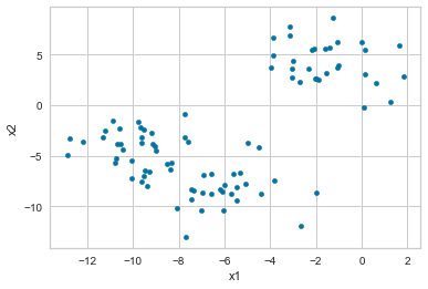
We can also put the features into a pandas DataFrame to make working with it easier. We plot it to see how it appears, color-coding each point according to the cluster from which it was produced.
%matplotlib inline

import pandas as pd

df = pd.DataFrame(features, columns=["x1", "x2"])
df.plot.scatter("x1", "x2")
*c* argument looks like a single numeric RGB or RGBA sequence, which should be avoided as value-mapping will have precedence in case its length matches with *x* & *y*. Please use the *color* keyword-argument or provide a 2D array with a single row if you intend to specify the same RGB or RGBA value for all points.
<AxesSubplot:xlabel='x1', ylabel='x2'>
#plt.scatter(features[:, 0], features[:, 1], s=50, c=true_labels);
Exercise
Machine learning algorithms must take all features into account. This means that all feature values must be scaled to the same scale. Perform feature scaling standardization in the dataset.
Perform exploratory data analysis (EDA) to analyze and explore data sets and summarize key characteristics, using data visualization methods.
df.head()
| x1 | x2 | |
|---|---|---|
| 0 | -2.043231 | 2.631232 |
| 1 | 0.143622 | 5.411479 |
| 2 | -9.020676 | -4.104492 |
| 3 | -8.358716 | -6.350254 |
| 4 | -1.021482 | 3.907749 |
# Make a copy of the original dataset
# df_copy = df.copy()
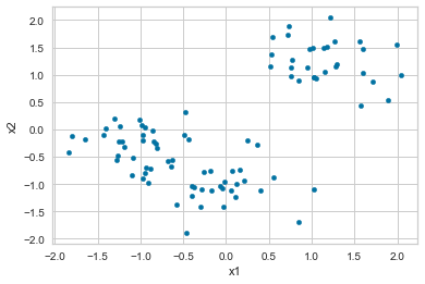
scaler = StandardScaler()

df_scaled = df
features = [['x1','x2']]
for feature in features:
    df_scaled[feature] = scaler.fit_transform(df_scaled[feature])
df_scaled.describe()
| x1 | x2 | |
|---|---|---|
| count | 9.000000e+01 | 9.000000e+01 |
| mean | -5.956655e-16 | 3.256654e-16 |
| std | 1.005602e+00 | 1.005602e+00 |
| min | -1.835782e+00 | -1.890076e+00 |
| 25% | -9.043642e-01 | -8.222624e-01 |
| 50% | -5.623279e-02 | -2.030913e-01 |
| 75% | 8.487898e-01 | 9.694556e-01 |
| max | 2.039518e+00 | 2.043826e+00 |
df_scaled.plot.scatter("x1", "x2")
*c* argument looks like a single numeric RGB or RGBA sequence, which should be avoided as value-mapping will have precedence in case its length matches with *x* & *y*. Please use the *color* keyword-argument or provide a 2D array with a single row if you intend to specify the same RGB or RGBA value for all points.
<AxesSubplot:xlabel='x1', ylabel='x2'>
We can see that two or three distinct clusters. This is a great situation to apply k-means clustering in, and the results will be highly valuable.
To facilitate the analysis of tabular data, we can use Pandas in Python to convert the data into a more computer-friendly form.
Pandas.melt() converts a DataFrame from wide format to long format.
The melt() function is useful to convert a DataFrame to a format where one or more columns are identifier variables, while all other columns considered as measurement variables are subtracted from the row axis, leaving only two non-identifier columns, variable and value.
df_melted = pd.melt(df_scaled[['x1','x2']], var_name = 'features',value_name = 'value')
df_melted.head()
| features | value | |
|---|---|---|
| 0 | x1 | 1.019528 |
| 1 | x1 | 1.595412 |
| 2 | x1 | -0.817907 |
| 3 | x1 | -0.643587 |
| 4 | x1 | 1.288594 |
from plotnine import *
(
    ggplot(df_melted) + aes('value') + geom_histogram(aes(y=after_stat('density')), color = 'lightskyblue', fill = 'lightskyblue', bins = 15)
    + geom_density(aes(y=after_stat('density')), color = 'steelblue')
    + facet_wrap('features')
)
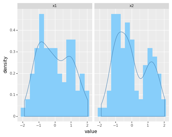
<ggplot: (304892637)>
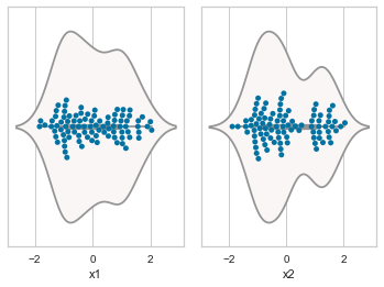
8.6.2. Violin and swarm plots
n = 0
for cols in ['x1' , 'x2']:
    n += 1
    plt.subplot(1 , 2 , n)
    plt.subplots_adjust(hspace = 0.5 , wspace = 0.1)
    sns.violinplot(x = cols, data = df , palette = 'vlag')
    sns.swarmplot(x = cols, data = df)
    #plt.ylabel('Gender' if n == 1 else '')
    #plt.title('Boxplots & Swarmplots' if n == 2 else '')
plt.show()
8.7. Clustering using K- means
The data is now ready for clustering. Before fitting the estimator to the data, you set the algorithm parameters in the KMeans estimator class in scikit-learn. The scikit-learn implementation is adaptable, with various adjustable parameters.
The following are the parameters that were utilized in this example.
init The initialization method is controlled by
init. Setting init to “random” implements the normal version of the k-means algorithm. Setting this to “k-means++” uses a more advanced technique to speed up convergence, which you’ll learn about later.n_clusters For the clustering step,
n_clusterssets k. For k-means, this is the most essential parameter.n_init The number of initializations to do is specified by
n_init. Because two runs can converge on different cluster allocations, this is critical. The scikit-learn algorithm defaults to running 10 k-means runs and returning the results of the one with the lowest SSE.max_iter For each initialization of the k-means algorithm,
max_iterspecifies the maximum number of iterations.
First we create a new instance of the KMeans class with the following parameters. Then passing the data, we want to fit to the fit() method, the algorithm will actually run. You can use nested lists, numpy arrays (as long as they have the shape (nsample,nfeatures) or Pandas DataFrames.
kmeans = KMeans(
                init="random",
                n_clusters=3,
                n_init=10,
                max_iter=300,
                random_state=88)

kmeans.fit(df_scaled)
KMeans(init='random', n_clusters=3, random_state=88)
Now that we have calculated the cluster centres, we can use the cluster_centers_ data attribute of our model to see which clusters it has chosen.
centroids = kmeans.cluster_centers_
print('Final centroids:\n', centroids)
Final centroids:
 [[ 0.0235795  -1.04710637]
 [-1.03913289 -0.30604602]
 [ 1.15724837  1.25434435]]
The sum of the squared distances of data points to their closest cluster center is another data characteristic of the model, which can be obtained by using the attribute inertia_. This property is used by the algorithm to determine whether it has converged. In general, a lower number indicates a better match.
print('The sum of the squared distrance:\n', kmeans.inertia_)
The sum of the squared distrance:
 24.20252704670535
The cluster assignments are stored as a one-dimensional NumPy array in kmeans.labels_ or using the function predict.
pred = kmeans.predict(df_scaled)
print('predicted labels:\n',pred[0:5])
predicted labels:
 [2 2 1 1 2]
#labels = kmeans.labels_
print('predicted labels:\n',kmeans.labels_[0:5])
predicted labels:
 [2 2 1 1 2]
df_scaled['cluster'] = pred
print('the number of samples in each cluster:\n', df_scaled['cluster'].value_counts())
the number of samples in each cluster:
 1    34
2    30
0    26
Name: cluster, dtype: int64
df_scaled.drop('cluster',axis='columns', inplace=True)
8.8. Choosing the appropriate number of clusters: Elbow Method
The elbow method is a widely used approach to determine the proper number of clusters.
To perform the elbow method, we run many k-means by increasing k at each iteration and plot the SST (also known as intetia) as a function of the number of clusters. We will observe that it continues to decrease as we increase k. The distance between each point and its nearest centroid will decrease as more centroids are added.
The elbow point is a position on the SSE curve when it begins to bend. This point is believed to be a good compromise between error and cluster count. From the figure below, the elbow is positioned at k=3 in our example.
# fitting multiple k-means algorithms and storing the values in an empty list
SSE = []
for cluster in range(1,20):
    kmeans = KMeans(n_clusters = cluster)
    kmeans.fit(df_scaled)
    SSE.append(kmeans.inertia_)

# converting the results into a dataframe and plotting them
frame = pd.DataFrame({'Cluster':range(1,20), 'SSE':SSE})
plt.figure(figsize=(12,6))
plt.plot(frame['Cluster'], frame['SSE'], marker='o')
plt.xlabel('Number of clusters')
plt.ylabel('Inertia')
Text(0, 0.5, 'Inertia')
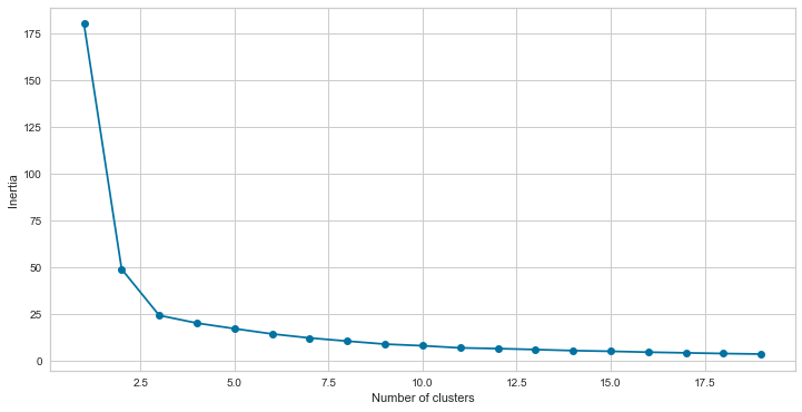
From the figure, the elbow is positioned at k=3 in our example where the curve starts to bend.
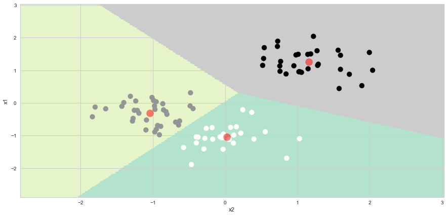
8.9. Ploting the cluster boundary and clusters
To plot the cluster boundary and the clusters, we run the Code below, which is modified from https://www.kaggle.com/code/irfanasrullah/customer-segmentation-analysis/notebook
# Using n_clusters = 3 as suggested by the elbow method

kmeans = KMeans(
                init="random",
                n_clusters=3,
                n_init=10,
                max_iter=300,
                random_state=88)

kmeans.fit(df_scaled)
KMeans(init='random', n_clusters=3, random_state=88)
X1 = df_scaled[['x1','x2']].values

h = 0.02
x_min, x_max = X1[:, 0].min() - 1, X1[:, 0].max() + 1
y_min, y_max = X1[:, 1].min() - 1, X1[:, 1].max() + 1
xx, yy = np.meshgrid(np.arange(x_min, x_max, h), np.arange(y_min, y_max, h))
##Z = kmeans.predict(np.c_[xx.ravel(), yy.ravel()])

meshed_points = pd.DataFrame(np.c_[xx.ravel(), yy.ravel()], columns = ['x1','x2'])
Z = kmeans.predict(meshed_points)
plt.figure(1 , figsize = (15 , 7) )
plt.clf()
Z = Z.reshape(xx.shape)
plt.imshow(Z , interpolation='nearest',
extent=(xx.min(), xx.max(), yy.min(), yy.max()),
cmap = plt.cm.Pastel2, aspect = 'auto', origin='lower')
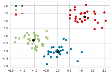
plt.scatter( x = 'x1' ,y = 'x2' , data = df_scaled , c = pred , s = 100 )
plt.scatter(x = centroids[: , 0] , y = centroids[: , 1] , s = 200 , c = 'red' , alpha = 0.5)
plt.ylabel('x1') , plt.xlabel('x2')
plt.show()
#np.c_[xx.ravel(), yy.ravel()]
#np.c_[xx.ravel(), yy.ravel()][:,0]
#pd.DataFrame(np.c_[xx.ravel(), yy.ravel()], columns = ['x1','x2'])
Alternatively, one can run the following Python code: (modified from https://www.askpython.com/python/examples/plot-k-means-clusters-python)
#Getting the Centroids
centroids = kmeans.cluster_centers_
u_labels = np.unique(kmeans.predict(df_scaled.iloc[:,0:2]))
#plotting the results:
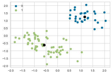
for i in u_labels:
plt.scatter(df_scaled.iloc[pred == i , 0] , df_scaled.iloc[pred == i , 1] , label = i)
plt.scatter(centroids[:,0] , centroids[:,1] , s = 80, color = 'k')
plt.legend()
plt.show()
#u_labels
#df_scaled.iloc[pred == 0 , 0]
#pred == 0
8.10. Choosing the appropriate number of clusters: Silhouette Method
In K-Means clustering, the number of clusters (k) is the most crucial hyperparameter. If we already know how many clusters we want to group the data into, tuning the value of k is unnecessary.
The silhouette method is also used to determine the optimal number of clusters, as well as to interpret and validate consistency within data clusters.
The silhouette method calculates each point’s silhouette coefficients, which measure how well a data point fits into its assigned cluster based on two factors:
How close the data point is to other points in the cluster.
How far the data point is from points in other clusters.
This method also displays a clear graphical depiction of how effectively each object has been classified
The silhouette value is a measure of how similar an object is to its own cluster (cohesion) compared to other clusters (separation).
8.10.1. Steps to find the silhouette score
To find the silhouette coefficient of each point, follow these steps:
For data point \({\displaystyle i}\) in the cluster \({\displaystyle C_{I}}\), we calculate the mean distance between \({\displaystyle i}\) and all other data points in the same cluster
This \({\displaystyle a(i)}\) measures how well \({\displaystyle i}\) is assigned to its cluster (the smaller the value, the better the assignment).
We then calculate the mean dissimilarity of point \({\displaystyle i}\) to its neighboring cluster.
We now define a silhouette coefficient of one data point \({\displaystyle i}\)
To determine the silhouette score, compute silhouette coefficients for each point and average them over all samples.
The silhouette value varies from [1, -1], with a high value indicating that the object is well matched to its own cluster but poorly matched to nearby clusters.
The clustering setup is useful if the majority of the objects have a high value.
The clustering setup may have too many or too few clusters if many points have a low (the sample is very close to the neighboring clusters) or negative value (the sample is assigned to the wrong clusters).
8.10.1.1. Silhouette Visualizer
The Silhouette Visualizer visualizes which clusters are dense and which are not by displaying the silhouette coefficient for each sample on a per-cluster basis. This is especially useful for determining cluster imbalance or comparing different visualizers to determine a K value.
We will import the Yellowbrik library for silhoutte analsis, an extension to the Scikit-Learn API that simplifies model selection and hyperparameter tuning.
For more details about the library, please refer to https://www.scikit-yb.org/en/latest/.
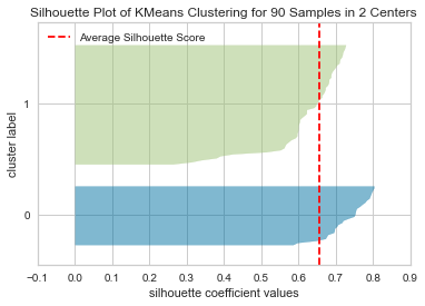
The following results compares different visualizers with n_cluster = 2, 3 and 4.
from yellowbrick.cluster import SilhouetteVisualizer
# Instantiate the clustering model and visualizer

kmeans = KMeans(
                init="random",
                n_clusters=2,
                n_init=10,
                max_iter=300,
                random_state=88)

visualizer = SilhouetteVisualizer(kmeans, colors='yellowbrick')
# Fit the data to the visualizer
visualizer.fit(df_scaled)
# Compute silhouette_score
print('The silhouette score:', visualizer.silhouette_score_)
# Finalize and render the figure
visualizer.show()


# For scatter plot
kmeans.fit(df_scaled)
pred2 = kmeans.predict(df_scaled)
#Getting the Centroids
centroids = kmeans.cluster_centers_
u_labels = np.unique(kmeans.predict(df_scaled.iloc[:,0:2]))

#plotting the results:
for i in u_labels:
    plt.scatter(df_scaled.iloc[pred2 == i , 0] , df_scaled.iloc[pred2 == i , 1] , label = i)

plt.scatter(centroids[:,0] , centroids[:,1] , s = 80, color = 'k')
plt.legend()
plt.show()
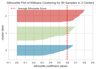
The silhouette score: 0.6558340654970938
# Instantiate the clustering model and visualizer

kmeans = KMeans(
                init="random",
                n_clusters=3,
                n_init=10,
                max_iter=300,
                random_state=88)

visualizer = SilhouetteVisualizer(kmeans, colors='yellowbrick')
# Fit the data to the visualizer
visualizer.fit(df_scaled)
# Compute silhouette_score
print('The silhouette score:', visualizer.silhouette_score_)
# Finalize and render the figure
visualizer.show()


# For scatter plot
kmeans.fit(df_scaled)
pred3 = kmeans.predict(df_scaled)
#Getting the Centroids
centroids = kmeans.cluster_centers_
u_labels = np.unique(kmeans.predict(df_scaled.iloc[:,0:2]))

#plotting the results:
for i in u_labels:
    plt.scatter(df_scaled.iloc[pred3 == i , 0] , df_scaled.iloc[pred3 == i , 1] , label = i)

plt.scatter(centroids[:,0] , centroids[:,1] , s = 80, color = 'k')
plt.legend()
plt.show()
The silhouette score: 0.5965646018263415

# Instantiate the clustering model and visualizer

kmeans = KMeans(
                init="random",
                n_clusters=4,
                n_init=10,
                max_iter=300,
                random_state=88)


visualizer = SilhouetteVisualizer(kmeans, colors='yellowbrick')
# Fit the data to the visualizer
visualizer.fit(df_scaled)
# Compute silhouette_score
print('The silhouette score:', visualizer.silhouette_score_)
# Finalize and render the figure
visualizer.show()


# For scatter plot
kmeans.fit(df_scaled)
pred4 = kmeans.predict(df_scaled)

#Getting the Centroids
centroids = kmeans.cluster_centers_
u_labels = np.unique(kmeans.predict(df_scaled.iloc[:,0:2]))

#plotting the results:
for i in u_labels:
    plt.scatter(df_scaled.iloc[pred4 == i , 0] , df_scaled.iloc[pred4 == i , 1] , label = i)

plt.scatter(centroids[:,0] , centroids[:,1] , s = 80, color = 'k')
plt.legend()
plt.show()
The silhouette score: 0.47977223451628676
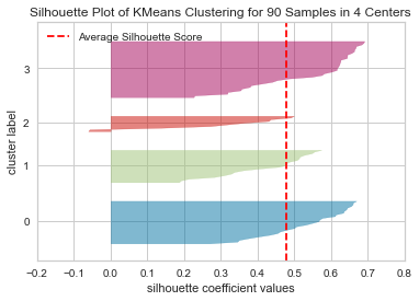
Based on the above results, we observe the following:
At n_clusters=4, the silhouette plot shows that the n_cluster value of 4 is a poor choice because most points in the cluster with cluster_label=2 have below average silhouette values.
At n_clusters=2, the thickness of the silhouette graph for the cluster with cluster_label=1 is larger due to the grouping of the 2 sub-clusters into one large cluster. Moreover, n_clusters=2 has the best average silhouette score of around 0.65, and all clusters are above the average, indicating that it is a good choice.
For n_clusters=3, all plots are more or less similar in thickness and therefore similar in size, which can be considered the one of the optimal values.
Silhouette analysis is more inconclusive in deciding between 2 and 3.
The bottom line is that good n clusters will have a silhouette average score far above 0.5, and all of the clusters will have a score higher than the average.
8.10.2. Evaluating Clustering Performance Using Advanced Techniques: Adjusted Rand Index
Without the use of ground truth labels, the elbow technique and silhouette coefficient evaluate clustering performance.
Ground truth labels divide data points into categories based on a human’s or an algorithm’s classification. When used without context, these measures do their best to imply the correct number of clusters, but they can be misleading.
Note that datasets with ground truth labels are uncommon in practice.
8.10.2.1. Adjusted Rand Index
Because the ground truth labels are known, a clustering metric that considers labels in its evaluation can be used. The scikit-learn version of a standard metric known as the adjusted rand index (ARI) can be used.
The Rand Index computes a similarity measure between two clusterings by evaluating all pairs of samples and counting pairs that are assigned in the same or different clusters in the predicted and true clusterings,
The Rand index has been adjusted to account for chance. For more information, please refer to https://towardsdatascience.com/performance-metrics-in-machine-learning-part-3-clustering-d69550662dc6.
The output values of the ARI vary from -1 to 1. A score around 0 denotes random assignments, whereas a score near 1 denotes precisely identified clusters.
from sklearn.metrics import adjusted_rand_score
Compare the clustering results with n_clusters= 2 and 3 using ARI as the performance metric.
print('ARI with n_clusters=2:',adjusted_rand_score(true_labels, pred2))
print('ARI with n_clusters=3:',adjusted_rand_score(true_labels, pred3))
ARI with n_clusters=2: 0.5658536585365853
ARI with n_clusters=3: 0.8164434485919437
The silhouette coefficient was misleading, as evidenced by the above output. In comparison to k-means, using 3 clusters is the better solution for the dataset.
The quality of clustering algorithms can also be assessed using a variety of measures. See the following link for more details: https://scikit-learn.org/stable/modules/model_evaluation.html
Final Remarks: Challenges with the K-Means Clustering Algorithm
One of the most common challenges when working with K-Means is that the size of the clusters varies. See https://www.analyticsvidhya.com/blog/2019/08/comprehensive-guide-k-means-clustering/.
Another challenge with K-Means is that the densities of the original points are different. Let us assume these are the original points:
One of the solutions is to use a higher number of clusters. So, in all the above scenarios, instead of using 3 clusters, we can use a larger number. Perhaps setting k=10 will lead to more meaningful clusters.
centroids
array([[ 0.0235795 , -1.04710637],
       [ 0.90891951,  1.33856737],
       [ 1.65390611,  1.08589831],
       [-1.03913289, -0.30604602]])
pred = kmeans.predict(df_scaled)
df_scaled['cluster'] = pred
print('the number of samples in each cluster:\n', df_scaled['cluster'].value_counts())
the number of samples in each cluster:
 3    34
0    26
1    20
2    10
Name: cluster, dtype: int64
df_scaled.drop('cluster',axis='columns', inplace=True)
visualizer.silhouette_score_
0.47977223451628676
#silhouette_score(X, cluster_labels)
silhouette_score(df_scaled, kmeans.labels_)
0.47977223451628676
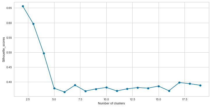
# fitting multiple k-means algorithms and storing the values in an empty list
silhouette_scores = []
for cluster in range(2,20):
    kmeans = KMeans(n_clusters = cluster)
    kmeans.fit(df_scaled)
    silhouette_scores.append(silhouette_score(df_scaled, kmeans.labels_)

)

# converting the results into a dataframe and plotting them
frame = pd.DataFrame({'Cluster':range(2,20), 'Silhouette_scores':silhouette_scores})
plt.figure(figsize=(12,6))
plt.plot(frame['Cluster'], frame['Silhouette_scores'], marker='o')
plt.xlabel('Number of clusters')
plt.ylabel('Silhouette_scores')
Text(0, 0.5, 'Silhouette_scores')
8.11. Customer segmentation
Customer segmentation is the process of categorizing your customers based on a variety of factors. These can be personal information,
buying habits,
demographics and
so on.
The goal of customer segmentation is to gain a better understanding of each group so you can market and promote your brand more effectively.
To understand your consumer persona, you may need to use a technique to achieve your goals. Customer segmentation can be achieved in a number of ways. One is to develop a set of machine learning algorithms. In the context of customer segmentation, this article focuses on the differences between
the kmeans and
knn algorithms.
Customer Segmentation: image from segmentify

8.11.1. Mall Customer Data
Mall Customer Segmentation Data is a dataset from Kaggle that contains the following information:
individual unique customer IDs,
a categorical variable in the form of gender, and
three columns of age, annual income, and spending level.
These numeric variables are our main targets for identifying patterns in customer buying and spending behaviour.
The data can be downloaded from https://www.kaggle.com/datasets/vjchoudhary7/customer-segmentation-tutorial-in-python
# Importing Libraries
import numpy as np
import pandas as pd
import matplotlib.pyplot as plt
%matplotlib inline

from sklearn.cluster import KMeans
from sklearn.metrics import silhouette_score
from sklearn.preprocessing import StandardScaler

import seaborn as sns
from plotnine import *
url = 'https://raw.githubusercontent.com/pairote-sat/SCMA248/main/Data/Mall_Customers.csv'

df = pd.read_csv(url)
df.head()
| CustomerID | Gender | Age | Annual Income (k$) | Spending Score (1-100) | |
|---|---|---|---|---|---|
| 0 | 1 | Male | 19 | 15 | 39 |
| 1 | 2 | Male | 21 | 15 | 81 |
| 2 | 3 | Female | 20 | 16 | 6 |
| 3 | 4 | Female | 23 | 16 | 77 |
| 4 | 5 | Female | 31 | 17 | 40 |
The dataset contains 200 observations and 5 variables. However, below is a description of each variable:
CustomerID = Unique ID, assigned to the customer.
Gender = Gender of the customer
Age = Age of the customer
Annual Income = (k$) annual income of the customer
Spending Score = (1-100) score assigned by the mall based on customer behavior and spending type
8.11.2. Exploratory Data Analysis
Exercise
Perform exploratory data analysis to understand the data set before modeling it, which includes:
Observe the data set (e.g., the size of the data set, including the number of rows and columns),
Find any missing values,
Categorize the values to determine which statistical and visualization methods can work with your data set,
Find the shape of your data set, etc.
Perform feature scaling standardization in the data set when preprocessing the data for the K-Means algorithm.
Implement the K-Means algorithm on the annual income and spending score variables.
Determine the optimal number of K based on the elbow method or the silhouette method.
Plot the cluster boundary and clusters.
Based on the optimal value of K, create a summary by averaging the age, annual income, and spending score for each cluster. Explain the main characteristics of each cluster.
(Optional) Implement the K-Means algorithm on the variables annual income, expenditure score, and age. Determine the optimal number of K and visualize the results (by creating a 3D plot).
df.describe()
| CustomerID | Age | Annual Income (k$) | Spending Score (1-100) | |
|---|---|---|---|---|
| count | 200.000000 | 200.000000 | 200.000000 | 200.000000 |
| mean | 100.500000 | 38.850000 | 60.560000 | 50.200000 |
| std | 57.879185 | 13.969007 | 26.264721 | 25.823522 |
| min | 1.000000 | 18.000000 | 15.000000 | 1.000000 |
| 25% | 50.750000 | 28.750000 | 41.500000 | 34.750000 |
| 50% | 100.500000 | 36.000000 | 61.500000 | 50.000000 |
| 75% | 150.250000 | 49.000000 | 78.000000 | 73.000000 |
| max | 200.000000 | 70.000000 | 137.000000 | 99.000000 |
df.dtypes
CustomerID                 int64
Gender                    object
Age                        int64
Annual Income (k$)         int64
Spending Score (1-100)     int64
dtype: object
df.isnull().sum()
CustomerID                0
Gender                    0
Age                       0
Annual Income (k$)        0
Spending Score (1-100)    0
dtype: int64
(
    ggplot(df) +
    aes('Age') +
    geom_histogram(aes(y=after_stat('density')), binwidth = 1, color = 'black') +
    geom_density(aes(y=after_stat('density')),color='blue')
)
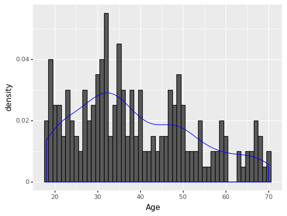
<ggplot: (306017193)>
df_melted = pd.melt(df[['Age','Annual Income (k$)','Spending Score (1-100)']], var_name = 'features',value_name = 'value')
df_melted
| features | value | |
|---|---|---|
| 0 | Age | 19 |
| 1 | Age | 21 |
| 2 | Age | 20 |
| 3 | Age | 23 |
| 4 | Age | 31 |
| ... | ... | ... |
| 595 | Spending Score (1-100) | 79 |
| 596 | Spending Score (1-100) | 28 |
| 597 | Spending Score (1-100) | 74 |
| 598 | Spending Score (1-100) | 18 |
| 599 | Spending Score (1-100) | 83 |
600 rows × 2 columns
(
    ggplot(df_melted) + aes('value') + geom_histogram(aes(y=after_stat('density')), color = 'lightskyblue', fill = 'lightskyblue', bins = 15)
    + geom_density(aes(y=after_stat('density')), color = 'steelblue')
    + facet_wrap('features')
)
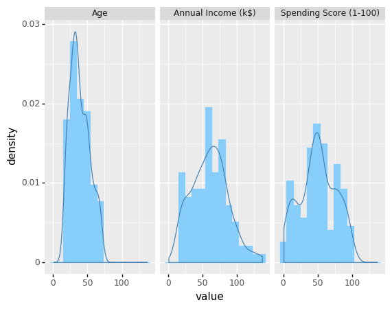
<ggplot: (305720949)>
# Make a copy of the original dataset
df_model = df.copy()

# Data scaling

from sklearn.preprocessing import StandardScaler

scaler = StandardScaler()

df_scaled = df_model
features = [['Age','Annual Income (k$)','Spending Score (1-100)']]
for feature in features:
    df_scaled[feature] = scaler.fit_transform(df_scaled[feature])
df_scaled
| CustomerID | Gender | Age | Annual Income (k$) | Spending Score (1-100) | |
|---|---|---|---|---|---|
| 0 | 1 | Male | -1.424569 | -1.738999 | -0.434801 |
| 1 | 2 | Male | -1.281035 | -1.738999 | 1.195704 |
| 2 | 3 | Female | -1.352802 | -1.700830 | -1.715913 |
| 3 | 4 | Female | -1.137502 | -1.700830 | 1.040418 |
| 4 | 5 | Female | -0.563369 | -1.662660 | -0.395980 |
| ... | ... | ... | ... | ... | ... |
| 195 | 196 | Female | -0.276302 | 2.268791 | 1.118061 |
| 196 | 197 | Female | 0.441365 | 2.497807 | -0.861839 |
| 197 | 198 | Male | -0.491602 | 2.497807 | 0.923953 |
| 198 | 199 | Male | -0.491602 | 2.917671 | -1.250054 |
| 199 | 200 | Male | -0.635135 | 2.917671 | 1.273347 |
200 rows × 5 columns
8.11.3. Clustering based on two features: annual income and spending score
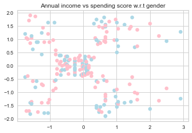
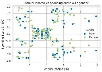
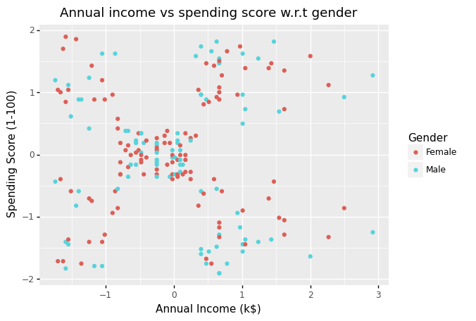
The figure below do appear to be some patterns in the data.
#df_scaled['Gender'].tolist()
#df_scaled.plot.scatter("Annual Income (k$)","Spending Score (1-100)", c = df_scaled['Gender'])

fig, ax = plt.subplots()

colors = {'Male':'lightblue', 'Female':'pink'}

ax.scatter(df_scaled['Annual Income (k$)'], df_scaled['Spending Score (1-100)'], c=df['Gender'].map(colors))

plt.title('Annual income vs spending score w.r.t gender')

plt.show()
sns.scatterplot('Annual Income (k$)', 'Spending Score (1-100)', data=df_scaled, hue='Gender').set(title='Annual income vs spending score w.r.t gender')
/Users/Kaemyuijang/opt/anaconda3/lib/python3.7/site-packages/seaborn/_decorators.py:43: FutureWarning: Pass the following variables as keyword args: x, y. From version 0.12, the only valid positional argument will be `data`, and passing other arguments without an explicit keyword will result in an error or misinterpretation.
[Text(0.5, 1.0, 'Annual income vs spending score w.r.t gender')]
(
    ggplot(df_scaled)
    + aes(x = 'Annual Income (k$)', y = 'Spending Score (1-100)', color = 'Gender')
    + geom_point()
    + labs(title = 'Annual income vs spending score w.r.t gender')
)
<ggplot: (304898945)>
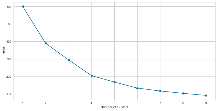
8.11.3.1. Choosing the appropriate number of clusters: Elbow Method
# Taking the annual income and spending score
features = ['Annual Income (k$)','Spending Score (1-100)']
model1 = df_scaled[features]


# fitting multiple k-means algorithms and storing the values in an empty list

SSE = []
for cluster in range(1,10):
    kmeans = KMeans(n_clusters = cluster)
    kmeans.fit(model1)
    SSE.append(kmeans.inertia_)

# converting the results into a dataframe and plotting them
frame = pd.DataFrame({'Cluster':range(1,10), 'SSE':SSE})
plt.figure(figsize=(12,6))
plt.plot(frame['Cluster'], frame['SSE'], marker='o')
plt.xlabel('Number of clusters')
plt.ylabel('Inertia')
Text(0, 0.5, 'Inertia')
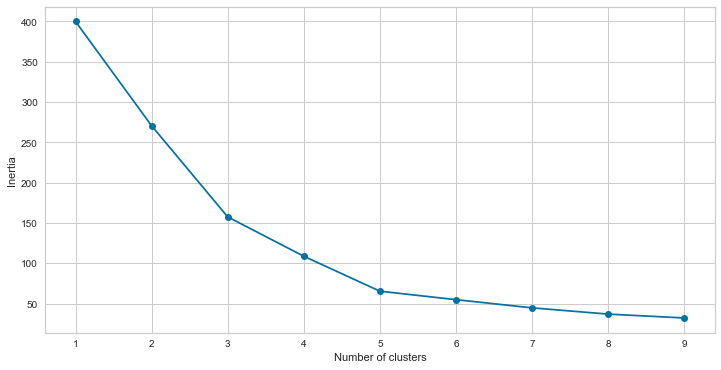
The best number of clusters for our data is clearly 5, as the curve slope is not severe enough after that.
8.11.3.2. Choosing the appropriate number of clusters: Silhouette Method
The silhouette method calculates each point’s silhouette coefficients, which measure how well a data point fits into its assigned cluster based on two factors:
How close the data point is to other points in the cluster.
How far the data point is from points in other clusters.
from yellowbrick.cluster import SilhouetteVisualizer
# Instantiate the clustering model and visualizer

kmeans = KMeans(
                init="random",
                n_clusters=5,
                n_init=10,
                max_iter=300,
                random_state=88)

visualizer = SilhouetteVisualizer(kmeans, colors='yellowbrick')
# Fit the data to the visualizer
visualizer.fit(model1)
# Compute silhouette_score
print('The silhouette score:', visualizer.silhouette_score_)
# Finalize and render the figure
visualizer.show()


# For scatter plot
kmeans.fit(model1)
pred1 = kmeans.predict(model1)
#Getting the Centroids
centroids = kmeans.cluster_centers_
u_labels = np.unique(kmeans.predict(model1))

#plotting the results:
for i in u_labels:
    plt.scatter(model1.iloc[pred1 == i , 0] , model1.iloc[pred1 == i , 1] , label = i)

plt.scatter(centroids[:,0] , centroids[:,1] , s = 80, color = 'k')
plt.legend()
plt.show()
The silhouette score: 0.5546571631111091
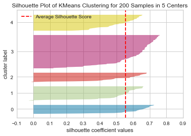
n_clusters=5 has the best average silhouette score of around 0.55, and all clusters are above the average, indicating that it is a good choice.
df['cluster'] = pred1
df.groupby('cluster').mean()[['Age','Annual Income (k$)','Spending Score (1-100)']]
| Age | Annual Income (k$) | Spending Score (1-100) | |
|---|---|---|---|
| cluster | |||
| 0 | 25.272727 | 25.727273 | 79.363636 |
| 1 | 41.114286 | 88.200000 | 17.114286 |
| 2 | 45.217391 | 26.304348 | 20.913043 |
| 3 | 42.716049 | 55.296296 | 49.518519 |
| 4 | 32.692308 | 86.538462 | 82.128205 |
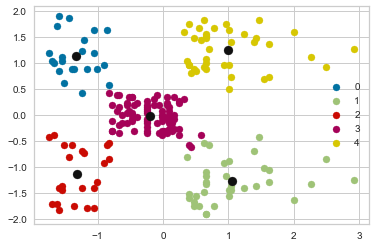
8.11.3.3. Cluster Analysis
Based on the above results, which clusters should be the target group?
There are five clusters created by the model including
Cluster 0: Low annual income, high spending (young age spendthrift)
Customers in this category earn less but spend more. People with low income but high spending scores can be viewed as possible target customers. We can see that people with low income but high spending scores are those who, for some reason, love to buy things more frequently despite their limited income. Perhaps it’s because these people are happy with the mall’s services. The shops/malls may not be able to properly target these customers, but they will not be lost.
Cluster 1: High annual income, low spending (miser)
Customers in this category earn a lot of money while spending little. It’s amazing to observe that customers have great income yet low expenditure scores. Perhaps they are the customers who are dissatisfied with the mall’s services. These are likely to be the mall’s primary objectives, as they have the capacity to spend money. As a result, mall officials will attempt to provide additional amenities in order to attract these customers and suit their expectations.
Cluster 2: Low annual income, low spending (pennywise)
They make less money and spend less money. Individuals with low yearly income and low expenditure scores are apparent, which is understandable given that people with low wages prefer to buy less; in fact, these are the smart people who know how to spend and save money. People from this cluster will be of little interest to the shops/mall.
Cluster 3: Medium annual income, medium spending
In terms of income and spending, customers are average. We find that people have average income and average expenditure value. These people will not be the primary target of stores or malls, but they will be taken into account and other data analysis techniques can be used to increase their spending value.
Cluster 4: High annual income, high spending (young age wealthy and target customer)
Target Customers that earn a lot of money and spend a lot of money. A target consumer with a high annual income and a high spending score. People with high income and high spending scores are great customers for malls and businesses because they are the primary profit generators. These individuals may be regular mall patrons who have been persuaded by the mall’s amenities.
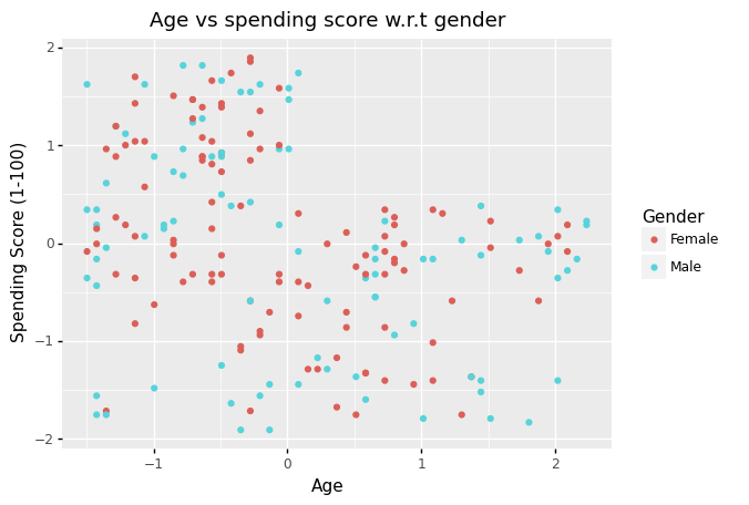
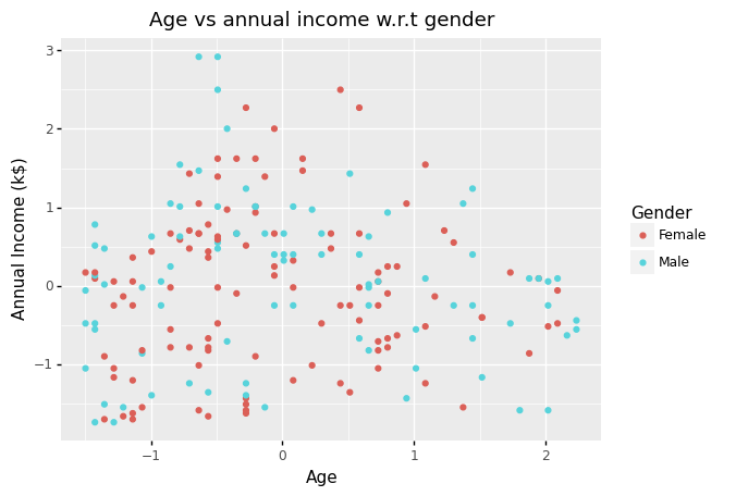
8.11.4. Clustering based on three features: annual income, spending score and age
8.11.4.1. Ploting the relation between age and other features
(
    ggplot(df_scaled)
    + aes(x = 'Age', y = 'Spending Score (1-100)', color = 'Gender')
    + geom_point()
    + labs(title = 'Age vs spending score w.r.t gender')
)
<ggplot: (305033681)>
(
    ggplot(df_scaled)
    + aes(x = 'Age', y = 'Annual Income (k$)', color = 'Gender')
    + geom_point()
    + labs(title = 'Age vs annual income w.r.t gender')
)
<ggplot: (307000729)>
Note Using a 2D visualization, we can’t see any distinct patterns in the data set.
8.11.4.2. The elbow method
# Taking the annual income and spending score
features = ['Age','Annual Income (k$)','Spending Score (1-100)']
model2 = df_scaled[features]


# fitting multiple k-means algorithms and storing the values in an empty list

SSE = []
for cluster in range(1,10):
    kmeans = KMeans(n_clusters = cluster)
    kmeans.fit(model2)
    SSE.append(kmeans.inertia_)

# converting the results into a dataframe and plotting them
frame = pd.DataFrame({'Cluster':range(1,10), 'SSE':SSE})
plt.figure(figsize=(12,6))
plt.plot(frame['Cluster'], frame['SSE'], marker='o')
plt.xlabel('Number of clusters')
plt.ylabel('Inertia')
Text(0, 0.5, 'Inertia')
8.11.4.3. The Silhouette Method
from sklearn import metrics
# Instantiate the clustering model and visualizer
kmeans = KMeans(
init="random",
n_clusters=6,
n_init=10,
max_iter=300,
random_state=88)
visualizer = SilhouetteVisualizer(kmeans, colors='yellowbrick')
# Fit the data to the visualizer
visualizer.fit(model2)
# Compute silhouette_score
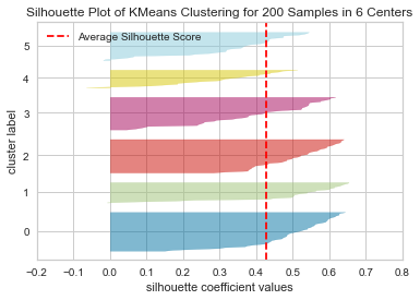
print('The silhouette score:', visualizer.silhouette_score_)
# Finalize and render the figure
visualizer.show()
# For scatter plot
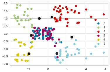
kmeans.fit(model2)
pred2 = kmeans.predict(model2)
#Getting the Centroids
centroids = kmeans.cluster_centers_
u_labels = np.unique(kmeans.predict(model2))
#plotting the results:
for i in u_labels:
plt.scatter(model1.iloc[pred2 == i , 0] , model1.iloc[pred2 == i , 1] , label = i)
plt.scatter(centroids[:,0] , centroids[:,1] , s = 80, color = 'k')
plt.legend()
plt.show()
The silhouette score: 0.42742814991580175
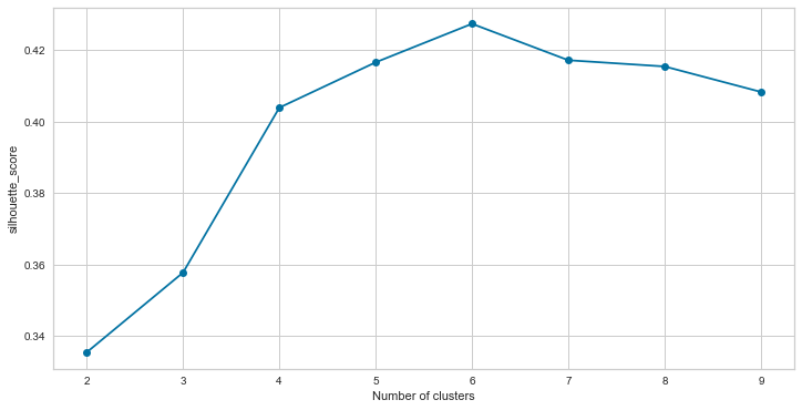
silhouette_score = []
for cluster in range(2,10):
    kmeans = KMeans(
                init="random",
                n_clusters=cluster,
                n_init=10,
                max_iter=300,
                random_state=88)

    kmeans.fit(model2)
    labels = kmeans.labels_
    silhouette_score.append(metrics.silhouette_score(model2, labels))

# converting the results into a dataframe and plotting them
frame = pd.DataFrame({'Cluster':range(2,10), 'Silhouette_score':silhouette_score})
plt.figure(figsize=(12,6))
plt.plot(frame['Cluster'], frame['Silhouette_score'], marker='o')
plt.xlabel('Number of clusters')
plt.ylabel('silhouette_score')
Text(0, 0.5, 'silhouette_score')
!pip install plotly
Requirement already satisfied: plotly in /Users/Kaemyuijang/opt/anaconda3/lib/python3.7/site-packages (5.7.0)
Requirement already satisfied: six in /Users/Kaemyuijang/opt/anaconda3/lib/python3.7/site-packages (from plotly) (1.16.0)
Requirement already satisfied: tenacity>=6.2.0 in /Users/Kaemyuijang/opt/anaconda3/lib/python3.7/site-packages (from plotly) (8.0.1)
import plotly as py
import plotly.graph_objs as go
df
| CustomerID | Gender | Age | Annual Income (k$) | Spending Score (1-100) | cluster | |
|---|---|---|---|---|---|---|
| 0 | 1 | Male | 19 | 15 | 39 | 2 |
| 1 | 2 | Male | 21 | 15 | 81 | 0 |
| 2 | 3 | Female | 20 | 16 | 6 | 2 |
| 3 | 4 | Female | 23 | 16 | 77 | 0 |
| 4 | 5 | Female | 31 | 17 | 40 | 2 |
| ... | ... | ... | ... | ... | ... | ... |
| 195 | 196 | Female | 35 | 120 | 79 | 4 |
| 196 | 197 | Female | 45 | 126 | 28 | 1 |
| 197 | 198 | Male | 32 | 126 | 74 | 4 |
| 198 | 199 | Male | 32 | 137 | 18 | 1 |
| 199 | 200 | Male | 30 | 137 | 83 | 4 |
200 rows × 6 columns
# Clustering with n_clusters = 6

#algorithm = (KMeans(n_clusters = 6 ,init='k-means++', n_init = 10 ,max_iter=300,
#                        tol=0.0001,  random_state= 111  , algorithm='elkan') )

kmeans = KMeans(
                init="random",
                n_clusters=6,
                n_init=10,
                max_iter=300,
                random_state=88)
kmeans.fit(model2)

pred2 = kmeans.predict(model2)
#Getting the Centroids
centroids2 = kmeans.cluster_centers_

#algorithm.fit(X3)
#labels3 = algorithm.labels_
#centroids3 = algorithm.cluster_centers_
df
| CustomerID | Gender | Age | Annual Income (k$) | Spending Score (1-100) | cluster | |
|---|---|---|---|---|---|---|
| 0 | 1 | Male | 19 | 15 | 39 | 2 |
| 1 | 2 | Male | 21 | 15 | 81 | 0 |
| 2 | 3 | Female | 20 | 16 | 6 | 2 |
| 3 | 4 | Female | 23 | 16 | 77 | 0 |
| 4 | 5 | Female | 31 | 17 | 40 | 2 |
| ... | ... | ... | ... | ... | ... | ... |
| 195 | 196 | Female | 35 | 120 | 79 | 4 |
| 196 | 197 | Female | 45 | 126 | 28 | 1 |
| 197 | 198 | Male | 32 | 126 | 74 | 4 |
| 198 | 199 | Male | 32 | 137 | 18 | 1 |
| 199 | 200 | Male | 30 | 137 | 83 | 4 |
200 rows × 6 columns
# x and y given as array_like objects
import plotly.express as px
fig = px.scatter(x=[0, 1, 2, 3, 4], y=[0, 1, 4, 9, 16])
fig.show()
labels3 = kmeans.predict(model2)


df['label3'] =  labels3
trace1 = go.Scatter3d(
    x= df['Age'],
    y= df['Spending Score (1-100)'],
    z= df['Annual Income (k$)'],
    mode='markers',
     marker=dict(
        color = df['label3'],
        size= 20,
        line=dict(
            color= df['label3'],
            width= 12
        ),
        opacity=0.8
     )
)
data = [trace1]
layout = go.Layout(
#     margin=dict(
#         l=0,
#         r=0,
#         b=0,
#         t=0
#     )
    title= 'Clusters',
    scene = dict(
            xaxis = dict(title  = 'Age'),
            yaxis = dict(title  = 'Spending Score'),
            zaxis = dict(title  = 'Annual Income')
        )
)
fig = go.Figure(data=data, layout=layout)
py.offline.iplot(fig)
# x and y given as array_like objects
import plotly.express as px
fig = px.scatter(x=[0, 1, 2, 3, 4], y=[0, 1, 4, 9, 16])
fig.show()