7. Machine learning: Introduction
Machine learning is clearly one of the most powerful and significant technologies in the world today. And more importantly, we have yet to fully realize its potential. It will undoubtedly continue to make headlines for the foreseeable future.
Machine learning is a technique for transforming data into knowledge. In the last 50 years, there has been a data explosion. This vast amount of data is worthless until we analyze it and uncover the underlying patterns.
Machine learning techniques are being used to discover useful underlying patterns in complex data that would otherwise be difficult to find. Hidden patterns and problem knowledge can be used to predict future events and make a variety of complex decisions.
7.1. What Is Machine Learning?
Machine learning is the study of computer algorithms that can learn and develop on their own with experience and data.
It is considered to be a component of artificial intelligence.
Machine learning algorithms create a model based on training data to make predictions or decisions without having to be explicitly programmed to do so.
7.1.1. Building models of data
It makes more sense to think of machine learning as a means of building models of data.
Machine learning is fundamentally about building mathematical models that facilitate the understanding of data.
If we provide these models with tunable parameters that can be adapted to the observed data, we can call the program “learning” from the data.
These models can be used to predict and understand features of newly observed data after fitting them to previously seen data.
Categories of Machine Learning: image from ceralytics

7.2. Applications of Machine learning
Machine learning tasks can be used for a variety of things. Here are some examples of traditional machine learning tasks:
Recommendation systems

We come across a variety of online recommendation engines and methods. Many major platforms, such as Amazon, Netflix, and others, use these technologies. These recommendation engines use a machine learning system that takes into account user search results and preferences.
The algorithm uses this information to make similar recommendations the next time you open the platform.
You will receive notifications about new programs on Netflix. Netflix’s algorithm checks the entire viewing history of its subscribers. It uses this information to suggest new series based on the preferences of its millions of active viewers.
The same recommendation engine can also be used to create ads. Take Amazon, for example. Let us say you go to Amazon to store or just search for something. Amazon’s machine learning technology analyzes the user’s search results and then generates ads as recommendations.
Machine learning for Illness Prediction Healthcare use cases in healthcare.

Doctors can warn patients ahead of time if they can predict a disease. They can even tell if a disease is dangerous or not, which is quite remarkable. But even though using ML is not an easy task, it can be of great benefit.
In this case, the ML algorithm first looks for symptoms on the patient’s body. It would use abnormal body functions as input, train the algorithm, and then make a prediction based on that. Since there are hundreds of diseases and twice as many symptoms, it may take some time to get the results.
Credit score - banking machine learning examples.
It can be difficult to determine whether a bank customer is creditworthy. This is critical because whether or not the bank will grant you a loan depends on it.
Traditional credit card companies only check to see if the card is current and perform a history check. If the cardholder does not have a card history, the assessment becomes more difficult. For this, there are a number of machine learning algorithms that take into account the user’s financial situation, previous credit repayments, debts and so on.
Due to a large number of defaulters, banks have already suffered significant financial losses. To limit these types of losses, we need an effective machine learning system that can prevent any of these scenarios from occurring. This would save banks a lot of money and allow them to provide more services to real consumers.
7.3. Categories of Machine Learning
Machine learning can be divided into two forms at the most basic level: supervised learning and unsupervised learning.
7.3.1. Supervised learning
Supervised learning involves determining how to model the relationship between measured data features and a label associated with the data; once this model is determined, it can be used to apply labels to new, unknown data. This is further divided into classification and regression tasks, where the labels in classification are discrete categories and the labels in regression are continuous values.
7.3.1.1. Classification problems (more examples below)
The output of a classification task is a discrete value. “Likes adding sugar to coffee” and “does not like adding sugar to coffee,” for example, are discrete. There is no such thing as a middle ground. This is similar to teaching a child to recognize different types of animals, whether they are pets or not.
The output (label) of a classification method is typically represented as an integer number such as 1, -1, or 0. These figures are solely symbolic in this situation. Mathematical operations should not be performed with them because this would be pointless. Consider this for a moment. What is the difference between “Likes adding sugar to coffee” and “does not like adding sugar to coffee”? Exactly. We won’t be able to add them, therefore we won’t.
7.3.1.2. Regression problem (discussed in our last chatpter)
The outcome of a regression problem is a real number (a number with a decimal point). We could, for example, use the height and weight information to estimate someone’s weight based on their height.
The data for a regression analysis will like the data in insurance data set. A dependent variable (or set of independent variables) and an independent variable (the thing we are trying to guess given our independent variables) are both present.
We could state that height is the independent variable and weight is the dependent variable, for example. In addition, each row in the dataset is commonly referred to as an example, observation, or data point, but each column (without the label/dependent variable) is commonly referred to as a predictor, independent variable, or feature.

7.3.2. Unsupervised learning (more details in the next chapter)
Unsupervised learning, sometimes known as “letting the dataset speak for itself,” models the features of a dataset without reference to a label. Clustering and dimensionality reduction are among the tasks these models perform.
Clustering methods find unique groups of data, while dimensionality reduction algorithms look for more concise representations.
7.3.3. Supervised vs Unsupervised Learning: image from researchgate

7.3.4. Various classification, regression and clustering algorithms: image from scikit-learn

7.4. Machine Learning Basics with the K-Nearest Neighbors Algorithm
We will learn what K-nearest neighbours (KNN) is, how it works, and how to find the right k value. We will utilize the well-known Python library sklearn to demonstrate how to use KNN.
7.4.1. K-nearest neighbours can be summarized as follows:
K- Nearest Neighbors is a supervised machine learning approach since the target variable is known,
It is non-parametric, since no assumptions are made about the underlying data distribution pattern.
It predicts the cluster into which the new point will fall based on feature similarity.
Both classification and regression prediction problems can be solved with KNN. However, since most analytical problems require making a decision, it is more commonly used in classification problems .
7.4.2. KNN algorithm’s theory
The KNN algorithm’s concept is one of the most straightforward of all the supervised machine learning algorithms.
It simply calculates the distance between a new data point and all previous data points in the training set.
Any form of distance can be used, such as
Euclidean or
Manhattan distances.
The K-nearest data points are then chosen, where K can be any integer. Finally, the data point is assigned to the class that contains the majority of the K data points.
Note that the Manhattan distance, \({\displaystyle d_{1}}\), between two vectors \({\displaystyle \mathbf {p} ,\mathbf {q} }\) in an n-dimensional real vector space with fixed Cartesian coordinate system is defined as
where \({\displaystyle (\mathbf {p} ,\mathbf {q} )}\) are vectors
7.4.3. Example on KNN classifiers: image from Researchgate

Our goal in this diagram is to identify a new data point with the symbol ‘Pt’ into one of three categories: “A,” “B,” or “C.”
Assume that K is equal to 7. The KNN algorithm begins by computing the distance between point ‘Pt’ and all of the other points. The 7 closest points with the shortest distance to point ‘Pt’ are then found. This is depicted in the diagram below. Arrows have been used to denote the seven closest points.
The KNN algorithm’s final step is to assign a new point to the class that contains the majority of the seven closest points. Three of the seven closest points belong to the class “B,” while two of the seven belongs to the classes “A” and “C”. Therefore the new data point will be classified as “B”.
7.4.4. Dataset: https://raw.githubusercontent.com/susanli2016/Machine-Learning-with-Python/master/fruit_data_with_colors.txt
import numpy as np
import pandas as pd
from sklearn.model_selection import train_test_split

import seaborn as sns
import matplotlib.pyplot as plt
%matplotlib inline
---------------------------------------------------------------------------
ModuleNotFoundError                       Traceback (most recent call last)
/var/folders/kl/h_r05n_j76n32kt0dwy7kynw0000gn/T/ipykernel_5515/278679566.py in <module>
      3 from sklearn.model_selection import train_test_split
      4
----> 5 import seaborn as sns
      6 import matplotlib.pyplot as plt
      7 get_ipython().run_line_magic('matplotlib', 'inline')

ModuleNotFoundError: No module named 'seaborn'
from plotnine import *
import warnings

warnings.filterwarnings( "ignore", module = "matplotlib\..*" )
We will be using the fruit_data_with_colors dataset, avalable here at github page, https://raw.githubusercontent.com/susanli2016/Machine-Learning-with-Python/master/fruit_data_with_colors.txt.
The mass, height, and width of a variety of oranges, lemons, and apples are included in the file. The heights were taken along the fruit’s core. The widths were measured perpendicular to the height at their widest point.
7.4.4.1. Our goals
To predict the appropriate fruit label, we’ll use the mass, width, and height of the fruit as our feature points (target value).
url = 'https://raw.githubusercontent.com/susanli2016/Machine-Learning-with-Python/master/fruit_data_with_colors.txt'

df = pd.read_table(url)
df.head()
| fruit_label | fruit_name | fruit_subtype | mass | width | height | color_score | |
|---|---|---|---|---|---|---|---|
| 0 | 1 | apple | granny_smith | 192 | 8.4 | 7.3 | 0.55 |
| 1 | 1 | apple | granny_smith | 180 | 8.0 | 6.8 | 0.59 |
| 2 | 1 | apple | granny_smith | 176 | 7.4 | 7.2 | 0.60 |
| 3 | 2 | mandarin | mandarin | 86 | 6.2 | 4.7 | 0.80 |
| 4 | 2 | mandarin | mandarin | 84 | 6.0 | 4.6 | 0.79 |
df.info()
<class 'pandas.core.frame.DataFrame'>
RangeIndex: 59 entries, 0 to 58
Data columns (total 7 columns):
 #   Column         Non-Null Count  Dtype
---  ------         --------------  -----
 0   fruit_label    59 non-null     int64
 1   fruit_name     59 non-null     object
 2   fruit_subtype  59 non-null     object
 3   mass           59 non-null     int64
 4   width          59 non-null     float64
 5   height         59 non-null     float64
 6   color_score    59 non-null     float64
dtypes: float64(3), int64(2), object(2)
memory usage: 3.4+ KB
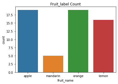
df.groupby('fruit_label').count()['fruit_name']
fruit_label
1    19
2     5
3    19
4    16
Name: fruit_name, dtype: int64
plt.title('Fruit_label Count')
sns.countplot(df['fruit_name'])
/Users/Kaemyuijang/opt/anaconda3/lib/python3.7/site-packages/seaborn/_decorators.py:43: FutureWarning: Pass the following variable as a keyword arg: x. From version 0.12, the only valid positional argument will be `data`, and passing other arguments without an explicit keyword will result in an error or misinterpretation.
<AxesSubplot:title={'center':'Fruit_label Count'}, xlabel='fruit_name', ylabel='count'>
df.head()
| fruit_label | fruit_name | fruit_subtype | mass | width | height | color_score | |
|---|---|---|---|---|---|---|---|
| 0 | 1 | apple | granny_smith | 192 | 8.4 | 7.3 | 0.55 |
| 1 | 1 | apple | granny_smith | 180 | 8.0 | 6.8 | 0.59 |
| 2 | 1 | apple | granny_smith | 176 | 7.4 | 7.2 | 0.60 |
| 3 | 2 | mandarin | mandarin | 86 | 6.2 | 4.7 | 0.80 |
| 4 | 2 | mandarin | mandarin | 84 | 6.0 | 4.6 | 0.79 |
(
    ggplot(df)
    + aes('fruit_name',fill = 'fruit_name')
    + geom_bar()
    + scale_fill_manual(values=['red', 'olivedrab', 'gold', 'orange'])

)
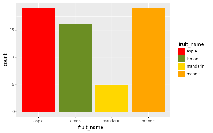
<ggplot: (305317857)>
# Check whether there are any missing values.

df.isnull().sum()
fruit_label      0
fruit_name       0
fruit_subtype    0
mass             0
width            0
height           0
color_score      0
dtype: int64
print(df.fruit_label.unique())
print(df.fruit_name.unique())
[1 2 3 4]
['apple' 'mandarin' 'orange' 'lemon']
To make the results easier to understand, we first establish a mapping from fruit label value to fruit name.
# create a mapping from a mapping from fruit label value to fruit name
lookup_fruit_name = dict(zip(df.fruit_label.unique(), df.fruit_name.unique()))
lookup_fruit_name
{1: 'apple', 2: 'mandarin', 3: 'orange', 4: 'lemon'}
7.4.4.2. Exploratory data analysis
It is now time to experiment with the data and make some visualizations.
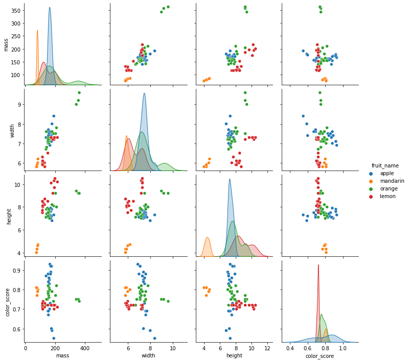
sns.pairplot(df[['fruit_name','mass','width','height']],hue='fruit_name')
<seaborn.axisgrid.PairGrid at 0x1232cd210>
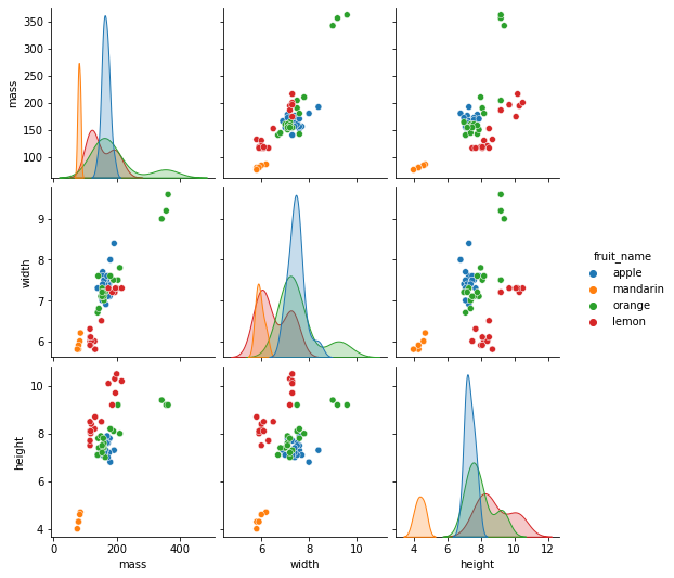
7.4.4.3. What we observe from the figures?
Mandarin has both lower mass and height. It also has the lower average widths.
Orange has higher average masses and widths.
There is a clear separation of lemon from the other both width-height plot and height-mass plot.
What else can we observe from the figures?
df.groupby('fruit_name').describe()[['mass']]
| mass | ||||||||
|---|---|---|---|---|---|---|---|---|
| count | mean | std | min | 25% | 50% | 75% | max | |
| fruit_name | ||||||||
| apple | 19.0 | 165.052632 | 11.969747 | 140.0 | 156.0 | 164.0 | 172.0 | 192.0 |
| lemon | 16.0 | 150.000000 | 37.487776 | 116.0 | 117.5 | 131.0 | 188.0 | 216.0 |
| mandarin | 5.0 | 81.200000 | 3.898718 | 76.0 | 80.0 | 80.0 | 84.0 | 86.0 |
| orange | 19.0 | 193.789474 | 73.635422 | 140.0 | 154.0 | 160.0 | 197.0 | 362.0 |
df.groupby('fruit_name').describe()[['height']]
| height | ||||||||
|---|---|---|---|---|---|---|---|---|
| count | mean | std | min | 25% | 50% | 75% | max | |
| fruit_name | ||||||||
| apple | 19.0 | 7.342105 | 0.291196 | 6.8 | 7.1 | 7.3 | 7.55 | 7.9 |
| lemon | 16.0 | 8.856250 | 0.997977 | 7.5 | 8.1 | 8.5 | 9.80 | 10.5 |
| mandarin | 5.0 | 4.380000 | 0.277489 | 4.0 | 4.3 | 4.3 | 4.60 | 4.7 |
| orange | 19.0 | 7.936842 | 0.769712 | 7.0 | 7.4 | 7.8 | 8.15 | 9.4 |
df.groupby('fruit_name').describe()[['width']]
| width | ||||||||
|---|---|---|---|---|---|---|---|---|
| count | mean | std | min | 25% | 50% | 75% | max | |
| fruit_name | ||||||||
| apple | 19.0 | 7.457895 | 0.345311 | 6.9 | 7.3 | 7.4 | 7.600 | 8.4 |
| lemon | 16.0 | 6.512500 | 0.624900 | 5.8 | 6.0 | 6.2 | 7.225 | 7.3 |
| mandarin | 5.0 | 5.940000 | 0.167332 | 5.8 | 5.8 | 5.9 | 6.000 | 6.2 |
| orange | 19.0 | 7.557895 | 0.813986 | 6.7 | 7.1 | 7.2 | 7.600 | 9.6 |
7.4.4.4. Preprocessing: Train Test Split.
Because training and testing on the same data is inefficient, we partition the data into two sets: training and testing.
To split the data, we use the train_test_split function.
The split percentage is determined by the optional parameter test_size. The default values are 75/25% train and test data.
The random state parameter ensures that the data is split in the same way each time the program is executed.
Because we are training and testing on distinct sets of data, the testing accuracy will be a better indication of how well the model will perform on new data.
# Train Test Split

X = df[['height', 'width', 'mass']]
y = df['fruit_label']
X_train, X_test, y_train, y_test = train_test_split(X, y, test_size=0.25, random_state=0)
#shape of train and test data
print(X_train.shape)
print(X_test.shape)
(44, 3)
(15, 3)
#shape of new y objects
print(y_train.shape)
print(y_test.shape)
(44,)
(15,)
7.4.4.5. Training and Predictions
Scikit-learn is divided into modules so that we may quickly import the classes we need.
Import the KNeighborsClassifer class from the neighbors module.
Instantiate the estimator (a model in scikit-learn is referred to as a estimator). Because their major function is to estimate unknown quantities, we refer to the model as an estimator.
In our example, we have generated an instance (knn) of the class KNeighborsClassifer, which means we have constructed an object called ‘knn’ that knows how to perform KNN classification once the data is provided.
The tuning parameter/hyper parameter (k) is the parameter n_ neighbors. All other parameters are set to default.
The fit method is used to train the model using training data (X train,y train), while the predict method is used to test the model using testing data (X test).
In this example, we take n_neighbors or k = 5.
from sklearn.neighbors import KNeighborsClassifier

knn = KNeighborsClassifier(n_neighbors = 5)
7.4.4.6. Train the classifier (fit the estimator) using the training data¶¶
We then train the classifier by passing the training set data in X_train and the labels in y_train to the classifier’s fit method.
knn.fit(X_train,y_train)
KNeighborsClassifier()
7.4.4.7. Estimate the accuracy of the classifier on future data, using the test data
Remember that the KNN classifier has not seen any of the fruits in the test set during the training phase.
To do this, we use the score method for the classifier object. This takes the points in the test set as input and calculates the accuracy.
The accuracy is defined as the proportion of points in the test set whose true label was correctly predicted by the classifier.
knn.score(X_test, y_test)

print('Accuracy:', knn.score(X_test, y_test))
Accuracy: 0.5333333333333333
We obtain a classficiation rate of 53.3%, considered as good accuracy.
Can we further improve the accuracy of the KNN algorithm?
7.4.4.8. Use the trained KNN classifier model to classify new, previously unseen objects
So, here for example. We are entering the mass, width, and height for a hypothetical piece of fruit that is pretty small.
And if we ask the classifier to predict the label using the predict method.
We can see that the output says that it is a mandarin.
for example: a small fruit with a mass of 20 g, a width of 4.5 cm and a height of 5.2 cm
X_train.columns
Index(['height', 'width', 'mass'], dtype='object')
#sample1 = pd.DataFrame({'height':[5.2], 'width':[4.5],'mass':[20]})
# Notice we use the same column as the X training data (or X test sate)
sample1 = pd.DataFrame([[5.2,4.5,20]],columns = X_train.columns)
fruit_prediction = knn.predict(sample1)

print('The prediction is:', lookup_fruit_name[fruit_prediction[0]])
The prediction is: mandarin
Here another example
#sample2 = pd.DataFrame({'height':[6.8], 'width':[8.5],'mass':[180]})

sample2 = pd.DataFrame([[6.8,8.5,180]],columns = X_train.columns)
fruit_prediction = knn.predict(sample2)

print('The prediction is:', lookup_fruit_name[fruit_prediction[0]])
The prediction is: apple
Exercise
Create a DataFrame comparing the y_test and the predictions from the model.
Confirm that the accuracy is the same as obtained by knn.score(X_test, y_test).
Here is the list of predictions of the test set obtained from the model.
#fruit_prediction = knn.predict([[20,4.5,5.2]])
y_pred = knn.predict(X_test)
7.4.4.9. Calculating the agorithm accuracy
# the accuracy of the test set

# https://stackoverflow.com/questions/59072143/pandas-mean-of-boolean
((knn.predict(X_test) == y_test.to_numpy())*1).mean()
(knn.predict(X_test) == y_test.to_numpy()).mean()
0.5333333333333333
# the accuracy of the original data set

# (knn.predict(X) == y.to_numpy()).mean()
# the accuracy of the training set

(knn.predict(X_train) == y_train.to_numpy()).mean()
0.7954545454545454
7.4.4.10. Comparison of the observed and predicted values from both training and test data sets
# Printing out the observed and predicted values of the test set

for i in range(len(X_test)):
    print('Observed: ', lookup_fruit_name[y_test.iloc[i]], 'vs Predicted:',    lookup_fruit_name[knn.predict(X_test)[i]])
Observed:  orange vs Predicted: orange
Observed:  orange vs Predicted: apple
Observed:  lemon vs Predicted: lemon
Observed:  orange vs Predicted: lemon
Observed:  apple vs Predicted: apple
Observed:  apple vs Predicted: apple
Observed:  orange vs Predicted: orange
Observed:  lemon vs Predicted: orange
Observed:  orange vs Predicted: apple
Observed:  apple vs Predicted: lemon
Observed:  mandarin vs Predicted: mandarin
Observed:  apple vs Predicted: apple
Observed:  orange vs Predicted: orange
Observed:  orange vs Predicted: apple
Observed:  orange vs Predicted: lemon
print(X_test.index)
y_test.index
Int64Index([26, 35, 43, 28, 11, 2, 34, 46, 40, 22, 4, 10, 30, 41, 33], dtype='int64')
Int64Index([26, 35, 43, 28, 11, 2, 34, 46, 40, 22, 4, 10, 30, 41, 33], dtype='int64')
pd.DataFrame({'observed': y_test ,'predicted':knn.predict(X_test)}).set_index(X_test.index)
| observed | predicted | |
|---|---|---|
| 26 | 3 | 3 |
| 35 | 3 | 1 |
| 43 | 4 | 4 |
| 28 | 3 | 4 |
| 11 | 1 | 1 |
| 2 | 1 | 1 |
| 34 | 3 | 3 |
| 46 | 4 | 3 |
| 40 | 3 | 1 |
| 22 | 1 | 4 |
| 4 | 2 | 2 |
| 10 | 1 | 1 |
| 30 | 3 | 3 |
| 41 | 3 | 1 |
| 33 | 3 | 4 |
pd.DataFrame({'observed': y_train ,'predicted':knn.predict(X_train)}).set_index(X_train.index).head()
| observed | predicted | |
|---|---|---|
| 42 | 3 | 1 |
| 48 | 4 | 1 |
| 7 | 2 | 2 |
| 14 | 1 | 1 |
| 32 | 3 | 1 |
pd.DataFrame({'observed': y ,'predicted':knn.predict(X)}).set_index(X.index).head()
| observed | predicted | |
|---|---|---|
| 0 | 1 | 4 |
| 1 | 1 | 1 |
| 2 | 1 | 1 |
| 3 | 2 | 2 |
| 4 | 2 | 2 |
df_result = df
df_result['predicted_label'] = knn.predict(X)
df_result.head()
| fruit_label | fruit_name | fruit_subtype | mass | width | height | color_score | predicted_label | |
|---|---|---|---|---|---|---|---|---|
| 0 | 1 | apple | granny_smith | 192 | 8.4 | 7.3 | 0.55 | 4 |
| 1 | 1 | apple | granny_smith | 180 | 8.0 | 6.8 | 0.59 | 1 |
| 2 | 1 | apple | granny_smith | 176 | 7.4 | 7.2 | 0.60 | 1 |
| 3 | 2 | mandarin | mandarin | 86 | 6.2 | 4.7 | 0.80 | 2 |
| 4 | 2 | mandarin | mandarin | 84 | 6.0 | 4.6 | 0.79 | 2 |
7.4.4.11. Visualize the decision regions of a classifier
After a classifier has been trained on training data, a classification model is created. What criteria does your machine learning classifier consider when deciding which class a sample belongs to? Plotting a decision region can provide some insight into the decision made by your ML classifier.
A decision region is a region in which a classifier predicts the same class label for data.
The boundary between areas of various classes is known as the decision boundary.
The plot decision regions function in mlxtend is a simple way to plot decision areas. We can also use mlxtend to plot decision regions of Logistic Regression, Random Forest, RBF kernel SVM, and Ensemble classifier.
Important Note for the 2D scatterplot, we can only visualize 2 features at a time. So, if you have a 3-dimensional (or more than 3) dataset, it will essentially be a 2D slice through this feature space with fixed values for the remaining feature(s).
from mlxtend.plotting import plot_decision_regions
# Importing a dataset
url = 'https://raw.githubusercontent.com/susanli2016/Machine-Learning-with-Python/master/fruit_data_with_colors.txt'
df = pd.read_table(url)

# Train Test Split

X = df[['height', 'width', 'mass']]
y = df['fruit_label']
X_train, X_test, y_train, y_test = train_test_split(X, y, test_size=0.25, random_state=0)

# Instantiate the estimator
from sklearn.neighbors import KNeighborsClassifier
knn = KNeighborsClassifier(n_neighbors = 5)

# Training the classifier by passing in the training set X_train and the labels in y_train
knn.fit(X_train,y_train)

# Predicting labels for unknown data
y_pred = knn.predict(X_test)
X_train.describe()
| height | width | mass | |
|---|---|---|---|
| count | 44.000000 | 44.000000 | 44.000000 |
| mean | 7.643182 | 7.038636 | 159.090909 |
| std | 1.370350 | 0.835886 | 53.316876 |
| min | 4.000000 | 5.800000 | 76.000000 |
| 25% | 7.200000 | 6.175000 | 127.500000 |
| 50% | 7.600000 | 7.200000 | 157.000000 |
| 75% | 8.250000 | 7.500000 | 172.500000 |
| max | 10.500000 | 9.200000 | 356.000000 |
7.4.4.12. Decision regions for two features, height and mass.
We may want to go beyond the numerical prediction (of the class or of the probability) and visualize the actual decision boundaries between the classes for many classification problems in the domain of supervised ML.
The visualization is displayed on a 2-dimensional (2D) plane, which makes it particularly ideal for binary classification tasks and for a pair of features.
We will be using the plot_decision_regions() function in the MLxtend library to draw a classifier’s decision regions.
knn = KNeighborsClassifier(n_neighbors = 5)
knn.fit(X_train.values, y_train.values)
# Plotting decision regions
fig, ax = plt.subplots()
# Decision region for feature 2 = width = value
value=7
# Plot training sample points with
# feature 2 = width = value +/- width
width=0.3
fig = plot_decision_regions(X_train.values, y_train.values, clf=knn,
feature_index=[0,2], #these one will be plotted
filler_feature_values={1: value}, #these will be ignored
filler_feature_ranges={1: width})
ax.set_xlabel('Feature 1 (height)')
ax.set_ylabel('Feature 2 (mass)')
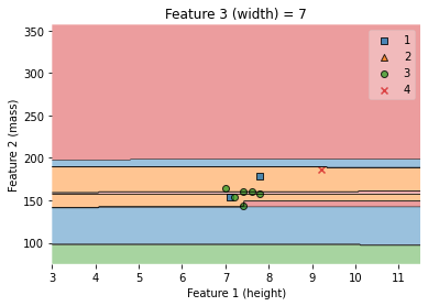
ax.set_title('Feature 3 (width) = {}'.format(value))
/Users/Kaemyuijang/opt/anaconda3/lib/python3.7/site-packages/mlxtend/plotting/decision_regions.py:279: UserWarning: You passed a edgecolor/edgecolors ('black') for an unfilled marker ('x'). Matplotlib is ignoring the edgecolor in favor of the facecolor. This behavior may change in the future.
Text(0.5, 1.0, 'Feature 3 (width) = 7')
Important Notes: the arguments used in the plot_decision_regions are explained below:
feature_index: feature indices to use for plotting.
This arguement defines the indices to be displayed in the 2D plot of the decision boundary. The first index in feature_index will be on the x-axis, the second index will be on the y-axis. (for array-like (default: (0,) for 1D, (0, 1) otherwise))
filler_feature_values:
This arguement defines the indices and their (fixed) values of the features that are not included in the 2D plot of the decision boundary (index-value pairs for the features that are not displayed). Required only for Number Features > 2.
The function ‘plot_decision_regions’ fits the data and makes a prediction to create the appropriate decision boundary by finding the predicted value for each point (the values of the ignored features are fixed and equal to the values specified by the user) in a grid-like scatter plot.
filler_feature_ranges:
The last argument we included for the ‘plot_decision_regions’ function is ‘filler_feature_ranges’. This arguement defines the ranges of features that will not be plotted, and these regions are used to select (training) sample points for plotting.
The following Python gives sample points that are plotted in the above decision region, i.e. the range of the widths is in this interval (value - width, value + width).
# Points to be included in the plot above,
# i.e. those sample points with width between (value - width, value + width)

# X_train

X_train.head()
#X_train.head()
print(X_train[(X_train.width < value + width) & (X_train.width > value - width)].sort_values(by = 'height'))
#print(y_train[(X_train.width < value + width) & (X_train.width > value - width)])
    height  width  mass
32     7.0    7.2   164
12     7.1    7.0   154
42     7.2    7.2   154
29     7.4    7.0   160
39     7.4    6.8   144
36     7.6    7.1   160
8      7.8    7.1   178
38     7.8    7.2   158
45     9.2    7.2   186
#df.head()
#X_train.head()
#df[(df.width < 7.2) & (df.width > 6.8)].sort_values(by = 'height')
7.4.4.13. Decision regions for two features, height and width.
#X_train.describe()
knn = KNeighborsClassifier(n_neighbors = 5)
knn.fit(X_train.values, y_train.values)
# Plotting decision regions
fig, ax = plt.subplots()
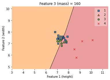
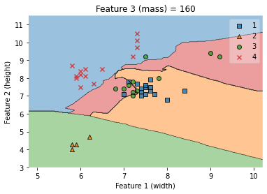
# Decision region for feature 3 = mass = value
value=160
# Plot training sample with feature 3 = mass = value +/- width
width=30
fig = plot_decision_regions(X_train.values, y_train.values, clf=knn,
feature_index=[0,1], #these one will be plotted
filler_feature_values={2: value}, #these will be ignored
filler_feature_ranges={2: width})
ax.set_xlabel('Feature 1 (height)')
ax.set_ylabel('Feature 2 (width)')
ax.set_title('Feature 3 (mass) = {}'.format(value))
/Users/Kaemyuijang/opt/anaconda3/lib/python3.7/site-packages/mlxtend/plotting/decision_regions.py:279: UserWarning: You passed a edgecolor/edgecolors ('black') for an unfilled marker ('x'). Matplotlib is ignoring the edgecolor in favor of the facecolor. This behavior may change in the future.
Text(0.5, 1.0, 'Feature 3 (mass) = 160')
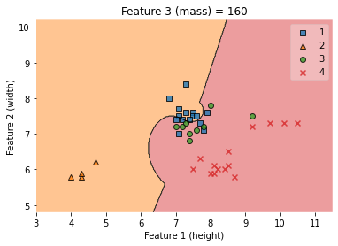
Important Note: Do not be surprised that the samples (with the cross symbol) are correctly classified. Why?
#print(X_train.head())
#print(y_train)
##### Convert pandas DataFrame to Numpy before applying classification
#####
#### weights{‘uniform’, ‘distance’}
#### ‘uniform’ : uniform weights. All points in each neighborhood are weighted equally.
#### ‘distance’ : weight points by the inverse of their distance. in this case, closer neighbors of a query point will have a greater influence than neighbors which are further away.
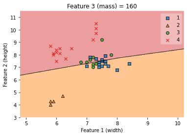
X_train_np = X_train.to_numpy()
y_train_np = y_train.to_numpy()
clf = KNeighborsClassifier(n_neighbors = 5,weights='distance')
clf.fit(X_train_np, y_train_np)
# Plotting decision regions
fig, ax = plt.subplots()
# Decision region for feature 3 = mass = value
value=160
# Plot training sample with feature = mass = value +/- width
width=100
fig = plot_decision_regions(X_train_np, y_train_np, clf=clf,
feature_index=[0,1], #these one will be plotted
filler_feature_values={2: value}, #these will be ignored
filler_feature_ranges={2: width})
ax.set_xlabel('Feature 1 (height)')
ax.set_ylabel('Feature 2 (width)')
ax.set_title('Feature 3 (mass) = {}'.format(value))
/Users/Kaemyuijang/opt/anaconda3/lib/python3.7/site-packages/mlxtend/plotting/decision_regions.py:279: UserWarning: You passed a edgecolor/edgecolors ('black') for an unfilled marker ('x'). Matplotlib is ignoring the edgecolor in favor of the facecolor. This behavior may change in the future.
Text(0.5, 1.0, 'Feature 3 (mass) = 160')
# clf.predict(X_train_np)
# y_train_np
# X_train.describe()
# X_train_np = X_train.iloc[:,0:2].to_numpy()
# y_train_np = y_train.to_numpy()

# X_train_np.shape
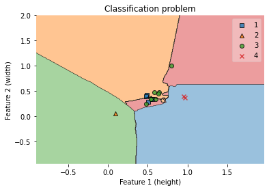
7.4.4.14. Visualization of Dicision Boundary with KNN classification for a dataset with only two features.
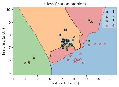
We will visualize the actual decision boundaries by training the KNN model with the dataset consisting of only one pair of features. We will then make a comparison the decision boundaries with the previous results.
##### Convert pandas DataFrame to Numpy before applying classification
X_train_np = X_train.iloc[:,0:2].to_numpy()
y_train_np = y_train.to_numpy()
clf = KNeighborsClassifier(n_neighbors = 5)
clf.fit(X_train_np, y_train_np)
# Plotting decision regions
fig, ax = plt.subplots()
# Decision region for feature 3 = mass = value
# value=160
# Plot training sample with feature = mass = value +/- width
# width=20
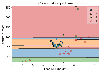
fig = plot_decision_regions(X_train_np, y_train_np, clf=clf)
ax.set_xlabel('Feature 1 (height)')
ax.set_ylabel('Feature 2 (width)')
ax.set_title('Classification problem')
/Users/Kaemyuijang/opt/anaconda3/lib/python3.7/site-packages/mlxtend/plotting/decision_regions.py:279: UserWarning: You passed a edgecolor/edgecolors ('black') for an unfilled marker ('x'). Matplotlib is ignoring the edgecolor in favor of the facecolor. This behavior may change in the future.
Text(0.5, 1.0, 'Classification problem')
##### Convert pandas DataFrame to Numpy before applying classification

X_train_np = X_train.iloc[:,[0,2]].to_numpy()
y_train_np = y_train.to_numpy()


clf = KNeighborsClassifier(n_neighbors = 5)
clf.fit(X_train_np, y_train_np)

# Plotting decision regions
fig, ax = plt.subplots()

# Decision region for feature 3 = mass = value
value=160
# Plot training sample with feature = mass = value +/- width
width=20

fig = plot_decision_regions(X_train_np, y_train_np, clf=clf)
ax.set_xlabel('Feature 1 (height)')
ax.set_ylabel('Feature 2 (mass)')
ax.set_title('Classification problem')
/Users/Kaemyuijang/opt/anaconda3/lib/python3.7/site-packages/mlxtend/plotting/decision_regions.py:279: UserWarning: You passed a edgecolor/edgecolors ('black') for an unfilled marker ('x'). Matplotlib is ignoring the edgecolor in favor of the facecolor. This behavior may change in the future.
Text(0.5, 1.0, 'Classification problem')
7.4.4.15. Width-Mass visualization
#print(X_train.head())
#print(X_train.values)
#X_train.to_numpy()

#print(type(X_train.values))
#print(type(X_train.to_numpy()))

#print(X_train.values.shape)
#print(X_train.to_numpy().shape)
X_train.describe()
| height | width | mass | |
|---|---|---|---|
| count | 44.000000 | 44.000000 | 44.000000 |
| mean | 7.643182 | 7.038636 | 159.090909 |
| std | 1.370350 | 0.835886 | 53.316876 |
| min | 4.000000 | 5.800000 | 76.000000 |
| 25% | 7.200000 | 6.175000 | 127.500000 |
| 50% | 7.600000 | 7.200000 | 157.000000 |
| 75% | 8.250000 | 7.500000 | 172.500000 |
| max | 10.500000 | 9.200000 | 356.000000 |
knn = KNeighborsClassifier(n_neighbors = 5)
knn.fit(X_train.values, y_train.values)
# Plotting decision regions
fig, ax = plt.subplots()
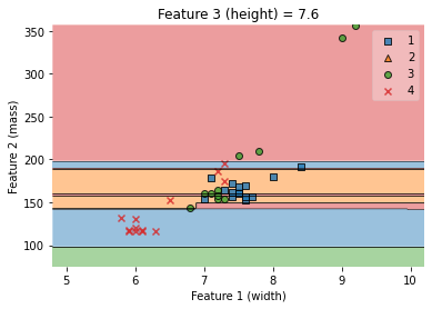
# Decision region for feature 1 = height = value
value=7.6
# Plot training sample with feature 1 = height = value +/- width
width=2.6
fig = plot_decision_regions(X_train.values, y_train.values, clf=knn,
feature_index=[1,2], #these one will be plotted
filler_feature_values={0: value}, #these will be ignored
filler_feature_ranges={0: width})
ax.set_xlabel('Feature 1 (width)')
ax.set_ylabel('Feature 2 (mass)')
ax.set_title('Feature 3 (height) = {}'.format(value))
/Users/Kaemyuijang/opt/anaconda3/lib/python3.7/site-packages/mlxtend/plotting/decision_regions.py:279: UserWarning: You passed a edgecolor/edgecolors ('black') for an unfilled marker ('x'). Matplotlib is ignoring the edgecolor in favor of the facecolor. This behavior may change in the future.
Text(0.5, 1.0, 'Feature 3 (height) = 7.6')
7.4.4.16. Width-height visualization
#### Applying KNN classfication with only two features

X_train[['width','height']].to_numpy()
y_train.to_numpy()

knn = KNeighborsClassifier(n_neighbors = 5)
knn.fit(X_train[['width','height']].to_numpy(), y_train.to_numpy())

# Plotting decision regions
fig, ax = plt.subplots()

# Decision region for feature 3 = mass = value
value=160
# Plot training sample with feature 3 = mass = value +/- width
width=50

fig = plot_decision_regions(X_train[['width','height']].to_numpy(), y_train.to_numpy(), clf=knn)
ax.set_xlabel('Feature 1 (width)')
ax.set_ylabel('Feature 2 (height)')
ax.set_title('Feature 3 (mass) = {}'.format(value))
/Users/Kaemyuijang/opt/anaconda3/lib/python3.7/site-packages/mlxtend/plotting/decision_regions.py:279: UserWarning: You passed a edgecolor/edgecolors ('black') for an unfilled marker ('x'). Matplotlib is ignoring the edgecolor in favor of the facecolor. This behavior may change in the future.
Text(0.5, 1.0, 'Feature 3 (mass) = 160')
knn = KNeighborsClassifier(n_neighbors = 5)
knn.fit(X_train.values, y_train.values)

# Plotting decision regions
fig, ax = plt.subplots()

# Decision region for feature 3 = mass = value
value=160
# Plot training sample with feature 3 = mass = value +/- width
width=100

fig = plot_decision_regions(X_train.values, y_train.values, clf=knn,
              feature_index=[1,0],               #these one will be plotted
              filler_feature_values={2: value},  #these will be ignored
              filler_feature_ranges={2: width})
ax.set_xlabel('Feature 1 (width)')
ax.set_ylabel('Feature 2 (height)')
ax.set_title('Feature 3 (mass) = {}'.format(value))
/Users/Kaemyuijang/opt/anaconda3/lib/python3.7/site-packages/mlxtend/plotting/decision_regions.py:279: UserWarning: You passed a edgecolor/edgecolors ('black') for an unfilled marker ('x'). Matplotlib is ignoring the edgecolor in favor of the facecolor. This behavior may change in the future.
Text(0.5, 1.0, 'Feature 3 (mass) = 160')
7.4.4.17. Visualize (from scratch) the decision regions of a classifier
from matplotlib.colors import ListedColormap
from sklearn import neighbors
#X = df[['height', 'width']].to_numpy()
#y = df['fruit_label'].to_numpy()
# The code below has been modified based on https://scikit-learn.org/stable/auto_examples/neighbors/plot_classification.html
# we only take the first two features. We could avoid this ugly
# slicing by using a two-dim dataset
#X = iris.data[:, :2]
#y = iris.target
X = df[['height', 'width']].to_numpy()
y = df['fruit_label'].to_numpy()
n_neighbors = 5
h = 0.02 # step size in the mesh
# Create color maps
cmap_light = ListedColormap(["orange", "cyan", "cornflowerblue","green"])
cmap_bold = ["darkorange", "c", "darkblue","darkgreen"]
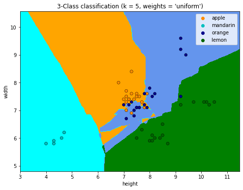
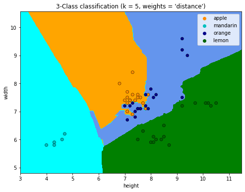
for weights in ["uniform", "distance"]:
# we create an instance of Neighbours Classifier and fit the data.
clf = neighbors.KNeighborsClassifier(n_neighbors, weights=weights)
clf.fit(X, y)
# Plot the decision boundary. For that, we will assign a color to each
# point in the mesh [x_min, x_max]x[y_min, y_max].
x_min, x_max = X[:, 0].min() - 1, X[:, 0].max() + 1
y_min, y_max = X[:, 1].min() - 1, X[:, 1].max() + 1
xx, yy = np.meshgrid(np.arange(x_min, x_max, h), np.arange(y_min, y_max, h))
Z = clf.predict(np.c_[xx.ravel(), yy.ravel()])
# Put the result into a color plot
Z = Z.reshape(xx.shape)
plt.figure(figsize=(8, 6))
plt.contourf(xx, yy, Z, cmap=cmap_light)
# Plot also the training points
sns.scatterplot(
x=X[:, 0],
y=X[:, 1],
hue= df.fruit_name.to_numpy(),
palette=cmap_bold,
alpha=1.0,
edgecolor="black",
)
plt.xlim(xx.min(), xx.max())
plt.ylim(yy.min(), yy.max())
plt.title(
"3-Class classification (k = %i, weights = '%s')" % (n_neighbors, weights)
)
plt.xlabel('height')
plt.ylabel('width')
plt.show()
#https://stackoverflow.com/questions/52952310/plot-decision-regions-with-error-filler-values-must-be-provided-when-x-has-more
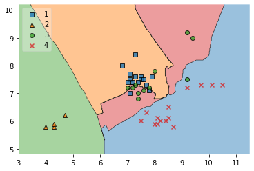
# You can use PCA to reduce your data multi-dimensional data to two dimensional data. Then pass the obtained result in plot_decision_region and there will be no need of filler values.
from mlxtend.plotting import plot_decision_regions
# Decision region of the training set

X = df[['height', 'width']]
y = df['fruit_label']
X_train, X_test, y_train, y_test = train_test_split(X, y, test_size=0.25, random_state=0)

clf = KNeighborsClassifier(n_neighbors = 5)
clf.fit(X_train,y_train)

plot_decision_regions(X_train.to_numpy(), y_train.to_numpy(), clf=clf, legend=2)
/Users/Kaemyuijang/opt/anaconda3/lib/python3.7/site-packages/sklearn/base.py:446: UserWarning: X does not have valid feature names, but KNeighborsClassifier was fitted with feature names
/Users/Kaemyuijang/opt/anaconda3/lib/python3.7/site-packages/mlxtend/plotting/decision_regions.py:279: UserWarning: You passed a edgecolor/edgecolors ('black') for an unfilled marker ('x').  Matplotlib is ignoring the edgecolor in favor of the facecolor.  This behavior may change in the future.
<AxesSubplot:>
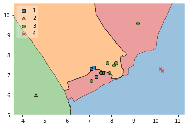
# Decision region of the test set

plot_decision_regions(X_test.to_numpy(), y_test.to_numpy(), clf=clf, legend=2)
/Users/Kaemyuijang/opt/anaconda3/lib/python3.7/site-packages/sklearn/base.py:446: UserWarning: X does not have valid feature names, but KNeighborsClassifier was fitted with feature names
/Users/Kaemyuijang/opt/anaconda3/lib/python3.7/site-packages/mlxtend/plotting/decision_regions.py:279: UserWarning: You passed a edgecolor/edgecolors ('black') for an unfilled marker ('x').  Matplotlib is ignoring the edgecolor in favor of the facecolor.  This behavior may change in the future.
<AxesSubplot:>
7.5. Model Evaluation Metrics in Machine Learning
Machine learning has become extremely popular in recent years. Machine learning is used to infer new situations from past data, and there are far too many machine learning algorithms to choose from.
Machine learning techniques such as
linear regression,
logistic regression,
decision tree,
Naive Bayes, K-Means, and
Random Forest
are widely used.
When it comes to predicting data, we do not use just one algorithm. Sometimes we use multiple algorithms and then proceed with the one that gives the best data predictions.
7.5.1. How can we figure out which algorithm is the most effective?
Model evaluation metrics allow us to evaluate the accuracy of our trained model and track its performance.
Model evaluation metrics, which distinguish adaptive from non-adaptive machine learning models, indicate how effectively the model generalizes to new data.
We could improve the overall predictive power of our model before using it for production on unknown data by using different performance evaluation metrics.
Choosing the right metric is very important when evaluating machine learning models. Machine learning models are evaluated using a variety of metrics in different applications. Let us look at the metrics for evaluating the performance of a machine learning model.
This is a critical phase in any data science project as it aims to estimate the generalization accuracy of a model for future data.
Evaluation Metrics For Regression Models: image from enjoyalgorithms

Evaluation Metrics For Classification Models: image from enjoyalgorithms

7.5.1.2. Classification Metrics
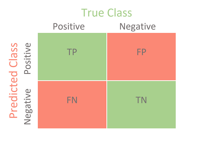
Confusion Matrix (Accuracy, Sensitivity, and Specificity)
A confusion matrix contains the results of any binary testing that is commonly used to describe the classification model’s performance.
In a binary classification task, there are only two classes to categorize, preferably a positive class and a negative class.
Let us take a look at the metrics of the confusion matrix.
Accuracy: indicates the overall accuracy of the model, i.e., the percentage of all samples that were correctly identified by the classifier. Use the following formula to calculate accuracy: (TP +TN)/(TP +TN+ FP +FN).
True Positive (TP): This is the number of times the classifier successfully predicted the positive class to be positive.
True Negative (TN): The number of times the classifier correctly predicts the negative class as negative.
False Positive (FP): This term refers to the number of times a classifier incorrectly predicts a negative class as positive.
False Negative (FN): This is the number of times the classifier predicts the positive class as negative.
The misclassification rate: tells you what percentage of predictions were incorrect. It is also called classification error. You can calculate it with (FP +FN)/(TP +TN+ FP +FN) or (1-accuracy).
Sensitivity (or Recall): It indicates the proportion of all positive samples that were correctly predicted to be positive by the classifier. It is also referred to as true positive rate (TPR), sensitivity, or probability of detection. To calculate recall, use the following formula: TP /(TP +FN).
Specificity: it indicates the proportion of all negative samples that are correctly predicted to be negative by the classifier. It is also referred to as the True Negative Rate (TNR). To calculate the specificity, use the following formula: TN /(TN +FP).
Precision: When there is an imbalance between classes, accuracy can become an unreliable metric for measuring our performance. Therefore, we also need to address class-specific performance metrics. Precision is one such metric, defined as positive predictive values (Proportion of predictions as positive class were actually positive). To calculate precision, use the following formula: TP/(TP+FP).
F1-score: it combines precision and recall in a single measure. Mathematically, it is the harmonic mean of Precision and Recall. It can be calculated as follows:
In a perfect world, we would want a model that has a precision of 1 and a recall of 1. This means an F1 score of 1, i.e. 100% accuracy, which is often not the case for a machine learning model. So we should try to achieve a higher precision with a higher recall value.
Confusion Matrix for Binary Classification: image from https://towardsdatascience.com/
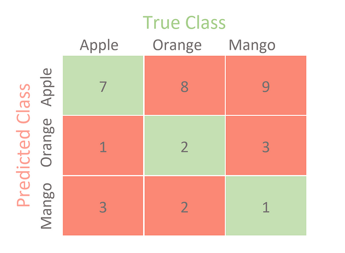
Confusion Matrix for Multi-class Classification: image from https://towardsdatascience.com/
# Importing a dataset
url = 'https://raw.githubusercontent.com/susanli2016/Machine-Learning-with-Python/master/fruit_data_with_colors.txt'
df = pd.read_table(url)

# Train Test Split

X = df[['height', 'width', 'mass']]
y = df['fruit_label']
X_train, X_test, y_train, y_test = train_test_split(X, y, test_size=0.25, random_state=0)

# Instantiate the estimator
from sklearn.neighbors import KNeighborsClassifier
knn = KNeighborsClassifier(n_neighbors = 5)

# Training the classifier by passing in the training set X_train and the labels in y_train
knn.fit(X_train,y_train)

# Predicting labels for unknown data
y_pred = knn.predict(X_test)
# Various attributes of the knn estimator

print(knn.classes_)
print(knn.feature_names_in_)
print(knn.n_features_in_)
print(knn.n_neighbors)
[1 2 3 4]
['height' 'width' 'mass']
3
5
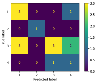
#importing confusion matrix

from sklearn.metrics import confusion_matrix, ConfusionMatrixDisplay
confusion = confusion_matrix(y_test, y_pred)
print('Confusion Matrix\n')
print(confusion)
Confusion Matrix

[[3 0 0 1]
 [0 1 0 0]
 [3 0 3 2]
 [0 0 1 1]]
# Confusion Matrix visualization.

cm = confusion_matrix(y_test, y_pred, labels=knn.classes_)
disp = ConfusionMatrixDisplay(confusion_matrix=cm,display_labels=knn.classes_)
disp.plot()
<sklearn.metrics._plot.confusion_matrix.ConfusionMatrixDisplay at 0x125e687d0>
pd.DataFrame({'observed': y_test ,'predicted':knn.predict(X_test)}).set_index(X_test.index).sort_values(by = 'observed')
| observed | predicted | |
|---|---|---|
| 11 | 1 | 1 |
| 2 | 1 | 1 |
| 22 | 1 | 4 |
| 10 | 1 | 1 |
| 4 | 2 | 2 |
| 26 | 3 | 3 |
| 35 | 3 | 1 |
| 28 | 3 | 4 |
| 34 | 3 | 3 |
| 40 | 3 | 1 |
| 30 | 3 | 3 |
| 41 | 3 | 1 |
| 33 | 3 | 4 |
| 43 | 4 | 4 |
| 46 | 4 | 3 |
Unlike the binary classification, there are no positive or negative classes here.
At first glance, it might be a little difficult to find TP, TN, FP, and FN since there are no positive or negative classes, but it’s actually pretty simple.
What we need to do here is find TP, TN, FP and FN for each and every class. For example, let us take the Apple class. Let us look at what values the metrics have in the confusion matrix. (DO NOT FORGET TO TRANSPOSE)
TP = 3
TN = (1 + 3 + 2 + 1 + 1) = 8 (the sum of the numbers in rows 2-4 and columns 2-4)
FP = (0 + 3 + 0) = 3
FN = (0 + 0 + 1) = 1
Now that we have all the necessary metrics for the Apple class from the confusion matrix, we can calculate the performance metrics for the Apple class. For example, the class Apple has
Precision = 3/(3+3) = 0.5
Recall = 3/(3+1) = 0.75
F1-score = 0.60
In a similar way, we can calculate the measures for the other classes. Here is a table showing the values of each measure for each class.
from sklearn.metrics import classification_report
print('\nClassification Report\n')
print(classification_report(y_test, y_pred, target_names=['Class 1', 'Class 2', 'Class 3', 'Class 4']))
Classification Report

              precision    recall  f1-score   support

     Class 1       0.50      0.75      0.60         4
     Class 2       1.00      1.00      1.00         1
     Class 3       0.75      0.38      0.50         8
     Class 4       0.25      0.50      0.33         2

    accuracy                           0.53        15
   macro avg       0.62      0.66      0.61        15
weighted avg       0.63      0.53      0.54        15
Now we can do more with these measures. We can combine the F1 score of each class to get a single measure for the entire model. There are several ways to do this, which we will now look at.
Macro F1 This is the macro-averaged F1 score. It calculates the metrics for each class separately and then takes the unweighted average of the measures. As we saw in the figure “Precision, recall and F1 score for each class”,
Weighted F1 The final value is the weighted mean F1 score. Unlike Macro F1, this uses a weighted mean of the measures. The weights for each class are the total number of samples in that class. Since we had 4 apples, 1 mandarin, 8 oranges, and 3 lemons,
We obtain a classficiation rate of 53.3%, considered as good accuracy.
Can we further improve the accuracy of the KNN algorithm?
In our example, we have created an instance (‘knn’) of the class ‘KNeighborsClassifer,’ which means we have constructed an object called ‘knn’ that knows how to perform KNN classification once the data is provided.
The tuning parameter/hyper parameter (K) is the parameter n_neighbors. All other parameters are set to default values.
Exercises
Fit the model and test it for different values for K (from 1 to 5) using a for loop and record the KNN’s testing accuracy of the KNN in a variable.
Plot the relationship between the values of K and the corresponding testing accuracy.
Select the optimal value of K that gives the highest testing accuray.
Compare the results between the optimal value of K and K = 5.
# Importing a dataset
url = 'https://raw.githubusercontent.com/susanli2016/Machine-Learning-with-Python/master/fruit_data_with_colors.txt'
df = pd.read_table(url)

# Train Test Split

X = df[['height', 'width', 'mass']]
y = df['fruit_label']
X_train, X_test, y_train, y_test = train_test_split(X, y, test_size=0.25, random_state=0)

# Instantiate the estimator
from sklearn.neighbors import KNeighborsClassifier
knn = KNeighborsClassifier()

k_range = range(1,15)

train_accuracy = {}
train_accuracy_list = []

test_accuracy = {}
test_accuracy_list = []

for k in k_range:
    knn = KNeighborsClassifier(n_neighbors = k)

    # Training the classifier by passing in the training set X_train and the labels in y_train
    knn.fit(X_train,y_train)

    # Compute accuracy on the training set
    train_accuracy[k] = knn.score(X_train, y_train)
    train_accuracy_list.append(knn.score(X_train, y_train))


    test_accuracy[k] = knn.score(X_test,y_test)
    test_accuracy_list.append(knn.score(X_test,y_test))
df_output = pd.DataFrame({'k':k_range,
                          'train_accuracy':train_accuracy_list,
                          'test_accuracy':test_accuracy_list
                         })

(
    ggplot(df_output)
    + geom_line(aes(x = 'k',  y = 'train_accuracy',color='"training accuracy"'))
    + geom_line(aes(x = 'k',  y = 'test_accuracy',color='"testing accuracy"'))
    + labs(x='k (n_neighbors)', y='overall accuracy', title = 'Model Accuracy')
    + scale_color_manual(values = ["blue", "green"], # Colors
        name = " ")
)
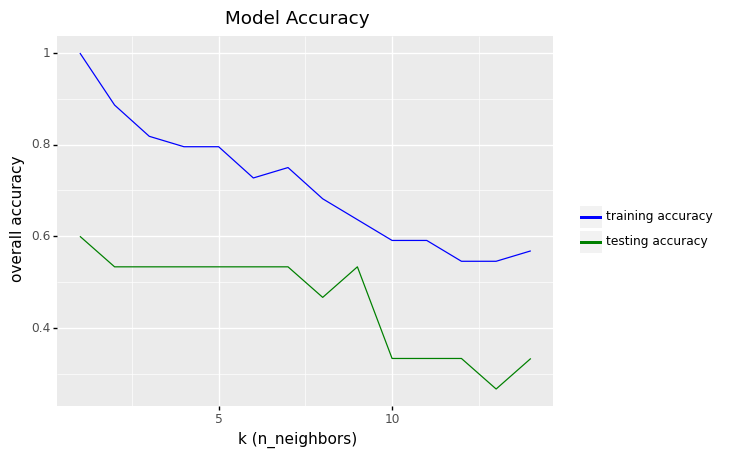
<ggplot: (306375789)>
df_output.sort_values(by = 'test_accuracy', ascending=False).head()
| k | train_accuracy | test_accuracy | |
|---|---|---|---|
| 0 | 1 | 1.000000 | 0.600000 |
| 1 | 2 | 0.886364 | 0.533333 |
| 2 | 3 | 0.818182 | 0.533333 |
| 3 | 4 | 0.795455 | 0.533333 |
| 4 | 5 | 0.795455 | 0.533333 |
row_max = df_output.test_accuracy.idxmax()

print(f'Best accuracy was {df_output.test_accuracy[row_max]}, which corresponds to a value of K={df_output.k[row_max]}')
Best accuracy was 0.6, which corresponds to a value of K=1
The overall accuracy of 0.6 shows that the model does not perform well in the predictions for the test data set.
#y_test.shape
#np.sqrt(15)
sns.pairplot(df[['fruit_name','mass','width','height','color_score']],hue='fruit_name')
<seaborn.axisgrid.PairGrid at 0x124397c50>

7.5.1.3. KNN model with color_score and other feature(s)
We will see if we can improve the accuracy of our model by including the feature color_score.
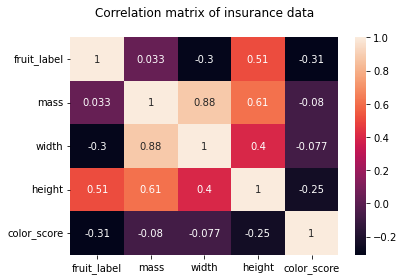
As we can see from the pair plots and correlation matrix below,
there is a clear nonlinear separation of the 4 fruit types when we consider color_score.
Also, we see that both mass and width have a positive correlation with height.
Therefore, we may omit the features weight and mass and train the KNN model with the two features height and color_score instead.
sns.pairplot(df[['fruit_name','mass','width','height','color_score']],hue='fruit_name')
<seaborn.axisgrid.PairGrid at 0x124c38810>
import seaborn as sns
import matplotlib.pyplot as plt

hm = sns.heatmap(df.corr(), annot = True)
hm.set(title = "Correlation matrix of insurance data\n")
plt.show()
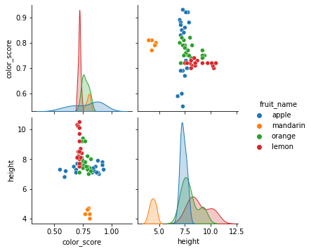
Let us make some visualizations with pair plots of the two features height and color_score instead.
sns.pairplot(df[['fruit_name','color_score','height']],hue='fruit_name')
<seaborn.axisgrid.PairGrid at 0x126ef57d0>
We will repeat the same process as before:
Spliting the data into training and test sets,
Fitting the model on the training dataset,
Making predictions on new dataset (test set), and
Evaluating the predictive performances on the test set
# Importing a dataset
url = 'https://raw.githubusercontent.com/susanli2016/Machine-Learning-with-Python/master/fruit_data_with_colors.txt'
df = pd.read_table(url)

# Train Test Split

X = df[['height', 'color_score']]
y = df['fruit_label']
X_train, X_test, y_train, y_test = train_test_split(X, y, test_size=0.25, random_state=0)

# Instantiate the estimator
from sklearn.neighbors import KNeighborsClassifier
#knn = KNeighborsClassifier()

k_range = range(1,16)

train_accuracy = {}
train_accuracy_list = []

test_accuracy = {}
test_accuracy_list = []

# misclassfication error
train_error_list = []
test_error_list = []

for k in k_range:
    knn = KNeighborsClassifier(n_neighbors = k)

    # Training the classifier by passing in the training set X_train and the labels in y_train
    knn.fit(X_train,y_train)

    # Compute accuracy on the training set
    train_accuracy[k] = knn.score(X_train, y_train)
    train_accuracy_list.append(knn.score(X_train, y_train))
    train_error_list.append(1 - knn.score(X_train, y_train))

    test_accuracy[k] = knn.score(X_test,y_test)
    test_accuracy_list.append(knn.score(X_test,y_test))
    test_error_list.append(1 - knn.score(X_test,y_test))

df_output = pd.DataFrame({'k':k_range,
                          'train_accuracy':train_accuracy_list,
                          'test_accuracy':test_accuracy_list,
                          'train_error':train_error_list,
                          'test_error':test_error_list
                         })
# Accuracy over the number of K neighbors

(
    ggplot(df_output)
    + geom_line(aes(x = 'k',  y = 'train_accuracy',color='"training accuracy"'))
    + geom_line(aes(x = 'k',  y = 'test_accuracy',color='"testing accuracy"'))
    + labs(x='k (n_neighbors)', y='overall accuracy')
    + scale_color_manual(values = ["blue", "green"], # Colors
        name = " ")
)
<ggplot: (309539749)>
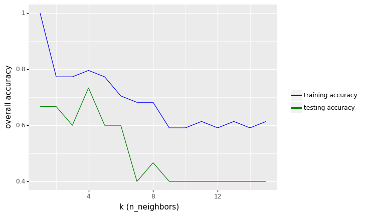
row_max = df_output.test_accuracy.idxmax()

print(f'Best accuracy was {df_output.test_accuracy[row_max]}, which corresponds to a value of K={df_output.k[row_max]}')
Best accuracy was 0.7333333333333333, which corresponds to a value of K=4
From the results above, we see that the performance of KNN model increase to values around 73.33% in accuracy.
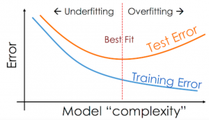
7.5.1.4. Overfitting and Underfitting (The Misclassification Rate vs K)
When implementing KNN (or other machine learning algorithms), one of the most important questions to consider is related to the choice of the number of neighbors (k) to use.
However, you should be aware of two issues that may arise as a result of the number of neighbors (k) you choose: underfitting and overfitting.
Underfitting
Underfitting occurs when there are
too few predictors or
a model that is too simplistic to accurately capture the data’s relationships/patterns (large K in KNN).
As a result, a biased model arises, one that performs poorly on both the data we used to train it and new data (low accuracy or high misclassification error).
Overfitting Overfitting is the opposite of underfitting, and it occurs when
we use too many predictors or
a model that is too complex (small K in KNN),
resulting in a model that models not just the relationships/patterns in our data, but also the noise.
Noise in a dataset is variance that is not consistently related to the variables we have observed, but is instead caused by inherent variability and/or measurement error.
Because the pattern of noise is so unique to each dataset, if we try to represent it, our model may perform very well on the data we used to train it but produce poor prediction results on new datasets.
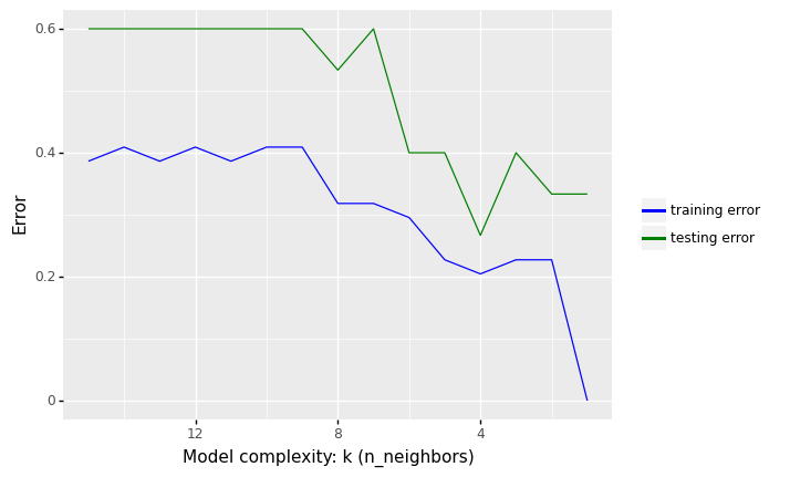
The following Python illustrate the concepts of underfitting and overfitting. It plots the misclassification rate (1 - accuracy) over the number of K neighbors.
# Error over the number of K neighbors

(
    ggplot(df_output)
    + geom_line(aes(x = 'k',  y = 'train_error',color='"training error"'))
    + geom_line(aes(x = 'k',  y = 'test_error',color='"testing error"'))
    + labs(x='Model complexity: k (n_neighbors)', y='Error')
    + scale_color_manual(values = ["blue", "green"], # Colors
        name = " ")
    + scale_x_continuous(trans = "reverse")
)
<ggplot: (309779273)>
7.5.1.4.1. Overfitting and Underfitting
In the figure above, we see that increasing K increases our error rate in the training set. The predictions begin to become biased (i.e., “over smoothing”) by creating prediction values that approach the mean of the observed data set
In contrast, we get minimal error in the training set if we use K = 1, i.e. the model is just memorising the data.
What we are interested in, however, is the generalization error (test error), i.e., the expected value of the misclassification rate when averaged over new data
This value can be approximated by computing the misclassification rate on a large independent test set that was not used in training the model.
We plot the test error against K in green (upper curve). Now we see a U-shaped curve: for complex models (small K), the method overfits, and for simple models (big K), the method underfits.
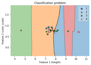
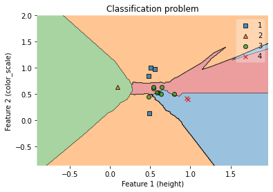
7.5.1.5. Visualization of decision regions (KNN model with two features, height and color_score)
##### Convert pandas DataFrame to Numpy before applying classification

X_train_np = X_train.to_numpy()
y_train_np = y_train.to_numpy()

X_test_np = X_test.to_numpy()
y_test_np = y_test.to_numpy()

clf = KNeighborsClassifier(n_neighbors = 4)
clf.fit(X_train_np, y_train_np)

# Plotting decision regions
fig, ax = plt.subplots()

# Decision region for feature 3 = mass = value
#value=160
# Plot training sample with feature = mass = value +/- width
#width=20

fig = plot_decision_regions(X_test_np, y_test_np, clf=clf)
ax.set_xlabel('Feature 1 (height)')
ax.set_ylabel('Feature 2 (color_scale)')
ax.set_title('Classification problem')
/Users/Kaemyuijang/opt/anaconda3/lib/python3.7/site-packages/mlxtend/plotting/decision_regions.py:279: UserWarning: You passed a edgecolor/edgecolors ('black') for an unfilled marker ('x'). Matplotlib is ignoring the edgecolor in favor of the facecolor. This behavior may change in the future.
Text(0.5, 1.0, 'Classification problem')
#clf.predict([[ 8.5 ,  0],
#       [9.2 ,  0]])
7.6. Scaling Features in KNN
KNN is a distance-based algorithm, where KNN classifies data based on proximity to K neighbors. Then, we often find that the features of the data we are using are not on the same scale/unit. An example of this is the characteristics of weight and height. Obviously these two features have different units, the feature weight is in kilograms and height is in centimeters.
Because this unit difference causes Distance-Based algorithms including KNN to perform poorly, rescaling features with different units to the same scale/units is required to improve performance of K-Nearest Neighbors.
Another reason for using feature scaling is that some algorithms, such as gradient descent in neural networks, converge faster with it than without it.
7.6.1. Common techniques of feature scaling
There are a variety of methods for rescaling features including
Min-Max Scaling
The simplest method, also known as min-max scaling or min-max normalization, consists of rescaling the range of features to scale the range in [0, 1] or [1, 1]. The goal range is determined by the data’s type. The following is the general formula for a min-max of [0, 1]:
where \(\displaystyle x\) is the original value and \(\displaystyle x'\) is the normalized value.
Standard Scaling
Feature standardization, also known as Z-score Normalization, ensures that the values of each feature in the data have a mean of zero (when subtracting the mean in the numerator) and a unit variance.
where \({\displaystyle x}\) is the original feature vector, \({\displaystyle {\bar {x}}={\text{average}}(x)}\) is the mean of that feature vector, and \({\displaystyle \sigma }\) is its standard deviation.
This method is commonly utilized in various machine learning methods for normalization (e.g., support vector machines, logistic regression, and artificial neural networks)
Robust Scaling.
This Scaler is robust to outliers, as the name suggests. The mean and standard deviation of the data will not scale well if our data contains several outliers.
For this robust scaling, the median is removed, and the data is scaled according to the interquartile range The interquartile range (IQR) is the distance between the first and third quartiles (25th and 3rd quantiles) (75th quantile). Because this Scaler’s centering and scaling statistics are based on percentiles, they are unaffected by a few large marginal outliers.
For more details of other scaling features, please follow the links:
https://towardsdatascience.com/all-about-feature-scaling-bcc0ad75cb35
7.6.2. Feature Scaling the Fruit Dataset
In this section, we will perform min-max scaling to rescaling the features height and color_score before training the KNN model.
#df.head()
from sklearn.preprocessing import MinMaxScaler
from sklearn.preprocessing import StandardScaler
from sklearn.preprocessing import RobustScaler
from sklearn.metrics import accuracy_score


# Importing a dataset
url = 'https://raw.githubusercontent.com/susanli2016/Machine-Learning-with-Python/master/fruit_data_with_colors.txt'
df = pd.read_table(url)

# Make a copy of the original dataset
df_model = df.copy()

#Rescaling features 'mass','width','height','color_score'.
#scaler = StandardScaler()
#scaler = RobustScaler()
scaler = MinMaxScaler()


features = [['mass','width','height','color_score']]
for feature in features:
    df_model[feature] = scaler.fit_transform(df_model[feature])

#print(df_model.head())

# Instantiate the estimator
knn = KNeighborsClassifier()

#Create x and y variable
#X = df_model[['mass','width','height','color_score']]
#y = df_model['fruit_label']

X = df_model[['height', 'color_score']]
y = df_model['fruit_label']

X_train, X_test, y_train, y_test = train_test_split(X, y, test_size=0.25, random_state=0)

k_range = range(1,11)

train_accuracy = {}
train_accuracy_list = []

test_accuracy = {}
test_accuracy_list = []

# misclassfication error
train_error_list = []
test_error_list = []

for k in k_range:
    knn = KNeighborsClassifier(n_neighbors = k)

    # Training the classifier by passing in the training set X_train and the labels in y_train
    knn.fit(X_train,y_train)

    # Compute accuracy on the training set
    train_accuracy[k] = knn.score(X_train, y_train)
    train_accuracy_list.append(knn.score(X_train, y_train))
    train_error_list.append(1 - knn.score(X_train, y_train))

    test_accuracy[k] = knn.score(X_test,y_test)
    test_accuracy_list.append(knn.score(X_test,y_test))
    test_error_list.append(1 - knn.score(X_test,y_test))

df_output = pd.DataFrame({'k':k_range,
                          'train_accuracy':train_accuracy_list,
                          'test_accuracy':test_accuracy_list,
                          'train_error':train_error_list,
                          'test_error':test_error_list
                         })
df_model.describe()
| fruit_label | mass | width | height | color_score | |
|---|---|---|---|---|---|
| count | 59.000000 | 59.000000 | 59.000000 | 59.000000 | 59.000000 |
| mean | 2.542373 | 0.304611 | 0.343443 | 0.568188 | 0.560214 |
| std | 1.208048 | 0.192374 | 0.214984 | 0.209387 | 0.202257 |
| min | 1.000000 | 0.000000 | 0.000000 | 0.000000 | 0.000000 |
| 25% | 1.000000 | 0.223776 | 0.210526 | 0.492308 | 0.447368 |
| 50% | 3.000000 | 0.286713 | 0.368421 | 0.553846 | 0.526316 |
| 75% | 4.000000 | 0.353147 | 0.447368 | 0.646154 | 0.684211 |
| max | 4.000000 | 1.000000 | 1.000000 | 1.000000 | 1.000000 |
# Accuracy over the number of K neighbors

(
    ggplot(df_output)
    + geom_line(aes(x = 'k',  y = 'train_accuracy',color='"training accuracy"'))
    + geom_line(aes(x = 'k',  y = 'test_accuracy',color='"testing accuracy"'))
    + labs(x='k (n_neighbors)', y='overall accuracy')
    + scale_color_manual(values = ["blue", "green"], # Colors
        name = " ")
)

<ggplot: (309897553)>
# Error over the number of K neighbors

(
    ggplot(df_output)
    + geom_line(aes(x = 'k',  y = 'train_error',color='"training error"'))
    + geom_line(aes(x = 'k',  y = 'test_error',color='"testing error"'))
    + labs(x='Model complexity: k (n_neighbors)', y='Error')
    + scale_color_manual(values = ["blue", "green"], # Colors
        name = " ")
    + scale_x_continuous(trans = "reverse")
)
<ggplot: (310429937)>
row_max = df_output.test_accuracy.idxmax()
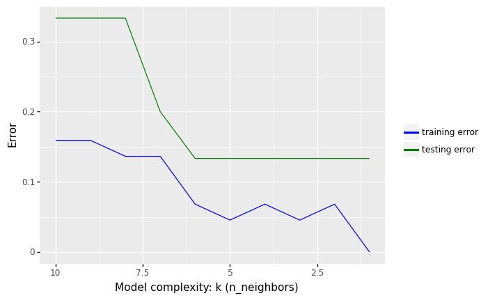
print(f'Best accuracy was {df_output.test_accuracy[row_max]}, which corresponds to a value of K between 1 and 6')
Best accuracy was 0.8666666666666667, which corresponds to a value of K between 1 and 6
df_output.sort_values(by='test_error', ascending=True)
| k | train_accuracy | test_accuracy | train_error | test_error | |
|---|---|---|---|---|---|
| 0 | 1 | 1.000000 | 0.866667 | 0.000000 | 0.133333 |
| 1 | 2 | 0.931818 | 0.866667 | 0.068182 | 0.133333 |
| 2 | 3 | 0.954545 | 0.866667 | 0.045455 | 0.133333 |
| 3 | 4 | 0.931818 | 0.866667 | 0.068182 | 0.133333 |
| 4 | 5 | 0.954545 | 0.866667 | 0.045455 | 0.133333 |
| 5 | 6 | 0.931818 | 0.866667 | 0.068182 | 0.133333 |
| 6 | 7 | 0.863636 | 0.800000 | 0.136364 | 0.200000 |
| 7 | 8 | 0.863636 | 0.666667 | 0.136364 | 0.333333 |
| 8 | 9 | 0.840909 | 0.666667 | 0.159091 | 0.333333 |
| 9 | 10 | 0.840909 | 0.666667 | 0.159091 | 0.333333 |
From the results above, we see that the performance of KNN model with two features (height and color_score) after rescaling the features increase from 73.33% to values around 86.67% in accuracy (for K between 1 to 6).
##### Convert pandas DataFrame to Numpy before applying classification

X_train_np = X_train.to_numpy()
y_train_np = y_train.to_numpy()

X_test_np = X_test.to_numpy()
y_test_np = y_test.to_numpy()

clf = KNeighborsClassifier(n_neighbors = 6)
clf.fit(X_train_np, y_train_np)

# Plotting decision regions
fig, ax = plt.subplots()

# Decision region for feature 3 = mass = value
value=160
# Plot training sample with feature = mass = value +/- width
width=20

fig = plot_decision_regions(X_test_np, y_test_np, clf=clf)
ax.set_xlabel('Feature 1 (height)')
ax.set_ylabel('Feature 2 (color_scale)')
ax.set_title('Classification problem')
/Users/Kaemyuijang/opt/anaconda3/lib/python3.7/site-packages/mlxtend/plotting/decision_regions.py:279: UserWarning: You passed a edgecolor/edgecolors ('black') for an unfilled marker ('x'). Matplotlib is ignoring the edgecolor in favor of the facecolor. This behavior may change in the future.
Text(0.5, 1.0, 'Classification problem')
7.7. Model validation
7.7.1. Holdout sets
We can gain a better understanding of a model’s performance by employing a holdout (or test) set, which is when we hold back a subset of data from the model’s training and then use it to verify the model’s performance. This may be done train_test_split in Scikit-train as previously done.
# Importing a dataset
url = 'https://raw.githubusercontent.com/susanli2016/Machine-Learning-with-Python/master/fruit_data_with_colors.txt'
df = pd.read_table(url)

# Make a copy of the original dataset
df_model = df.copy()

#Rescaling features 'mass','width','height','color_score'.
#scaler = StandardScaler()
#scaler = RobustScaler()
scaler = MinMaxScaler()


features = [['mass','width','height','color_score']]
for feature in features:
    df_model[feature] = scaler.fit_transform(df_model[feature])


#Create x and y variable
#X = df_model[['mass','width','height','color_score']]
#y = df_model['fruit_label']

X = df_model[['height', 'color_score']]
y = df_model['fruit_label']

print(X.head())
     height  color_score
0  0.507692     0.000000
1  0.430769     0.105263
2  0.492308     0.131579
3  0.107692     0.657895
4  0.092308     0.631579
In this example, we use half of the data as a training set and the other half as the validation set with n_neighbors=5.
X1, X2, y1, y2 = train_test_split(X, y, test_size=0.5, random_state=0)

model1 = KNeighborsClassifier(n_neighbors=5)

model1.fit(X1,y1)
accuracy_score(y2, model1.predict(X2))
0.7
We obtain an accuracy score of 0.7 which indicates that 70% of points were correctly labeled by our model
# checking the number of fruits by type in the training data

y1.value_counts()
1    12
4    10
3     5
2     2
Name: fruit_label, dtype: int64
7.7.2. Cross-validation
One drawback of using a holdout set for model validation is that we lost some of our data during model training. In the preceding example, half of the dataset is not used to train the model! This is inefficient and can lead to issues, particularly if the initial batch of training data is small.
One solution is to employ cross-validation, which requires performing a series of fits in which each subset of the data is used as both a training and a validation set.
We perform two validation trials here, utilizing each half of the data as a holdout set alternately.
With the split data from earlier, we could implement it like this:
model1 = KNeighborsClassifier(n_neighbors=5)
model2 = KNeighborsClassifier(n_neighbors=5)

model1.fit(X1,y1)
model2.fit(X2,y2)

print('Accuracy score of model 1:', accuracy_score(y2, model1.predict(X2)))
print('Accuracy score of model 2:', accuracy_score(y1, model2.predict(X1)))

# use the average as an estimate of the accuracy
print('\nAn estimate of the accuracy: ',(accuracy_score(y2, model1.fit(X1,y1).predict(X2)) + accuracy_score(y1, model2.fit(X2,y2).predict(X1)))/2)
Accuracy score of model 1: 0.7
Accuracy score of model 2: 0.6896551724137931

An estimate of the accuracy:  0.6948275862068966
The result is two accuracy scores, which we may combine (for example, by taking the mean) to produce a more accurate estimate of the global model performance.
This type of cross-validation is a two-fold cross-validation, in which the data is split into two sets and each is used as a validation set in turn.
Two-fold cross-validation: image from datavedas

This notion might be expanded to include more trials and folds in the data—for example, the below figure from scikit-learn.org shows a visual representation of five-fold cross-validation.
Five-fold cross-validation: image from scikit-learn.org
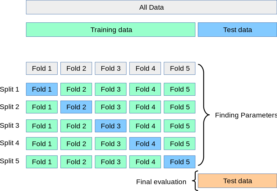
we can use Scikit-Learn’s cross_val_score convenience routine to do it k-fold cross-validation. The Python code below performs k-fold cross-validation.
In what follows, we perform StratifiedKFold to split the data in 2 folds (defined by n_splits = 2) (see Chapter 5 for more details).
The StratifiedKFold module in Scikit-learn sets up n_splits (folds, partitions or groups) of the dataset in a way that the folds are made by preserving the percentage of samples for each class.
The brief explaination for the code below (also see the diagram below) is as follows:
The dataset has been split into K (K = 2 in our example) equal partitions (or folds).
(In iteration 1) use fold 1 as the testing set and the union of the other folds as the training set.
Repeat step 2 for K times, using a different fold as the testing set each time.
from sklearn.model_selection import cross_val_score, StratifiedKFold

knn = KNeighborsClassifier(n_neighbors=5)

# Create StratifiedKFold object.
skf = StratifiedKFold(n_splits=2, shuffle=True, random_state=0)

# store cross-validation scores in cv_scores object
cv_scores = []

for train_index, test_index in skf.split(X, y):
    X_train_fold, X_test_fold = X.loc[train_index,], X.loc[test_index,]
    y_train_fold, y_test_fold = y.loc[train_index,], y.loc[test_index,]
    knn.fit(X_train_fold, y_train_fold)
    cv_scores.append(knn.score(X_test_fold, y_test_fold))

print(cv_scores)
[0.7, 0.7931034482758621]
The accuracy scores of the two-fold cross-validation are 0.7 and 0.793.
7.7.2.1. Computing cross-validated metrics¶¶
We can use Scikit-Learn’s cross_val_score convenience routine to do it k-fold cross-validation without the need to create a StratifiedKFold object (skf above). The Python code below computes the cross-validation scores.
from sklearn.model_selection import cross_val_score

knn = KNeighborsClassifier(n_neighbors=5)

cross_val_score(knn, X, y, cv=2)

print('The accuracy scores after performing two-fold cross-vlaidation are:',cross_val_score(knn, X, y, cv=2))
The accuracy scores after performing two-fold cross-vlaidation are: [0.66666667 0.5862069 ]
It is also possible to use other cross validation strategies by passing a cross validation iterator instead, for instance:
See the link below for more details:
https://scikit-learn.org/stable/modules/cross_validation.html
from sklearn.model_selection import ShuffleSplit

knn = KNeighborsClassifier(n_neighbors=5)

cv = ShuffleSplit(n_splits=2, test_size=0.5, random_state=1)

cross_val_score(knn, X, y, cv=cv)
array([0.8 , 0.86666667])
Note The validation scores from the previous results are differents due to the training and test sets are randomly sampled from the original dataset.
Exercise Plot the (mean) misclassification error over the number of K neighbours to find the optimal K value that gives the maximum mean accuracy score (the mean of the accuracy scores obtained from the two-fold cross-validation).
7.7.3. Hypertuning Model Parameters using Grid Search
In the validation section, we set the parameter ‘n_neighbors’ to 5 as a starting point when we generated our KNN models.
When we go through a process to identify the best parameters for our model to improve accuracy, we are hypertuning parameters. We will use GridSearchCV to find the best value for ‘n_neighbors’ in our situation.
GridSearchCV works by repeatedly training our model on a set of parameters that we define. That manner, we can test our model with each parameter and determine the best settings for maximum accuracy. In order to see which value for ‘n_neighbors’ works best for our model, we will specify a range of values.
To perform so, we’ll make a dictionary with the key ‘n_neighbors’ and use numpy to build an array of values ranging from 1 to 15. In order to determine the best value for ‘n_neighbors,’ our new grid search model will use a new k-NN classifier, our param grid, and a cross-validation value of 2 (use 2 in our case why?).
# Importing a dataset
url = 'https://raw.githubusercontent.com/susanli2016/Machine-Learning-with-Python/master/fruit_data_with_colors.txt'
df = pd.read_table(url)

# Make a copy of the original dataset
df_model = df.copy()

#Rescaling features 'mass','width','height','color_score'.
#scaler = StandardScaler()
#scaler = RobustScaler()
scaler = MinMaxScaler()


features = [['mass','width','height','color_score']]
for feature in features:
    df_model[feature] = scaler.fit_transform(df_model[feature])


#Create X and y variable
X = df_model[['height', 'color_score']]
y = df_model['fruit_label']

# Split the dataset into training and testing sets
X_train, X_test, y_train, y_test = train_test_split(X, y, test_size=0.25, random_state=0)
To get started, we need to import GridSearchCV from the Sklearn library.
The model we use for hyperparameter tuning is required (knn in our case) by the estimator parameter of GridSearchCV.
A list of parameters and the range of values for each parameter of the specified estimator are required by the param_grid parameter. When working with the KNN model, the most important parameter is n_neighbors.
Cross-validation is performed to determine the hyperparameter value set that provides the best accuracy.
from sklearn.model_selection import GridSearchCV
# the estimator used in out example
knn = KNeighborsClassifier()

# create a parameter grid: map the parameter names to the values that should be searched
# simply a python dictionary
# key: parameter name
# value: list of values that should be searched for that parameter
# single key-value pair for param_grid
param_grid = {'n_neighbors':np.arange(1,16)}

#k_range = list(range(1, 16))
#param_grid = dict(n_neighbors=k_range)
# instantiate the grid
grid = GridSearchCV(knn, param_grid, cv=2, scoring='accuracy')

#grid = GridSearchCV(knn, param_grid, cv=2, scoring='balanced_accuracy')
The grid object is ready for 2-fold cross-validation of a KNN model with classification accuracy as the evaluation measure.
There is also a grid parameter to repeat the 2-fold cross-validation 15 times.
Each time, the parameter n_neighbors should get a different value from the list.
Here we specify that n_neighbors should take the values 1 to 15.
We can designate a scorer object with the scoring parameter,
scoring='accuracy'in this example. (for more details https://scikit-learn.org/stable/modules/model_evaluation.html)You can set n_jobs = -1 to run calculations in parallel (if your computer and OS support it). This is also called parallel programming.
# fit the grid with the training set
grid.fit(X_train, y_train)
GridSearchCV(cv=2, estimator=KNeighborsClassifier(),
             param_grid={'n_neighbors': array([ 1,  2,  3,  4,  5,  6,  7,  8,  9, 10, 11, 12, 13, 14, 15])},
             scoring='accuracy')
cv_results_ returns a dictionary of all the evaluation metrics from the gridsearch. To visualize it properly, you can convert into a pandas DataFrame. The results include the test scores for the two folds, the mean and standard deviation of the test scores and also the ranking of the mean test scores.
# view the complete results
# cv_results_dict: this attributes gives a dict with keys as column headers
# and values as columns, that can be imported into a pandas DataFrame.

pd.DataFrame(grid.cv_results_).head()
| mean_fit_time | std_fit_time | mean_score_time | std_score_time | param_n_neighbors | params | split0_test_score | split1_test_score | mean_test_score | std_test_score | rank_test_score | |
|---|---|---|---|---|---|---|---|---|---|---|---|
| 0 | 0.005679 | 0.002084 | 0.005561 | 0.000824 | 1 | {'n_neighbors': 1} | 0.636364 | 0.909091 | 0.772727 | 0.136364 | 1 |
| 1 | 0.002670 | 0.000004 | 0.006662 | 0.003166 | 2 | {'n_neighbors': 2} | 0.727273 | 0.772727 | 0.750000 | 0.022727 | 2 |
| 2 | 0.002560 | 0.000067 | 0.003976 | 0.000336 | 3 | {'n_neighbors': 3} | 0.636364 | 0.772727 | 0.704545 | 0.068182 | 3 |
| 3 | 0.007777 | 0.005566 | 0.005177 | 0.001293 | 4 | {'n_neighbors': 4} | 0.500000 | 0.772727 | 0.636364 | 0.136364 | 4 |
| 4 | 0.002213 | 0.000024 | 0.003185 | 0.000199 | 5 | {'n_neighbors': 5} | 0.545455 | 0.681818 | 0.613636 | 0.068182 | 5 |
# Create a list of the mean scores

grid_mean_scores = grid.cv_results_['mean_test_score']
Plot the value of K for KNN (x-axis) against the cross-validated accuracy (y-axis).
# Plot the result
k_range = list(range(1, 16))
plt.plot(k_range, grid_mean_scores)
plt.xlabel('Value of K for KNN')
plt.ylabel('Cross-Validated Accuracy')
Text(0, 0.5, 'Cross-Validated Accuracy')
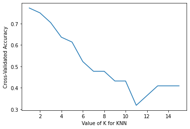
After training, we can check which of the values we tested for ‘n_neighbors’ worked best. For this purpose we call ‘best_params_’ in our model.
# examine the best model

# Single best score achieved across all params (k)
print(grid.best_score_)

# Dictionary containing the parameters (k) used to generate that score
print(grid.best_params_)

# Actual model object fit with those best parameters
# Shows default parameters that we did not specify
print(grid.best_estimator_)
0.7727272727272727
{'n_neighbors': 1}
KNeighborsClassifier(n_neighbors=1)
The results show that the cross-validated accuracy is 77.27% when the value of the K is 1.
7.7.3.1. Using the best parameter to make prediction and result evaluation
The classfification report on the validation set can be created on a per-class basis. It provides a deeper understanding of the behavior of the classifier than global accuracy, which can disguise functional weaknesses in a class of a multiclass problem.
# Using the best parameter obtained earlier

best_model = KNeighborsClassifier(n_neighbors=1)

# Train out best_model on the training set
best_model.fit(X_train, y_train)

# Make predictions on the test set
y_pred = best_model.predict(X_test)
We can crate the confusion metrix and the summary of the predictions.
# Confusion Matrix visualization.

cm = confusion_matrix(y_test, y_pred, labels=best_model.classes_)
disp = ConfusionMatrixDisplay(confusion_matrix=cm,display_labels=best_model.classes_)
disp.plot()
<sklearn.metrics._plot.confusion_matrix.ConfusionMatrixDisplay at 0x1287f8e10>
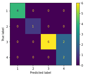
print('Classification report: \n')
print(classification_report(y_test, y_pred))
Classification report:

              precision    recall  f1-score   support

           1       1.00      1.00      1.00         4
           2       1.00      1.00      1.00         1
           3       1.00      0.75      0.86         8
           4       0.50      1.00      0.67         2

    accuracy                           0.87        15
   macro avg       0.88      0.94      0.88        15
weighted avg       0.93      0.87      0.88        15
Observation of the classification report for the prediction model as follows.
The classifier made a total of 15 predictions.
Out of those 15 samples, the classifier predicted 4 apples, 1 mandarins, 6 oranges and 4 lemons.
In reality, out of 4 predicted lemons, two of them are oranges.
The overall accuracy of the prediction of the fruit data set by applying the KNN classifier model is 86.67 which means the model performs well in our example.
accuracy_score(y_test,y_pred)
0.8666666666666667
7.7.3.2. Swarmplots
df_model.columns
Index(['fruit_label', 'fruit_name', 'fruit_subtype', 'mass', 'width', 'height',
       'color_score'],
      dtype='object')
#df_model[['fruit_name','mass', 'width','height', 'color_score']]
data = pd.melt(df_model[['fruit_name','mass', 'width','height', 'color_score']], id_vars = 'fruit_name', var_name = 'features',value_name = 'value')
#data
# swarmplot for analysing the different attributes
plt.figure(figsize = (6,6))
sns.swarmplot(x = 'features', y = 'value', hue = 'fruit_name', data = data)
plt.show()
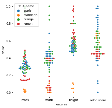
X = df_model[['mass', 'width','height', 'color_score']]
y = df_model['fruit_label']

X_train, X_test, y_train, y_test = train_test_split(X, y, test_size=0.25, random_state=0)
from sklearn.feature_selection import chi2, SelectKBest, f_classif
# Get the two best(k = 2) features using the SelectKBest method
ft = SelectKBest(chi2, k = 2).fit(X_train, y_train)
print('Score: ', ft.scores_)
print('Columns: ', X_train.columns)
Score:  [2.0299807  3.68664781 2.56587049 0.43604189]
Columns:  Index(['mass', 'width', 'height', 'color_score'], dtype='object')
ft = SelectKBest(f_classif, k= 2).fit(X_train, y_train)
print('Score: ', ft.scores_)
print('Columns: ', X_train.columns)
Score:  [ 8.69254183 18.22929591 40.53528918  2.26802478]
Columns:  Index(['mass', 'width', 'height', 'color_score'], dtype='object')
# Importing a dataset
url = 'https://raw.githubusercontent.com/susanli2016/Machine-Learning-with-Python/master/fruit_data_with_colors.txt'
df = pd.read_table(url)

from sklearn.preprocessing import MinMaxScaler

features = [['mass','width','height','color_score']]

X = df[['mass','width','height','color_score']]
y = df['fruit_label']

scaler = MinMaxScaler()

scaled_X = pd.DataFrame(scaler.fit_transform(X),
                        columns=X.columns)
scaled_X.head()
| mass | width | height | color_score | |
|---|---|---|---|---|
| 0 | 0.405594 | 0.684211 | 0.507692 | 0.000000 |
| 1 | 0.363636 | 0.578947 | 0.430769 | 0.105263 |
| 2 | 0.349650 | 0.421053 | 0.492308 | 0.131579 |
| 3 | 0.034965 | 0.105263 | 0.107692 | 0.657895 |
| 4 | 0.027972 | 0.052632 | 0.092308 | 0.631579 |
scaled_df = scaled_X
scaled_df['fruit_label'] = df[['fruit_label']]
#scaled_df

hm = sns.heatmap(scaled_df.corr(), annot = True)
hm.set(title = "Correlation matrix of insurance data\n")
plt.show()
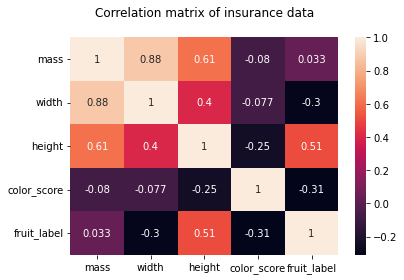
sns.pairplot(scaled_df[['fruit_label','color_score','height']],hue='fruit_label')
<seaborn.axisgrid.PairGrid at 0x127982c50>
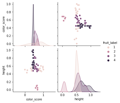
# Importing a dataset
#url = 'https://raw.githubusercontent.com/susanli2016/Machine-Learning-with-Python/master/fruit_data_with_colors.txt'
#df = pd.read_table(url)

# Train Test Split

X = scaled_df[['height', 'color_score']]
y = scaled_df['fruit_label']
X_train, X_test, y_train, y_test = train_test_split(X, y, test_size=0.25, random_state=0)

# Instantiate the estimator
from sklearn.neighbors import KNeighborsClassifier
knn = KNeighborsClassifier()

k_range = range(1,11)

train_accuracy = {}
train_accuracy_list = []

test_accuracy = {}
test_accuracy_list = []

for k in k_range:
    knn = KNeighborsClassifier(n_neighbors = k)

    # Training the classifier by passing in the training set X_train and the labels in y_train
    knn.fit(X_train,y_train)

    # Compute accuracy on the training set
    train_accuracy[k] = knn.score(X_train, y_train)
    train_accuracy_list.append(knn.score(X_train, y_train))


    test_accuracy[k] = knn.score(X_test,y_test)
    test_accuracy_list.append(knn.score(X_test,y_test))
train_accuracy
print(test_accuracy)
{1: 0.8666666666666667, 2: 0.8666666666666667, 3: 0.8666666666666667, 4: 0.8666666666666667, 5: 0.8666666666666667, 6: 0.8666666666666667, 7: 0.8, 8: 0.6666666666666666, 9: 0.6666666666666666, 10: 0.6666666666666666}
#scaled_df_output
scaled_df_output = pd.DataFrame({'k':k_range,
                          'train_accuracy':train_accuracy_list,
                          'test_accuracy':test_accuracy_list
                         })

(
    ggplot(scaled_df_output)
    + geom_line(aes(x = 'k',  y = 'train_accuracy',color='"training accuracy"'))
    + geom_line(aes(x = 'k',  y = 'test_accuracy',color='"testing accuracy"'))
    + labs(x='k (n_neighbors)', y='overall accuracy')
    + scale_color_manual(values = ["blue", "green"], # Colors
        name = " ")
)
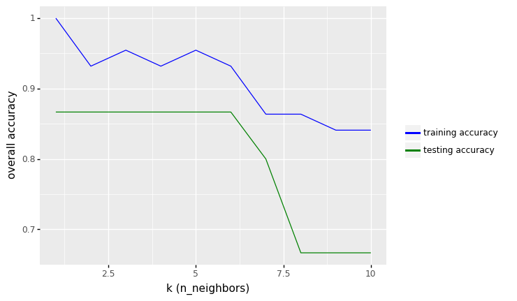
<ggplot: (300097561)>
##### Convert pandas DataFrame to Numpy before applying classification

X_train_np = X_train.to_numpy()
y_train_np = y_train.to_numpy()

X_test_np = X_test.to_numpy()
y_test_np = y_test.to_numpy()

clf = KNeighborsClassifier(n_neighbors = 4)
clf.fit(X_train_np, y_train_np)

# Plotting decision regions
fig, ax = plt.subplots()

# Decision region for feature 3 = mass = value
value=160
# Plot training sample with feature = mass = value +/- width
width=20

fig = plot_decision_regions(X_test_np, y_test_np, clf=clf)
ax.set_xlabel('Feature 1 (height)')
ax.set_ylabel('Feature 2 (color_scale)')
ax.set_title('Classification problem')
/Users/Kaemyuijang/opt/anaconda3/lib/python3.7/site-packages/mlxtend/plotting/decision_regions.py:279: UserWarning: You passed a edgecolor/edgecolors ('black') for an unfilled marker ('x'). Matplotlib is ignoring the edgecolor in favor of the facecolor. This behavior may change in the future.
Text(0.5, 1.0, 'Classification problem')
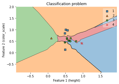
test_accuracy
{1: 0.8666666666666667,
 2: 0.8666666666666667,
 3: 0.8666666666666667,
 4: 0.8666666666666667,
 5: 0.8666666666666667,
 6: 0.8666666666666667,
 7: 0.8,
 8: 0.6666666666666666,
 9: 0.6666666666666666,
 10: 0.6666666666666666}
7.7.3.3. Feature Scaling the Fruit Dataset (width and height)
In this section, we will perform min-max scaling to rescaling the features height and color_score before training the KNN model.
#df.head()
from sklearn.preprocessing import MinMaxScaler
from sklearn.preprocessing import StandardScaler
from sklearn.preprocessing import RobustScaler
from sklearn.metrics import accuracy_score


# Importing a dataset
url = 'https://raw.githubusercontent.com/susanli2016/Machine-Learning-with-Python/master/fruit_data_with_colors.txt'
df = pd.read_table(url)

# Make a copy of the original dataset
df_model = df.copy()

#Rescaling features 'mass','width','height','color_score'.
#scaler = StandardScaler()
#scaler = RobustScaler()
scaler = MinMaxScaler()


features = [['mass','width','height','color_score']]
for feature in features:
    df_model[feature] = scaler.fit_transform(df_model[feature])

#print(df_model.head())

# Instantiate the estimator
knn = KNeighborsClassifier()

#Create x and y variable
#X = df_model[['mass','width','height','color_score']]
#y = df_model['fruit_label']

X = df_model[['height', 'width']]
y = df_model['fruit_label']

X_train, X_test, y_train, y_test = train_test_split(X, y, test_size=0.25, random_state=0)

k_range = range(1,11)

train_accuracy = {}
train_accuracy_list = []

test_accuracy = {}
test_accuracy_list = []

# misclassfication error
train_error_list = []
test_error_list = []

for k in k_range:
    knn = KNeighborsClassifier(n_neighbors = k)

    # Training the classifier by passing in the training set X_train and the labels in y_train
    knn.fit(X_train,y_train)

    # Compute accuracy on the training set
    train_accuracy[k] = knn.score(X_train, y_train)
    train_accuracy_list.append(knn.score(X_train, y_train))
    train_error_list.append(1 - knn.score(X_train, y_train))

    test_accuracy[k] = knn.score(X_test,y_test)
    test_accuracy_list.append(knn.score(X_test,y_test))
    test_error_list.append(1 - knn.score(X_test,y_test))

df_output = pd.DataFrame({'k':k_range,
                          'train_accuracy':train_accuracy_list,
                          'test_accuracy':test_accuracy_list,
                          'train_error':train_error_list,
                          'test_error':test_error_list
                         })
# Accuracy over the number of K neighbors

(
    ggplot(df_output)
    + geom_line(aes(x = 'k',  y = 'train_accuracy',color='"training accuracy"'))
    + geom_line(aes(x = 'k',  y = 'test_accuracy',color='"testing accuracy"'))
    + labs(x='k (n_neighbors)', y='overall accuracy')
    + scale_color_manual(values = ["blue", "green"], # Colors
        name = " ")
)
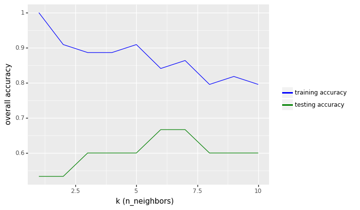
<ggplot: (313184393)>
# Error over the number of K neighbors

(
    ggplot(df_output)
    + geom_line(aes(x = 'k',  y = 'train_error',color='"training error"'))
    + geom_line(aes(x = 'k',  y = 'test_error',color='"testing error"'))
    + labs(x='Model complexity: k (n_neighbors)', y='Error')
    + scale_color_manual(values = ["blue", "green"], # Colors
        name = " ")
    + scale_x_continuous(trans = "reverse")
)
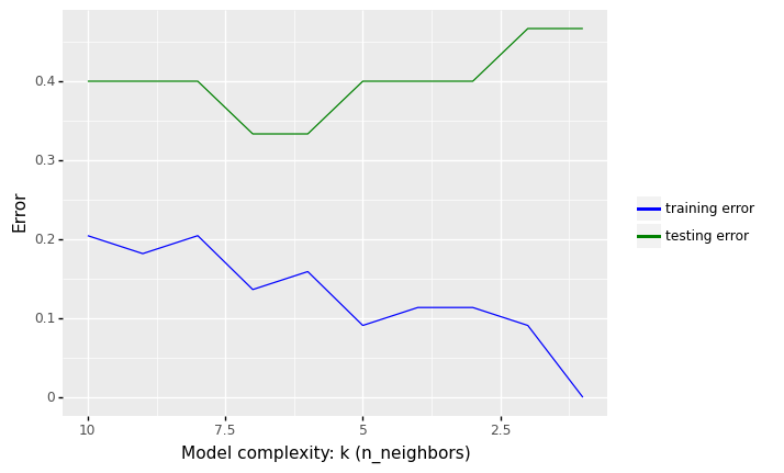
<ggplot: (312075721)>
row_max = df_output.test_accuracy.idxmax()

print(f'Best accuracy was {df_output.test_accuracy[row_max]}, which corresponds to a value of K between 1 and 6')
Best accuracy was 0.6666666666666666, which corresponds to a value of K between 1 and 6
From the results above, we see that the performance of KNN model with two features (height and color_score) increase from 73.33% to values around 86.67% in accuracy.
##### Convert pandas DataFrame to Numpy before applying classification

X_train_np = X_train.to_numpy()
y_train_np = y_train.to_numpy()

X_test_np = X_test.to_numpy()
y_test_np = y_test.to_numpy()

clf = KNeighborsClassifier(n_neighbors = 6)
clf.fit(X_train_np, y_train_np)

# Plotting decision regions
fig, ax = plt.subplots()

# Decision region for feature 3 = mass = value
#value=160
# Plot training sample with feature = mass = value +/- width
#width=20

fig = plot_decision_regions(X_test_np, y_test_np, clf=clf)
ax.set_xlabel('Feature 1 (height)')
ax.set_ylabel('Feature 2 (width)')
ax.set_title('Classification problem')
/Users/Kaemyuijang/opt/anaconda3/lib/python3.7/site-packages/mlxtend/plotting/decision_regions.py:279: UserWarning: You passed a edgecolor/edgecolors ('black') for an unfilled marker ('x'). Matplotlib is ignoring the edgecolor in favor of the facecolor. This behavior may change in the future.
Text(0.5, 1.0, 'Classification problem')