Predictive Analytics: Linear Regression#
How to Read CSV to DataFrame in Google Colab#
To read a CSV file into a Pandas DataFrame in Google Colab, follow these steps:
Open Google Colab and Create a New Notebook
Go to Google Colab and create a new notebook.
Upload the CSV File to Your Google Drive
Make sure the CSV file you want to read is uploaded to your Google Drive.
Mount Your Google Drive in Colab
Run the following code to mount your Google Drive:
from google.colab import drive
drive.mount('/content/drive')
This will prompt you to authorize Colab to access your Google Drive. Follow the instructions and enter the authorization code.
Navigate to the CSV File
Use the file explorer on the left panel of the Colab notebook to find the path to your CSV file.
Load the CSV File into a Pandas DataFrame
Run the following code to load the CSV file into a Pandas DataFrame:
import pandas as pd
df = pd.read_csv('/content/drive/My Drive/path/to/your/csv/iris.csv')
Replace
/content/drive/My Drive/path/to/your/csv/iris.csvwith the actual path to your CSV file in Google Drive.
By following these steps, you can easily read a CSV file from your Google Drive into a Pandas DataFrame in Google Colab.
Linear Regression#
Introduction to Linear Regression#
Linear regression is a statistical method used to model the relationship between two variables by fitting a linear equation to the observed data. The goal is to find the best-fitting straight line through the points.
For a simple linear regression, we are interested in finding the relationship between a dependent variable \( Y \) and an independent variable \( x \). The linear equation can be written as:
Here:
\( Y \) is the dependent variable we are trying to predict.
\( x \) is the independent variable we are using to make predictions.
\( a \) is the slope of the line, which represents the change in \( Y \) for a one-unit change in \( x \).
\( b \) is the y-intercept, which is the value of \( Y \) when \( x \) is zero.
How Linear Regression Works#
The main idea behind linear regression is to find the line that best fits the data points. This is done by minimizing the sum of the squared differences between the observed values and the values predicted by the line. This method is known as “least squares.”
Example of Linear Regression#
Let’s consider a simple example. Suppose we have data on the number of hours studied (\( x \)) and the corresponding test scores (\( Y \)). Our goal is to find the relationship between the hours studied and the test scores.
Plot the data points on a graph with hours studied on the x-axis and test scores on the y-axis.
Draw the best-fitting line through the points.
Use the equation of the line to make predictions.
For example, if the equation of our best-fitting line is:
This means that for every additional hour studied, the test score increases by 5 points, and the y-intercept is 10.
Importance of Linear Regression#
Linear regression is a fundamental technique in statistics and machine learning. It is widely used for predicting outcomes and understanding relationships between variables. In many real-world situations, it provides a simple yet powerful way to make informed decisions based on data.
By learning linear regression, students can gain valuable insights into data analysis and develop critical thinking skills that are applicable in various fields, from economics to engineering.
Example: Predict the Height or Weight of a Person
In this section, we will use a simple dataset from Kaggle, specifically the Weights and Heights dataset, to apply a linear regression algorithm. The dataset includes the following variables:
Gender
Height (m)
Weight (kg)
About the Dataset
The dataset provides information about individuals’ heights and weights. We will use this data to build a linear regression model to predict either height or weight based on the other variable.
Tasks for Building and Evaluating a Linear Regression Model
Load the Dataset
Import the dataset containing individuals’ heights and weights.
Display the first few rows to understand the structure of the data.
Explore the Data
Check for missing values and handle them appropriately.
Perform basic statistical analysis (mean, median, standard deviation) on the height and weight variables.
Visualize the distribution of heights and weights using histograms.
Visualize Relationships
Create scatter plots to visualize the relationship between height and weight.
Fit a linear regression line to the scatter plot to observe the trend.
Prepare the Data
Split the dataset into features (X) and target (y).
Perform a train-test split to evaluate the model’s performance on unseen data.
Train the Model
Initialize a linear regression model.
Train the model using the training data.
Evaluate the Model
Predict the target variable (height or weight) on the test set.
Calculate and display performance metrics such as Mean Absolute Error (MAE), Mean Squared Error (MSE), and R-squared.
Compare the predicted values with actual values using a scatter plot or residual plot.
Make Predictions
Use the trained model to predict height or weight for new data points.
Display and interpret the predictions.
Review Model Performance
Assess the model coefficients (slope and intercept) and interpret their meaning.
Check for overfitting or underfitting based on performance metrics.
Document and Report
Summarize the findings and insights from the model.
Create a report detailing the analysis, model performance, and predictions.
Optional: Improve the Model
Explore feature engineering or data transformation techniques to improve model performance.
Consider alternative regression techniques if needed.
Data Preprocessing (height-weight dataset)#
First, we need to preprocess the data before applying the linear regression model. This includes loading the data, handling missing values, and encoding categorical variables.
import pandas as pd
import numpy as np

url = "https://raw.githubusercontent.com/shashankvmaiya/Height-Weight-Gender-Classification/master/data/01_heights_weights_genders.csv"

df = pd.read_csv(url)
Visualize Relationships Between Variables Using Pairplot#
To understand the relationships between variables, we can use Seaborn’s pairplot function. This function creates a matrix of scatter plots for each pair of variables in the DataFrame, allowing us to visually inspect correlations and patterns.
Here’s how you can use pairplot:
import seaborn as sns
import matplotlib.pyplot as plt
import numpy as np

# Plot pairplot
sns.pairplot(df)
plt.show()
/Users/Kaemyui/anaconda3/lib/python3.10/site-packages/seaborn/_oldcore.py:1119: FutureWarning: use_inf_as_na option is deprecated and will be removed in a future version. Convert inf values to NaN before operating instead.
  with pd.option_context('mode.use_inf_as_na', True):
/Users/Kaemyui/anaconda3/lib/python3.10/site-packages/seaborn/_oldcore.py:1119: FutureWarning: use_inf_as_na option is deprecated and will be removed in a future version. Convert inf values to NaN before operating instead.
  with pd.option_context('mode.use_inf_as_na', True):
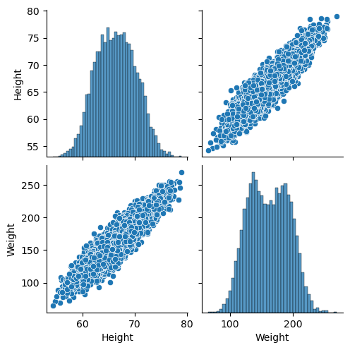
Interpreting the Pairplot for Height and Weight#
When you visualize the relationship between height and weight using a pairplot, you get a matrix of scatter plots and histograms that help you understand the relationships between these variables.
Here’s how to interpret the results:
Scatter Plot:
The scatter plot in the pairplot shows the relationship between height and weight. Each point represents an individual’s height and corresponding weight.
Positive Correlation: If the points tend to form an upward trend from left to right, this indicates a positive correlation, meaning as height increases, weight also tends to increase.
No Clear Pattern: If the points are scattered randomly with no discernible trend, there may be no significant correlation between height and weight.
Histogram:
The diagonal of the pairplot contains histograms for each variable (height and weight). These histograms show the distribution of individual variables.
Height Histogram: This histogram displays how frequently different heights occur in the dataset.
Weight Histogram: Similarly, this histogram shows the distribution of weights in the dataset.
Correlation Strength:
You can get a sense of the strength of the correlation by observing how tightly the points cluster around an imaginary line in the scatter plot.
Strong Correlation: Points closely follow a straight line.
Weak Correlation: Points are more dispersed and less aligned.
Note
Correlation measures how two variables are related to each other. In simple terms, if one variable changes, correlation helps us understand how and whether another variable changes in response. For example, if we find a positive correlation between height and weight, it means that as people’s height increases, their weight tends to increase as well. Correlation can be positive (both variables move in the same direction), negative (one variable increases while the other decreases), or zero (no clear relationship). It’s a useful tool for identifying relationships and patterns between different sets of data.
For a dataset with height and weight:
If you observe that as height increases, weight also generally increases, you might conclude there is a positive correlation between height and weight.
If the scatter plot shows a scattered distribution with no clear pattern, the relationship between height and weight may not be strong or linear.
By using a pairplot, you can visually assess the relationships and decide whether further statistical analysis is needed to quantify the correlation.
Correlation Between Each Variable#
We need to check the correlation between variables to understand their relationships. This helps us identify which variable can predict another.
# If 'Gender' is not needed for correlation, select only numerical columns
df_numerical = df[['Height', 'Weight']]

# Calculate the correlation matrix
correlation_matrix = df_numerical.corr()
print(correlation_matrix)
          Height    Weight
Height  1.000000  0.924756
Weight  0.924756  1.000000
Note
In the given correlation matrix, the correlation coefficient between Height and Weight is 0.925, which indicates a very strong positive linear relationship between these two variables. This value close to 1 suggests that as Height increases, Weight tends to increase as well, and vice versa. The diagonal elements of the matrix are 1, which represent the perfect correlation of each variable with itself.
Splitting the Dataset into Training and Testing Sets#
To evaluate our model, we need to split the dataset into training and testing sets. This allows us to train the model on one part of the data and test it on another.
from sklearn.model_selection import train_test_split
from sklearn.model_selection import train_test_split

# Define features and target
X = df[['Height']]
y = df['Weight']

# Split the dataset
X_train, X_test, y_train, y_test = train_test_split(X, y, test_size=0.2, random_state=42)
Build a Linear Model#
Now we will build a linear regression model using the training data.
from sklearn.linear_model import LinearRegression

# Initialize the model
model = LinearRegression()

# Train the model
model.fit(X_train, y_train)

# Print the model coefficients
print(f"Slope (a): {model.coef_[0]}")
print(f"Intercept (b): {model.intercept_}")
Slope (a): 7.70218560509581
Intercept (b): -349.7878205824454
Evaluate the Model#
After building and training your linear regression model, it’s important to evaluate its performance. This involves predicting the target variable on the test set and calculating various performance metrics. Here’s how you can do it:
1. Predict the Target Variable#
Use your trained model to make predictions on the test set. For example, if you are predicting weight based on height, you would use the test set heights to predict weights.
# Predict the target variable on the test set
y_pred = model.predict(X_test)
2. Calculate Performance Metrics#
Calculate and display the following performance metrics to assess how well your model is performing:
Mean Absolute Error (MAE): Measures the average magnitude of errors in predictions, without considering their direction. It is calculated as:
where \( y_i \) is the actual value and \( \hat{y}_i \) is the predicted value.
Mean Squared Error (MSE): Measures the average squared difference between the predicted and actual values. It gives more weight to larger errors. It is calculated as:
where \( y_i \) is the actual value and \( \hat{y}_i \) is the predicted value.
R-squared (R^2): Represents the proportion of variance in the dependent variable that is predictable from the independent variable(s). It ranges from 0 to 1, where 1 indicates a perfect fit. It is calculated as:
where \( \bar{y} \) is the mean of the actual values, \( y_i \) is the actual value, and \( \hat{y}_i \) is the predicted value.
from sklearn.metrics import mean_absolute_error, mean_squared_error, r2_score

# Calculate performance metrics
mae = mean_absolute_error(y_test, y_pred)
mse = mean_squared_error(y_test, y_pred)
r2 = r2_score(y_test, y_pred)

print(f"Mean Absolute Error (MAE): {mae}")
print(f"Mean Squared Error (MSE): {mse}")
print(f"R-squared (R^2): {r2}")
Mean Absolute Error (MAE): 9.69193380188457
Mean Squared Error (MSE): 149.00350418448122
R-squared (R^2): 0.85773177770385
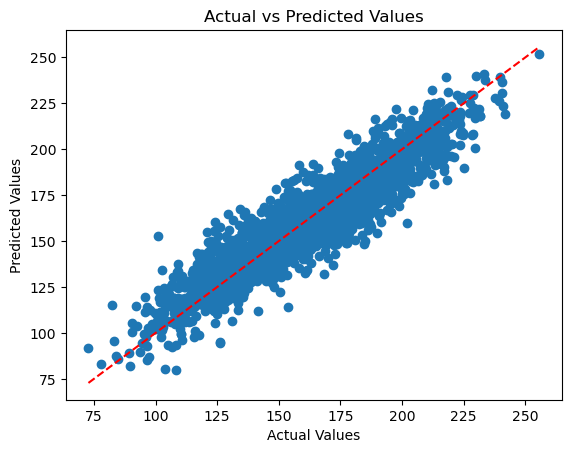
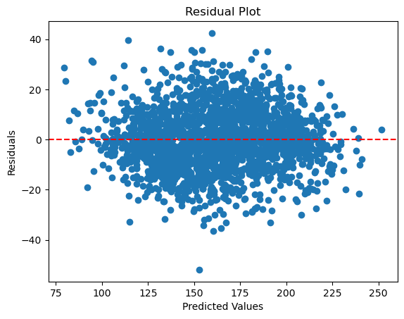
3. Compare Predicted Values with Actual Values#
Visualize how well your model’s predictions match the actual values. This can be done using scatter plots or residual plots:
Scatter Plot: This plot displays predicted values against actual values. It helps you see how closely the predicted values align with the actual values. If the points closely follow a diagonal line, it indicates that the predictions are accurate.
Residual Plot: This plot shows the residuals, which are the differences between actual and predicted values. By plotting residuals against predicted values, you can check for patterns that might indicate problems with the model, such as non-linearity or heteroscedasticity. Ideally, residuals should be randomly scattered around zero with no clear pattern.
import matplotlib.pyplot as plt

# Scatter plot of predicted vs actual values
plt.scatter(y_test, y_pred)
plt.xlabel('Actual Values')
plt.ylabel('Predicted Values')
plt.title('Actual vs Predicted Values')
plt.plot([min(y_test), max(y_test)], [min(y_test), max(y_test)], color='red', linestyle='--')
plt.show()
# Calculate residuals
residuals = y_test - y_pred

# Residual plot
plt.scatter(y_pred, residuals)
plt.axhline(y=0, color='red', linestyle='--')
plt.xlabel('Predicted Values')
plt.ylabel('Residuals')
plt.title('Residual Plot')
plt.show()
Visualize Model Performance on Test Data#
To assess the performance of your linear regression model, it’s crucial to visualize the results using the test data. This helps us understand how well the model generalizes to new, unseen data.
Here’s how to visualize the model’s predictions:
Scatter Plot and Regression Line: Plotting the actual data points alongside the regression line helps us see how well the model fits the test data. The scatter plot shows the actual data, while the regression line indicates the model’s predictions.
import matplotlib.pyplot as plt

# Plotting
plt.scatter(X_test, y_test, color='blue', label='Actual data')
plt.plot(X_test, model.predict(X_test), color='red', linewidth=2, label='Regression line')
plt.xlabel('Height (m)')
plt.ylabel('Weight (kg)')
plt.title('Height vs Weight')
plt.legend()
plt.show()
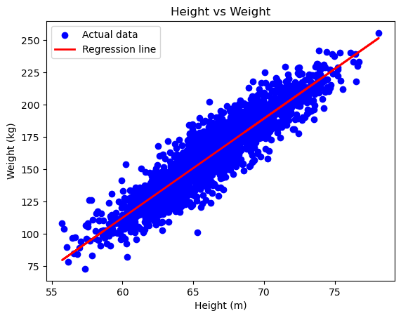
Explanation:
Scatter Plot: This shows the actual test data points, with
Heighton the x-axis andWeighton the y-axis. Each blue dot represents an actual data point from the test set, allowing you to see the distribution and spread of the data.Regression Line: The red line represents the model’s predictions. It is plotted using the
predictmethod of your trained linear regression model. This line indicates the trend that the model has learned from the training data and how it predictsWeightbased onHeight.Axis Labels: Clearly label the x-axis as
Height (m)and the y-axis asWeight (kg). This helps in understanding what each axis represents in the plot.Title: The plot is titled
Height vs Weight, providing context to what the plot represents and making it easier to interpret the visualization.
By comparing the regression line with the actual data points, you can visually assess the fit of the model and determine how well it generalizes to the test data.
Make a Prediction from the Model Result#
Finally, we can use the trained model to make predictions. For example, we can predict the weight of a person given their height.
# Predict the weight for a specific height
height = pd.DataFrame({'Height': [75,80]})  # Ensure column name matches
predicted_weight = model.predict(height)

print(f"Predicted weight: {predicted_weight}")
Predicted weight: [227.8760998 266.38702783]
Conclusion#
In this regression analysis, we used linear regression to model the relationship between height and weight. By training the model on a training set and evaluating it on a test set, we were able to predict weight based on height. We assessed the model’s performance using metrics such as Mean Absolute Error (MAE), Mean Squared Error (MSE), and R-squared (\(R^2\)), which provided insights into the accuracy and goodness of fit of the model.
Visualizing the results with scatter plots and regression lines on the test data allowed us to assess how well the model generalizes to new data. The combination of statistical metrics and visual plots provides a comprehensive view of the model’s effectiveness and helps in understanding the strengths and limitations of the predictions. Overall, linear regression is a powerful tool for uncovering relationships between variables and making predictions based on these relationships.
Exercise: Linear Regression Analysis: Swedish Insurance Dataset
You are provided with the “Auto Insurance in Sweden” dataset. This dataset contains two variables:
Total Number of Claims (x): The number of claims made.
Total Payment for Claims (y): The total payment for all claims, measured in thousands of Swedish Kronor.
Your task is to perform linear regression analysis to predict the total payment for claims given the number of claims.
Tasks
Estimate Statistical Quantities
Load the dataset and examine its structure.
Calculate the mean and standard deviation of both the total number of claims and the total payment for claims.
Provide summary statistics for the dataset.
Estimate Linear Regression Coefficients
Fit a simple linear regression model to the dataset.
Extract the estimated coefficients (slope and intercept) of the regression line.
Interpret the meaning of the coefficients in the context of the problem.
Make Predictions Using Linear Regression
Use the fitted regression model to make predictions for new values of the total number of claims.
Create a plot showing the regression line along with the data points.
Compare the predicted values to the actual total payment values and evaluate the model’s performance.